#StandWithUkraine - Stop the Russian invasion
Join us and donate. Since 2022 we have contributed over $5,000 in book royalties to Save Life in Ukraine & Ukraine Humanitarian Appeal & The HALO Trust, and we will continue to give!
Ten Factors When Considering Tools
Making decisions between the seemingly endless number of digital tools can feel overwhelming. To help you navigate your decision-making process, below we list ten key factors that we consider when evaluating new visualization tools or online services. When comparing options, many decisions involve some type of tradeoff, a balance between competing wants and needs, such as ease-of-use versus extensive features. By identifying key factors, we believe that each reader can make a more informed decision about which tools offer the best tradeoff for you, since all of us are different. Furthermore, we worded our categories broadly, because the concepts can be applied to other areas of your digital life, but followed up with more context about data visualization in particular.
1. Easy-to-learn
How much time will be required to learn a new tool? In our busy lives, this is often the most important factor, but also one that varies widely, as your personal investment of time and energy depends on your prior experience in using related tools and grasping key concepts. In this book, we use the label Easy Tools to identify those best suited for beginners (and even some advanced users prefer them, too). They usually feature a graphical user interface, meaning you operate them with pull-down menus or drag-and-drop steps, rather than memorizing commands to be typed into a blank screen. The better ones also offer user-friendly error messages that guide you in the right direction after a wrong turn. Later in the book, we’ll introduce Power Tools that provide more control and customization of your visualizations, such as code templates that you can copy and edit, which is easier than writing them from scratch. Overall, when deciding which tools to include in this book, we placed easy-to-learn at the top of our list. In fact, we removed a popular free drag-and-drop tool from an earlier draft of this book because even we had difficulty following our own instructions in how to use it. When faced with several good options, choose simplicity.
2. Free or Affordable
Is the tool free to use? Or is it based on a freemium model that offers basic functions for free, with premium features at a price? Or does it require paying a one-time purchase or monthly subscription fee? Of course, the answer to what is affordable will vary for each reader. We fully understand that the business model for many software developers requires steady revenue, and both of us willingly pay to use specific tools necessary for our work. If you regularly rely on a tool to do your job, with no clear alternative, it’s in your best interest to financially support their continued existence. But when creating this book, we were impressed by the wide array of high-quality data visualization tools that are available at no cost to users. To increase access to data visualization for all readers, every tool we recommend is free, or its core features are freely available.
3. Powerful
Does the tool offer all of the features you anticipate needing? For example, does it support building sufficient types of data visualizations for your project? Although more is usually better, some types of charts are obscure and rarely used, such as radar charts and waterfall charts. Also, look out for limits on the amount of data you can upload, or restrictions on visualizations you create. For example, we previously removed a freemium tool from an earlier version of this book when the company began to require a paid license if your map was viewed more than 100 times on the web. Furthermore, to what extent does the tool allow you to customize the appearance of your visualizations? Since drag-and-drop and freemium tools commonly limit your display options, you may need to make tradeoffs between them versus more powerful and customizable tools. In this book, we begin with easy tools and gradually introduce more advanced ones in each chapter, to help you identify your ideal combination of simplicity and power.
4. Supported
Does the developer regularly maintain and update the tool, and respond to questions or issues? Is there an active user community that supports the tool and shares its knowledge about using it? If you’ve worked with digital tools as long as we have, you’ll recognize our pain in losing several whose developers pulled the plug. For example, the Killed By Google lists nearly 200 applications and online services that this multi-billion dollar corporation closed down. One of these was a popular data visualization tool, Google Fusion Tables, which once occupied a full chapter in an earlier version of this book, when we removed when Google shut down the tool after a ten-year run in 2019. Although none of us can predict which online tools will persist in future years, we looked for signs of active support before including them in this book, such as regular updates, stars earned on a GitHub developer’s site, and questions answered in the StackOverflow user forum. But never assume that the future will resemble the past. The continuous evolution of digital tools means that some become extinct.
5. Portable
How easily can you migrate your data into and out of a tool? For example, we stopped recommending an online story map tool created by a well-known software company when we discovered that while users could easily upload locations, text, and photos, but there was no way to export all of their work! As digital technology inevitably changes, all data will need to migrate to another platform, and it’s your job to be prepared for this eventual transition. Think about the issue as historical preservation, to increase the likelihood that your projects will continue to function on some unknown platform in the future. If your current tool developer announced that it was shutting down next month, could you easily extract all of the underlying data in a commonly-used file format to upload to a different tool? A key step to future-proof your visualizations is to ensure that your data files are easily separated from the presentation software that generates the charts or maps. When recommending tools for this book, we favored those that support portable data downloads for future migrations.
6. Secure and Private
This category combines related questions about security and privacy. First, does the online tool or service take reasonable precautions to protect your personal information from malicious hackers and malware? Review a list of major data breaches on Wikipedia to help you make informed decisions. If your tool developer recently experienced a malicious data hack, find out how they responded. Second, when you access tools through your browser, does they track your web activity across different sites? Also be aware of internet censorship by different governments around the globe, as compiled by Wikipedia, unless you happen to be reading this book in China, which has blocked access to all of Wikipedia since April 2019. Finally, does the tool clearly explain whether the data you enter or the products you create will stay private or become public? For example, some companies offer free access to their visualization tools, but in exchange require you to make your data, charts, and maps publicly accessible. That tradeoff may be acceptable if you’re working with open-access data and already plan to freely share your visualizations, as many journalists and scholars do. In any case, make sure the terms of service are clearly defined before you start using a tool.
7. Collaborative
Does the tool allow people to work together and co-create a data visualization? If so, does the tool allow different levels of access or version control to help prevent team members from accidentally overwriting each other’s contributions? Prior generations of digital tools were designed primarily for solo users, in part to address security and privacy issues raised above. But today, many data visualization projects require access and input from multiple team members. Collaboration is essential for success. As co-authors of this book, who jointly wrote the text and co-created many of the visualizations, we favor a newer generation of tools designed for team work environments.
8. Cross-Platform
This category refers to both creating and consuming digital content. First, does the tool work across different computer operating systems? In this book, we highlight several tools that run inside any modern web browser, which usually (but not always) means they will operate on all major desktop and laptop computer platforms, such as Windows, Mac, Chromebook, and Linux. When necessary, we specify when a tool will only run on specific computer operating systems, and this often reduces access for people using lower-cost computers. Second, does the tool create visualizations that are responsive to different screen sizes? In other words, does it produce charts and maps that display satisfactorily on smaller devices, such as smartphones and tablets? In this book, we favor cross-platform tools that also display content responsively on smaller devices, but we do not necessarily expect that tools can be operated on small devices to create visualizations. In other words, when we say that a tool runs inside any modern web browser, we don’t necessarily mean phone and tablet browsers, but sometimes they work there, too.
9. Open-Source
Is the tool’s software code publicly viewable? Can the code be modified and redistributed, so that other developers can suggest improvements, or build new features or extensions? We recognize that many developers rely on non-public proprietary code to sell their tools at a profit, and several of those appear in the book. But we also have been impressed with the number of high-quality data visualization tools offered under different types of open-source licensing arrangements, by sustainable communities of volunteer developers, non-profit organizations, and also for-profit companies who recognize some economic benefits of open-source code development. When recommending tools for this book, we highlight open-source options when available.
10. Accessible for Visually-Impaired Readers
Does the tool create visualizations that are accessible for visually-impaired readers? Although disability advocacy laws were passed decades ago, digital technology still lags behind and is slowly catching up, especially in the field of data visualization. But some tools include a built-in check for colorblindness and offer chart types designed for people with low vision using screen readers, as shown in Figure 1.3.
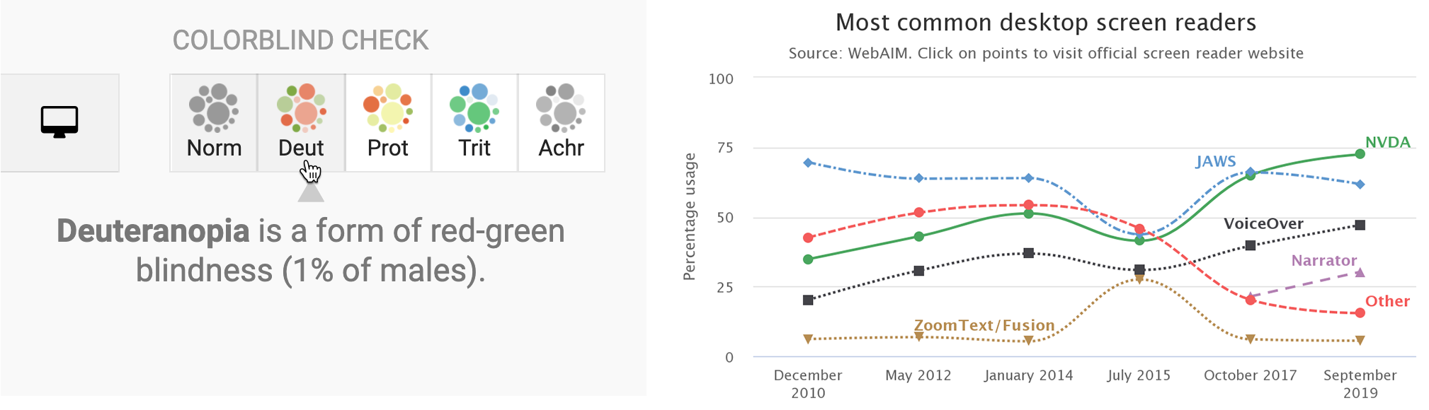
Figure 1.3: On the left, the Datawrapper built-in check for colorblindness. On the right, a Highcharts line chart designed for low-vision accessibility.
Those are ten factors we consider when deciding whether to add another item into our digital toolkit. Often we need to make compromises, as you’ll read in the next section. Of course, your list of factors may vary, and might include other values that are vitally important yet sometimes harder to judge, such as a software developer’s ethical business practices or contribution to the public good. Whatever criteria you value, make them explicit in your decision-making process, and inform others about what influences your choices.
Also consider other people’s perspectives on making tool decisions. When visualization designer Lisa Charlotte Rost wrote about her fascinating experiment in recreating one chart with 24 different tools, she concluded that “there are no perfect tools, just good tools for people with certain goals.” On a related note, when digital historian Lincoln Mullen offered advice on making prudent choices about digital tools, his first recommendation was: “The best possible tool is the one you’re already using to get work done.” Don’t fall into the familiar trap of believing that your productivity will increase if only you began to use yet another new tool. Mullen’s second piece of advice was: “Prefer the tool that your local co-workers use.” Even if a different tool is objectively better, it may be outweighed by the benefits of mutual support and collaboration with people using a less-awesome application in your local setting.8
Now that you’ve considered different factors behind tool decisions, in the next section you’ll see an overview of our recommendations for readers of this book, with a quick description and link to the chapter where we introduce each of them.
Lisa Charlotte Rost, “What I Learned Recreating One Chart Using 24 Tools” (Source, December 8, 2016), https://source.opennews.org/en-US/articles/what-i-learned-recreating-one-chart-using-24-tools/; Lincoln Mullen, “How to Make Prudent Choices About Your Tools” (ProfHacker, August 14, 2013), https://lincolnmullen.com/blog/how-to-make-prudent-choices-about-your-tools/. See also criteria for educational tools by Audrey Watters, “’The Audrey Test’: Or, What Should Every Techie Know About Education?” (Hack Education, March 17, 2012), http://hackeducation.com/2012/03/17/what-every-techie-should-know-about-education.↩︎