#StandWithUkraine - Stop the Russian invasion
Join us and donate. Since 2022 we have contributed over $5,000 in book royalties to Save Life in Ukraine & Ukraine Humanitarian Appeal & The HALO Trust, and we will continue to give!
- Pie, Line, and Area Charts
Before starting this section, be sure to review the pros and cons of designing charts with Google Sheets, as well as beginner-level step-by-step instructions for creating bar and column charts, in the previous sections of this chapter. In this section, you’ll learn why and how to use Google Sheets to build three more types of interactive visualizations: pie charts (to show parts of a whole), line charts (to show change over time), and stacked area charts (to combine showing parts of a whole, with change over time). If Google Sheets or these chart types do not meet your needs, refer back to Table 6.1 for other tools and tutorials.
Pie Charts
Some people use pie charts to show parts of a whole, but we urge caution with this type of chart for reasons explained further below. For example, if you wish to show the number of different fruits sold by a store in one day, as a proportion of total fruit sold, then format the labels and values in vertical columns in your Google Sheet, as shown in Figure 6.31. Values can be expressed as either raw numbers or percentages. Now you can easily create a pie chart that displays these values as colored slices of a circle, as shown in Figure 6.32. Viewers can see that bananas made up slightly over half of the fruit sold, followed by apples and oranges.
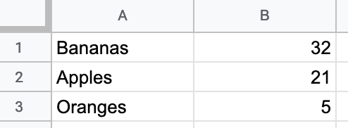
Figure 6.31: To create a pie chart, format the data values vertically in Google Sheets.
Figure 6.32: Pie chart: Explore the interactive version. Data is fictitious.
But you need to be careful when using pie charts, as we described in the Chart Design section of this chapter. First, make sure your data adds up to 100 percent. If you created a pie chart that displayed some but not all of the fruits sold, it would not make sense. Second, avoid creating too many slices, since people cannot easily distinguish smaller ones. Ideally, use no more than 5 slices in a pie chart. Finally, start the pie at the top of the circle (12 o’clock) and arrange the slices clockwise, from largest to smallest.
Create your own version using our Pie Chart in Google Sheets template. The steps are similar to those in prior Google Sheets chart tutorials in this chapter. Go to File > Make a Copy to create a version you can edit in your Google Drive. Select all of the cells and go to Insert > Chart. If Google Sheets does not correctly guess that you wish to create a pie chart, then in the Chart editor window, in the Setup tab, select Pie chart from the Chart type dropdown list.
Note that slices are ordered the same way they appear in the spreadsheet. Select the entire sheet and Sort the values column from largest to smallest, or from Z to A. In Customize tab of the Chart editor, you can change colors and add borders to slices. Then add a meaningful title and labels as desired.
Line Charts
A line chart is the best way to represent continuous data, such as change over time. For example, imagine you wish to compare the availability of different meats per capita in the US over the past century. In your Google Sheet, organize the time units (such as years) into the first column, since these will appear on the horizontal X-axis. Also, place each data series (such as beef, pork, chicken) alongside the vertical time-unit column, and each series will become its own line, as shown in Figure 6.33. Now you can easily create a line chart that emphasizes each data series changed over time, as shown in Figure 6.34. In the US, the amount of chicken per capita steadily rose and surpassed pork and beef around 2000.
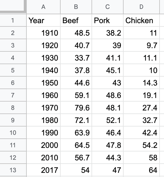
Figure 6.33: To create a line chart, format the time units and each data series in vertical columns.
Figure 6.34: Line chart: Explore the interactive version. Data from US Department of Agriculture.
Create your own version using our Line Chart in Google Sheets template. The steps are similar to those in prior Google Sheets chart tutorials in this chapter. Go to File > Make a Copy to create a version you can edit in your Google Drive. Select the data, and choose Insert > Chart. If Google Sheets does not correctly guess that you wish to create a line chart, in the Chart editor, Setup tab, select Line chart from the Chart type dropdown list.
Sidebar: Tables and charts approach time-series data in opposite directions. When designing a table, the proper method is to place dates horizontally as column headers, so that we read them from left-to-right, like this:34
| Year | 2000 | 2010 | 2020 |
|---|---|---|---|
| Series1 | … | … | … |
| Series2 | … | … | … |
But when designing a line chart in Google Sheets and several other tools, we organize the spreadsheet by placing the dates vertically down the first column, so that the tool reads them as labels for a data series, like this:
| Year | Series1 | Series2 |
|---|---|---|
| 2000 | … | … |
| 2010 | … | … |
| 2020 | … | … |
To convert data from tables to charts, learn how to transpose rows and columns in Chapter 4: Clean Up Messy Data.
Stacked Area Charts
Area charts resemble line charts with filled space underneath. The most useful type is a stacked area chart, which is best for combining two concepts from above: showing parts of the whole (like a pie chart) and continuous data over time (like a line chart). For example, the line chart above shows how the availability of three different meats changed over time. However, if you also wish to show how the total availability of these combined meats went up or down over time, it’s hard to see this in a line chart. Instead, use a stacked line chart to visualize the availability of each meat and the total combined availability per capita over time. Stacked line charts show both aspects of your data simultaneously.
To create a stacked area chart, organize the data in the same way as you did for the line chart in Figure 6.33. Now you can easily create a stacked line chart that displays the availability of each meat—and their combined total—over time, as shown in Figure 6.35. Overall, we can see that total available meat per capita increased after the 1930s Depression, and chicken steadily became a larger portion of the total after 1970.
Figure 6.35: Stacked area chart: Explore the interactive version. Data from US Department of Agriculture.
Create your own version using our Stacked Area Chart in Google Sheets template. The steps are similar to those in prior Google Sheets chart tutorials in this chapter. Go to File > Make a Copy to create a version you can edit in your Google Drive. Set up the data exactly as you would for a line chart, with the first column for time units in the X-axis, and place each data series in its own column. Select the data, and choose Insert > Chart. In the Chart editor, in tab Setup, select Stacked area chart from the Chart type dropdown list.
Now that you’ve built several basic charts in Google Sheets, in the next section we’ll build some slightly more advanced charts in a different tool, Datawrapper.
Few, Show Me the Numbers, p. 166↩︎