#StandWithUkraine - Stop the Russian invasion
Join us and donate. Since 2022 we have contributed over $5,000 in book royalties to Save Life in Ukraine & Ukraine Humanitarian Appeal & The HALO Trust, and we will continue to give!
Build a Narrative on a Storyboard
Let’s return to the Sketch Your Data Story exercise from Chapter 1. We encouraged you to scribble words and sketch pictures on sheets of paper to lay out at least four initial elements of your story:
- Identify the problem that motivates your project.
- Reframe the problem into a researchable question.
- Describe your plan to find data to answer the question.
- Dream up one or more visualizations you might create using imaginary data.
Spread out these sheets like a storyboard to define the sequence of your narrative, as shown in Figure 15.1. Imagine them as preliminary slides for your presentation, or paragraphs and pictures for your written report or web page, for how you will explain the process to your audience. If you prefer to construct your storyboard digitally, another option is to convert blocks of text and images from your sheets into a Google Slides presentation or a draft Google Document, or your preferred tools for telling the data story. Of course, it’s perfectly normal to update the sheets you created at the beginning of your project to reflect changes in your thinking. For example, you may have refined your research question, found new sources during your search, and of course, turned your imagined visualizations into actual tables, charts, or maps with real data.
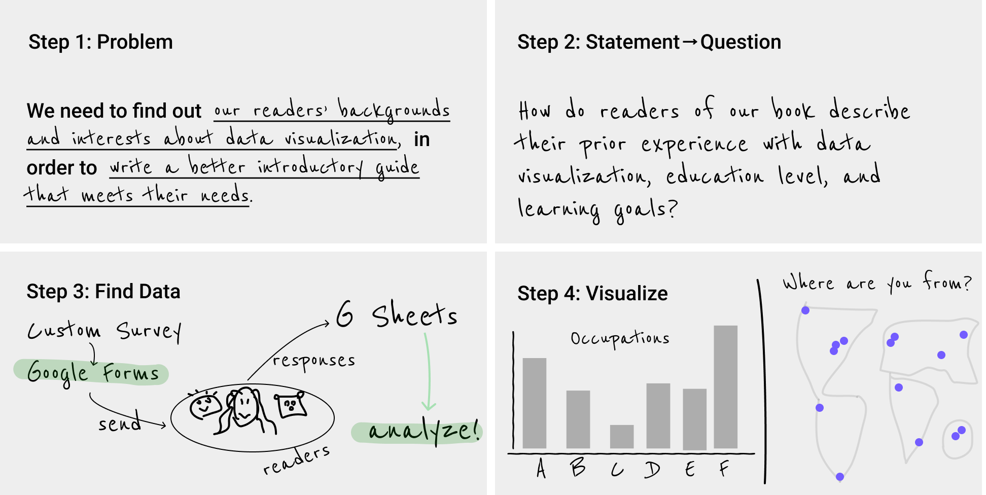
Figure 15.1: Sketch out your story idea on four pages: problem, question, find data, visualize.
Let’s enrich your storyboard by adding content about what you discovered while searching, cleaning, analyzing, and visualizing your data. Select only your most meaningful tables, charts, or maps. Print them out on separate sheets of paper, or download static images or capture screenshots to place them in your draft slides or document. Leave room for you to write at the top and bottom of each table, chart, or map in order to tell your data story.
The next step is to summarize the most important message the data reveals, and write it as a one-sentence summary at the top of each page that contains a table, chart, or map. Verbalize what your eyes see as the most insightful finding for your most important visualizations. Become our guide, and focus our attention on the data forest, rather than individual trees. Two sentences are acceptable, but one succinct sentence is better. If your prose becomes too wordy, try writing the first sentence in “headline” style and the second as a more descriptive follow-up. Despite the old saying that a picture is worth a thousand words, data visualizations do not speak for themselves. Your job is to interpret their meaning for your audience. One of the best ways to translate charts or maps into words is to describe exactly what captures your eye as the designer, and communicate this to your reader, who is seeing it for the first time and relying on your guidance. In every case, you need to decide on the ideal mix of words and images.
At the bottom of each visualization, tell us why it matters, and build up to how audiences should rethink or react. A good way to discuss the significance of your data story is to focus on how this new information changes us. When you discovered interesting patterns in your data visualization, how did it make you feel about the problem you (or your organization) were trying to solve? How did your answers to the research question make you think about the issue in a new or different way? Overall, does your data story inspire you or others to take action in some way? Once again, think about these questions from the perspective of your audience, and find words that capture how the data story should change our mindset, alter our habits, or influence our next steps.
For example, we started to sketch our own data storyboard in chapter 2 to define our problem statement: We need to find out our readers’ backgrounds and interests about data visualization, in order to write a better introductory guide that meets their needs. We collected data from over 3,000 readers of an earlier draft of this book who responded to our online survey and agreed that we would publicly share the survey results, as we discussed in chapter 2. We cleaned up the data as described in chapter 4 because some responses were partially empty or contained locations that could not be accurately geocoded. Then we looked for meaningful comparisons as described in chapter 5 and visualized our most interesting results in two ways. We created a scatter chart as described in chapter 6 and also a point map as described in chapter 7. For this chapter, we followed our own advice above by writing short summaries at the top of each visualization, and explaining why it matters at the bottom.
What did we discover in our reader survey about the earlier draft of this book? And how did we respond to the key data findings? First, over 70 percent of readers who responded live outside of North America. Most notably, 35 percent reside in Asia, 20 percent in Europe, 6 percent each in Africa and South America, and 3 percent in Oceania, as shown in the left side of Figure 15.2. Our first draft of the book mostly included examples from Hartford, Connecticut, where we both worked. While we knew that our book had a global audience, we were surprised to see how many readers—among those who responded to the survey—live outside of the United States. In order to be more inclusive and expand our international audience, we revised the book to add more sample charts and maps from other regions around the world. Second, we learned that readers who responded to our survey have relatively high levels of education, but limited data visualization experience. In particular, 89 percent reported completing the equivalent of a college degree (16 or more years of schooling), and 64% of these rated themselves as data visualization beginners (either 1 or 2 on the 5-point experiential scale), as shown in the right side of Figure 15.2. In our earlier draft of the book, our primary audience were college undergraduates, and we were uncertain about the reading and background levels of other readers. Based on the survey responses, we revised the manuscript to add deeper concepts about data visualization, because we believe most of our readers can grasp them, yet we continue to write at an introductory level that assumes no prior knowledge beyond a secondary school or early college education. Now we can add these new sheets to our storyboard.
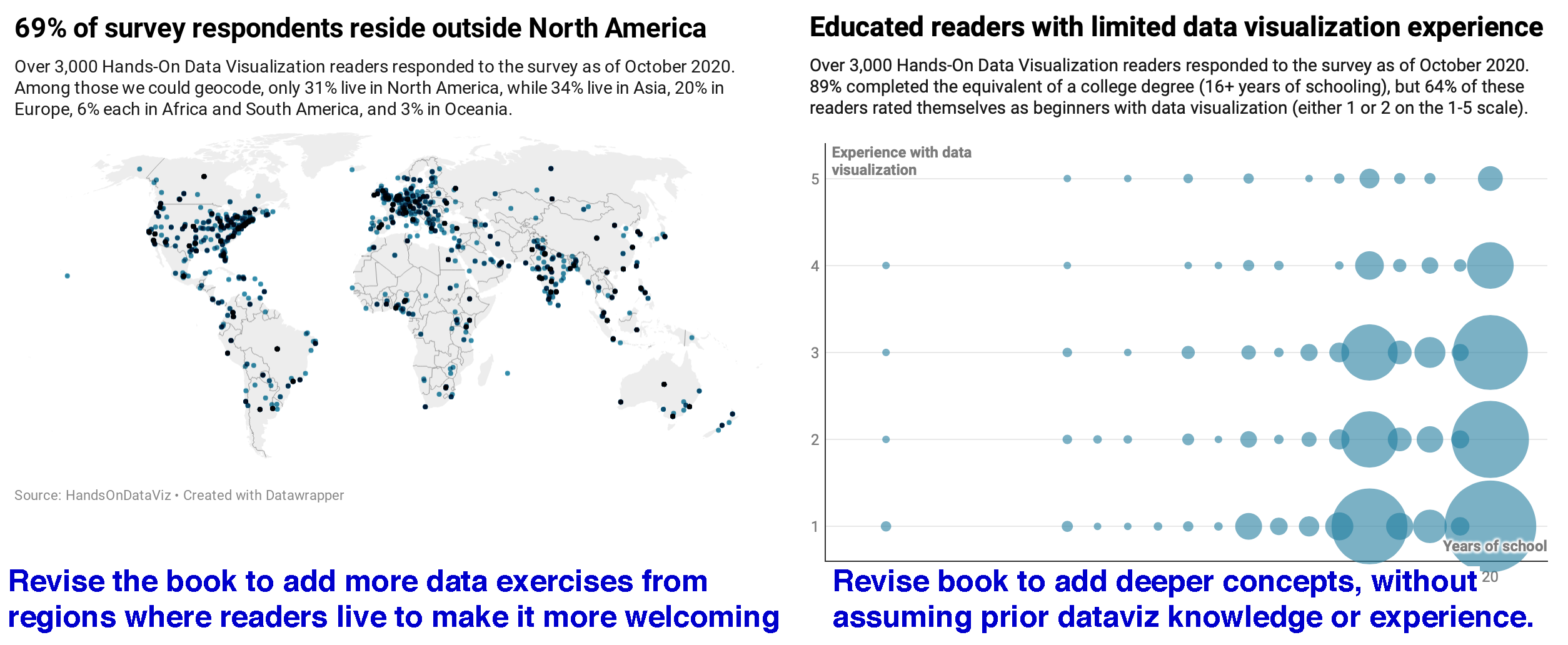
Figure 15.2: Verbalize meaningful insights at the top of each visualization, and tell why it matters at the bottom, then insert them into your storyboard.
Let’s pivot back to your storyboard. Insert your new data visualization sheets (or slides, or blocks of text and images) into the pages you’ve already assembled. As you complete your work, your layout might look something like this:
- problem statement
- research question
- how you found data
- tell 1st data insight—show evidence—why it matters
- tell 2nd data insight—show evidence—why it matters
- …and so forth toward your summary conclusion
As the storyteller, it’s your job to organize your data narrative in the way that makes sense to your audience, who most likely will be viewing all of this content for the first time. While there is no one way to tell a story, consider this advice to avoid making rookie mistakes:
- Tell us the problem and question before you offer an answer, because our brains expect to hear them in that order.
- Summarize each insight before you show us the supporting evidence, because once again, reversing the normal sequence makes it harder for us to follow your argument.
- Make sure that your research question and key insights are aligned with one another, since your audience will be confused if you ask one question, but answer a different one. It’s perfectly normal to tweak or fully revise the wording of your research question after you’ve dug deep into the data, because sometimes you don’t really know what you’re looking for until you’ve discovered it.
Now you should have a clearer sense of how a storyboard helps you to bring together narrative and data. In the next section, you’ll learn how to refine your visualizations by using text and color to draw attention to what is most important.