#StandWithUkraine - Stop the Russian invasion
Join us and donate. Since 2022 we have contributed over $5,000 in book royalties to Save Life in Ukraine & Ukraine Humanitarian Appeal & The HALO Trust, and we will continue to give!
Recognize and Reduce Data Bias
We define bias as unfairly favoring one view over another. When working with data and designing visualizations, it’s important to be aware of different types of bias, so that you can recognize them as potential factors that may influence your perception, and reduce their presence in your own work. The first step toward reducing bias is to correctly identify various types, which at first glance may appear hidden, so that we can call them out. In this section we’ll discuss four categories of bias that anyone who works with data needs to recognize: sampling biases, cognitive biases, algorithmic biases, and intergroup biases. In a later section we’ll address other types of biases that are highly relevant to anyone working with map data.
Sampling biases occur when we believe our data has been selected fairly, but some behind-the-scenes process influences its composition and skews the results. We previously warned you about several types in the Beware of Biased Comparisons section of Chapter 5. One type to avoid is selection bias, which means that the sample selected for your study differs systematically from the larger population, such as when you randomly measure the height of people who happen to be leaving the gym after basketball practice. A second type to avoid is non-response bias, which happens when certain subgroups of a population as less likely to respond to a survey, and leads to less representative results. We also cautioned you about a third type, self-selection bias, where participants who apply or volunteer for a program must be evaluated carefully to avoid comparisons with people with non-participants, who may not share the same motivations. Always question your data, as described in chapter 3, before you attempt to make meaningful comparisons. If you suspect that sampling issue may have snuck into the data collection process, either do not use the data, or clearly describe your concerns in your visualization notes and companion text to call out potential biases.
Cognitive biases refer to a category of human behaviors that skew how we interpret data. One example is confirmation bias, which refers to the tendency to accept only claims that fit our preconceived notions of how the world works. Counter this by actively searching for alternative interpretations and considering contradictory findings with open eyes. A second example is pattern bias, which describes how people tend to see meaningful relationships in data, even when numbers were randomly selected. Fight against this by reminding readers (and yourself) that data is noisy, and our brains are wired to see patterns, even where none exist. See additional resources on statistical analysis mentioned in chapter 5 to learn about appropriate tests to determine whether apparent patterns in your data exist at odds greater than chance. A third example is framing bias, which refers to negative or positive labels or conceptual categories that affect how we interpret information. On the power of labels, British statistician David Spiegelhalter notes that US hospitals tend to report mortality rates, while UK hospitals report survival rates. When weighing the risks of a surgical procedure for member of your family, a 5 percent mortality rate seems worse than a 95 percent survival rate, even though they’re identical. Furthermore, Spiegelhalter observes that when we supplement rates with raw counts, it further increases our impression of risks. For example, if we told you a surgical procedure had a 5 percent mortality rate and that 20 out of 400 patients died, that outcome seems worse because we begin to imagine real people’s lives, not just abstract percentages.51 Counter framing bias by being aware of its potential effect on our minds and calling it out.
Algorithmic biases occur when computer systems routinely favor certain outcomes over others, often by reinforcing privileges held by dominant social groups. Several cases have recently gained public attention. For example, algorithms have contributed to racial bias in the US court system. The Northpointe software company (now called Equivant) developed an algorithm to predict the risk of recidivism among defendants, which judges used when deciding on prison sentences or probation. But ProPublica investigative journalists found that the algorithm wrongly predicted Black defendants to be repeat offenders at almost twice the rate as White defendants, even when controlling for the types of prior crimes they committed.52 Algorithms also have added to gender bias in the financial services industry. When Apple and Goldman Sachs partnered to offer a new type of credit card, several customers noticed that the software formula to evaluate applications sometimes offered men 10 to 20 times the amount of credit as women, even if they were married, owned the same assets, and had similar prior credit scores.53 In both cases, companies denied the charges of algorithmic bias but refused to reveal the decision-making process within their software formulas, which they argued were proprietary. As a result, we need to be vigilant about the misuse of data.
Intergroup biases refers to multiple ways that people privilege or discriminate by social categories, such as race, gender, class, and sexuality. Clearly, intergroup biases have a long history that predate the digital era. But in the wake of the Black Lives Matter movement, some authors have called attention to ways that intergroup bias pervades the field of data visualization, and have advocated for ways to counter its impact. For example, Jonathan Schwabish and Alice Feng describe how they applied a racial equity lens to revise the Urban Institute’s Data Visualization Style Guide.54 For example, Schwabish and Feng recommend ordering group labels to focus on the data story, rather than listing “White” and “Men” at the top by default. They also call on us to proactively acknowledge missing groups in our data by calling attention to those often omitted, such as non-binary and transgender people in US federal datasets, rather than ignoring their absence. Furthermore, when choosing color palettes to represent people in charts and maps, the authors remind us to avoid stereotypical colors and to avoid color-grouping Black, Latino, and Asian people as polar opposites of White people.
Schwabish and Feng offer several excellent recommendations to improve racial equity in data visualization, though some of their more provocative proposals are likely to generate more discussion and debate. For example, they contrast different ways to portray Covid-19 pandemic data and recommend that we stop placing disaggregated racial and ethnic data on the same chart because it promotes a “deficit-based perspective” that judges lower-performing groups by the standards of higher-performing ones, as shown in Figure 14.15. Instead, Schwabish and Feng suggest that we plot racial and ethnic data in separate but adjacent charts, each with its own reference to state or national averages and confidence intervals, as shown in Figure 14.16.
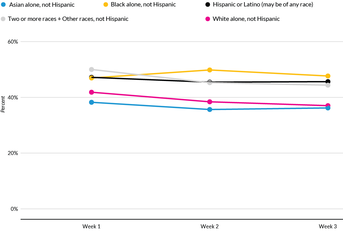
Figure 14.15: To avoid a deficit-based perspective, Schwabish and Feng argue against combining racial and ethnic data on the same chart. Image by Urban Institute, reprinted with permission.
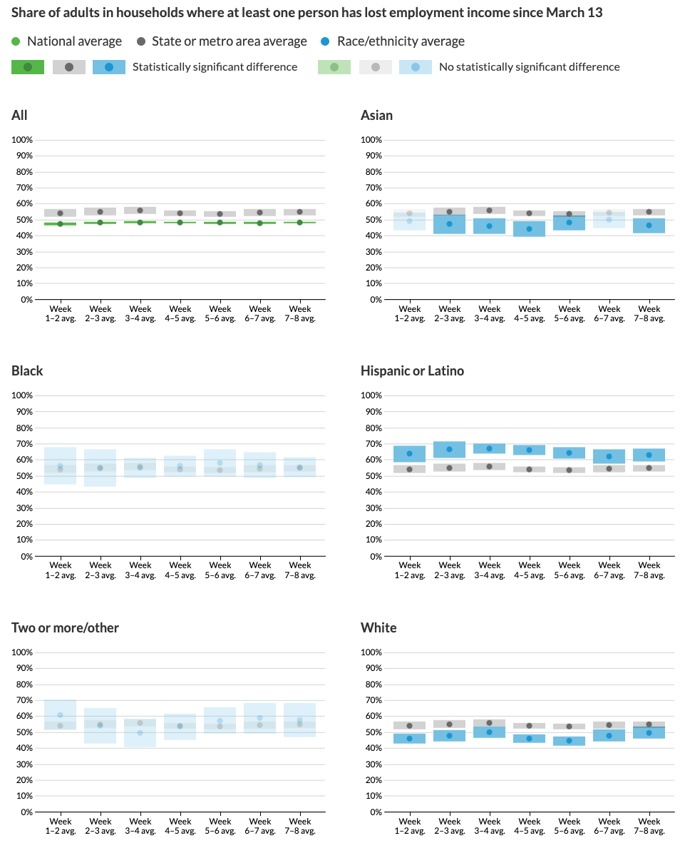
Figure 14.16: Instead, Schwabish and Feng recommend placing racial and ethnic data in separate charts, with state or national averages as a comparison point. Image by Urban Institute, reprinted with permission.
Comparing both sets of charts lead us to wonder about the broad question: whose interests are best served by data visualizations? On one hand, if dominant groups use racial disparities in charts to blame the victim, then it makes sense to stop feeding racist stereotypes of group behavior and cease comparing different groups on the same chart. On the other hand, if racial disparities are caused by structural obstacles to quality jobs, housing, and health care, then do separate six-panel visualizations make it harder for readers to recognize and challenge the roots of systemic racism? Schwabish and Feng raise an important perspective, but do not persuade us that separating racial and ethnic data necessarily promotes equity and justice. Nevertheless, we agree on the need to continually reflect on and reduce bias in data visualization, while also considering the broader context around how people in our unjust world interpret our charts and maps, to strengthen our continuing search for better ways to tell true and meaningful data stories.
All of us who create data visualizations should strive to recognize and reduce these general categories of data bias: sampling, cognitive, algorithmic, and intergroup. In the next section, we’ll focus on different types of spatial bias that are particular to working with map data.
David Spiegelhalter, The Art of Statistics: Learning from Data (Penguin UK, 2019), https://www.google.com/books/edition/The_Art_of_Statistics/CiZeDwAAQBAJ, pp. 22-5↩︎
Julia Angwin et al., “Machine Bias” (ProPublica, May 23, 2016), https://www.propublica.org/article/machine-bias-risk-assessments-in-criminal-sentencing?token=pnmZCKup_9SO_Q1DvGQOooKLHsrJG0Fr.↩︎
Neil Vigdor, “Apple Card Investigated After Gender Discrimination Complaints (Published 2019),” The New York Times: Business, November 10, 2019, https://www.nytimes.com/2019/11/10/business/Apple-credit-card-investigation.html.↩︎
Jonathan Schwabish and Alice Feng, “Applying Racial Equity Awareness in Data Visualization,” preprint (Open Science Framework, August 27, 2020), https://doi.org/10.31219/osf.io/x8tbw. See also this web post summary of the paper, Jonathan Schwabish and Alice Feng, “Applying Racial Equity Awareness in Data Visualization” (Medium, September 3, 2020), https://medium.com/@urban_institute/applying-racial-equity-awareness-in-data-visualization-bd359bf7a7ff, and Urban Institute, “Urban Institute Data Visualization Style Guide,” 2020, http://urbaninstitute.github.io/graphics-styleguide/.↩︎