#StandWithUkraine - Stop the Russian invasion
Join us and donate. Since 2022 we have contributed over $5,000 in book royalties to Save Life in Ukraine & Ukraine Humanitarian Appeal & The HALO Trust, and we will continue to give!
- Bar and Column Charts
Before you begin, be sure to review the pros and cons of designing charts with Google Sheets in the prior section. In this section, you’ll learn how to create bar and column charts, the most common visualization methods to compare values across categories. We’ll focus on why and how to create three different types: grouped, split, and stacked. For all of these, we blend the instructions for bar and column charts because they’re essentially the same, though oriented in different directions. If your data contains long labels, create a horizontal bar chart, instead of a vertical column chart, to give them more space for readability.
Grouped Bar and Column Charts
A grouped bar or column chart is best to compare categories side-by-side. For example, if you wish to emphasize gender differences in obesity across age brackets, then format the male and female data series together in vertical columns in your Google Sheet, as shown in Figure 6.12. Now you can easily create a grouped column chart to displays these data series side-by-side, as shown in Figure 6.13.
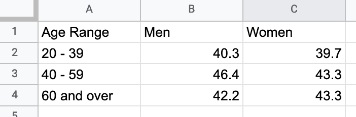
Figure 6.12: To create a grouped bar or column chart, format each data series vertically in Google Sheets.
Figure 6.13: Grouped Column chart: Explore the interactive version. Data from NHANES / State of Childhood Obesity, 2017-18.
To create your own interactive grouped column (or bar) chart, use our template and follow these steps.
- Open our Grouped Column chart template in Google Sheets with US obesity data by gender and age. Sign in to your account, and go to File > Make a Copy to save a version you can edit to your own Google Drive, as shown in Figure 6.14.
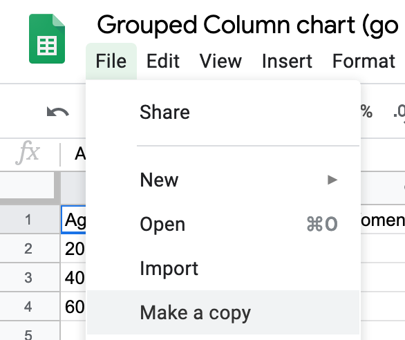
Figure 6.14: Make your own copy of the Google Sheet template.
- To remove the current chart from your copy of the spreadsheet, float your cursor to the top-right corner of the chart to make the three-dot kebab menu appear, and select Delete, as shown in Figure 6.15.
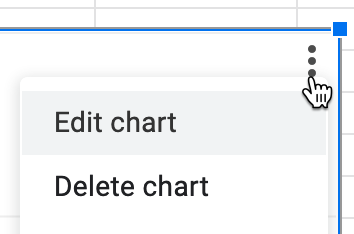
Figure 6.15: Float cursor in top-right corner of the chart to make the three-dot kebab menu appear, and select Delete.
Format your data to make each column a data series (such as male and female), as shown in Figure 6.12, which means it will display as a separate color in the chart. Feel free to add more than two columns.
Use your cursor to select only the data you wish to chart, then go to the Insert menu and select Chart, as shown in Figure 6.16.
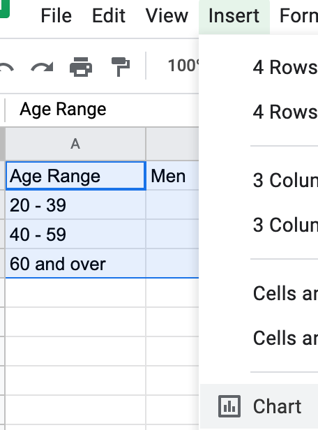
Figure 6.16: Select your data and Insert the Chart.
- In the Chart Editor, change the default selection to Column chart, with Stacking none, to display Grouped Columns, as shown in Figure 6.17. Or select Horizontal bar chart if you have longer labels.
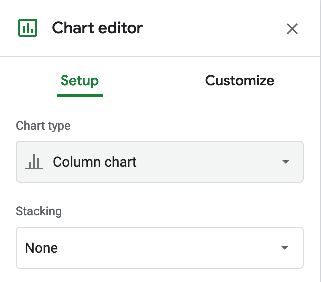
Figure 6.17: Change the default to Column chart, with Stacking none.
- To customize title, labels, and more, in the Chart Editor select Customize, as shown in Figure 6.18. Also, you can select the chart and axis titles to edit them.
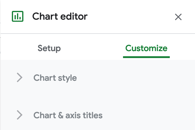
Figure 6.18: Select Customize to edit title, labels, and more.
- To make your data public, go to the upper-right corner of your sheet to click the Share button, and in the next screen, click the words “Change to anyone with the link,” as shown in Figure 6.19. This means your sheet is no longer Restricted to only you, but can be viewed by anyone with the link. See additional options.
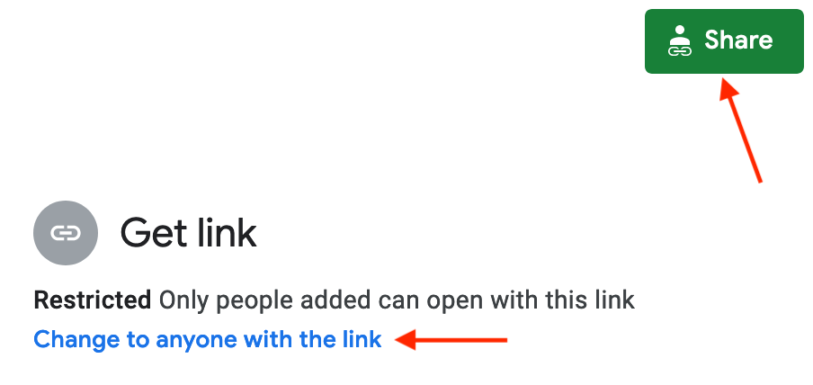
Figure 6.19: Click the Share button and then click Change to anyone with the link to make your data public.
- To embed an interactive version of your chart in another web page, click the kebab menu in the upper-right corner of your chart, and select Publish Chart, as shown in Figure 6.20. In the next screen, select Embed and press the Publish button. See Chapter 9: Embed on the Web to learn what to do with the iframe code.
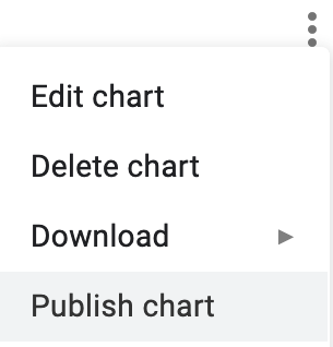
Figure 6.20: Select Publish Chart to embed an interactive chart on another web page.
Unfortunately Google Sheets functionality is very limited when it comes to displaying error bars or uncertainty. You can only assign either constant numbers or percent values as error bar values to an individual series, not to specific data points. If you wish to display error bars in Google Sheets, in Chart editor, select Customize tab, scroll down to Series, and select a series from the dropdown menu. Check Error bars, and customize its value as either percent or a constant value, as shown in Figure 6.21. This setting will be applied to all data points in that series.
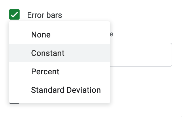
Figure 6.21: Google Sheets has limited settings to create error bars.
Finally, remember that providing your data source adds credibility to your work. You can briefly describe the source in a chart subtitle in Google Sheets. But there is no easy way to insert a clickable link in your chart, so you would need to add more details or links in the separate web page that contains your embedded interactive chart.
Split Bar and Column Charts
A split column (or bar) chart is best to compare categories in separate clusters. For example, imagine you wish to emphasize calorie counts for selected foods offered at two different restaurants, Starbucks and McDonalds. Format the restaurant data in vertical columns in your Google Sheet, as shown in Figure 6.22. Since food items are unique to each restaurant, only enter calorie data in the appropriate column, and leave other cells blank. Now you can easily create a split bar (or column) chart that displays the restaurant data in different clusters, as shown in Figure 6.23. Unlike the grouped column chart previously shown in Figure 6.13, here the bars are separated from each other, because we do not wish to draw comparisons between food items that are unique to each restaurant. Also, our chart displays horizontal bars (not columns) because our some data labels are long.
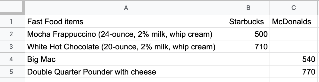
Figure 6.22: To create a split bar (or column) chart, format each data series vertically, and leave cells blank where appropriate.
Figure 6.23: Split bar chart: Explore the full-screen interactive version. Data from Starbucks and McDonalds.
Create your own version using our Split Bar Chart in Google Sheets template with Starbucks and McDonalds data. Organize each data series vertically so that it becomes its own color in the chart. Leave cells blank when no direct comparisons are appropriate. The remainder of the steps are similar to the grouped column chart tutorial above.
Stacked Bar and Column Charts
Stacked column (or bar) charts are best to compare subcategories, or parts of a whole. For example, if you wish to compare the percentage of overweight residents across nations, format each weight-level data series in vertical columns in your Google Sheet, as shown in Figure 6.24. Now you can easily create a stacked column (or bar) chart that displays comparisons of weight-level subcategories across nations, as shown in Figure 6.25. Often it’s better to use a stacked chart instead of multiple pie charts, because people can see differences more precisely in rectangular stacks than in circular pie slices.
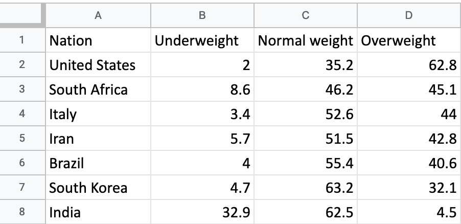
Figure 6.24: To create a stacked column (or bar) chart, format each data series vertically in Google Sheets.
Figure 6.25: Stacked column chart: Explore the interactive version. Data from WHO and CDC.
Create your own version using our Stacked Column Chart in Google Sheets template with international weight-level data. Organize each data series vertically so that it becomes its own color in the chart. In the Chart Editor window, choose Chart Type > Stacked column chart (or choose Stacked bar chart if you have long data labels). The rest of the steps are similar to the ones above.
To change the color of a data series (for example, to show Overweight category in red), click the kebab menu in the top-right corner of the chart, then go to Edit Chart > Customize > Series. Then choose the appropriate series from the dropdown menu, and set its color in the dropdown menu, as shown in Figure 6.26.
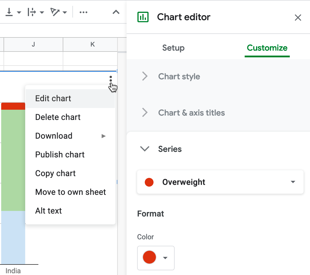
Figure 6.26: To edit a column color, select Edit Chart - Customize - Series.