#StandWithUkraine - Stop the Russian invasion
Join us and donate. Since 2022 we have contributed over $5,000 in book royalties to Save Life in Ukraine & Ukraine Humanitarian Appeal & The HALO Trust, and we will continue to give!
Beware of Biased Comparisons
Everyone knows not to cherry-pick your data, which means to select only the evidence that supports a pre-determined conclusion, while ignoring the remainder. When we make a commitment to tell true and meaningful data stories, we agree to keep an open mind, examine all of the relevant evidence, and weigh the merits of competing interpretations. If you agree to these principles, then also watch out for biased data comparisons, especially sampling biases, which refers to data collection procedures that may appear legitimate on the surface, but actually include partially-hidden factors that skew the results. While we may believe we’re operating with open minds, we might overlook methods that effectively cherry-pick our evidence without our knowledge.
First, look out for selection bias, which means that the sample chosen for your study differs systematically from the larger population. “What you see depends on where you look,” cautions professors Carl Bergstrom and Jevin West, authors of a book with an unforgettable title, Calling Bullshit.28 If you randomly measured the height of people who happened to be leaving the gym after basketball practice, your artificially taller results would be due to selection bias, as shown in Figure 5.2.
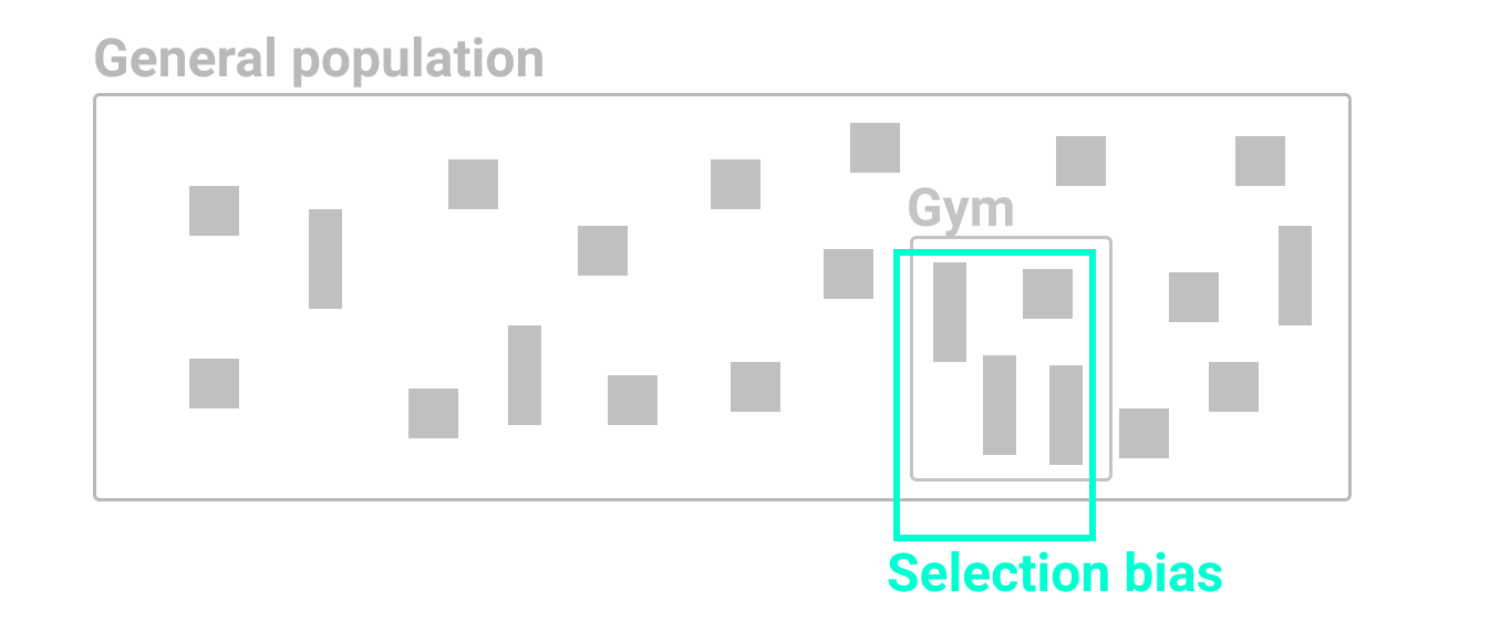
Figure 5.2: If you randomly measured the height of people who happened to be leaving the gym after basketball practice, your artificially taller results would be due to selection bias.
Second, beware of non-response bias. If you send a survey to a broad population, but not everyone responds, you need to be aware that those who chose to participate may possess certain qualities that make them less representative of the whole population. For example, US Census researchers discovered that the non-response rate for lower-income people was significantly higher than usual for the 2020 Current Population Survey supplement, which they determined by comparing individual survey results to prior years. Since richer people were more likely to respond, this artificially raised the reported median income level, which researchers needed to correct.29 See also the US Census Bureau Hard to Count 2020 map that visualizes self-response rates by states, counties, and tracts. If you conduct a survey that does not correct for non-response bias, you may have biased results.
Third, watch out for self-selection bias, which often arises when attempting to evaluate the effectiveness of a particular program or treatment where people applied or volunteered to participate, as shown in Figure 5.3. If your job is to judge whether a weight-loss program actually works, this requires a deep understanding of how data samples were chosen, because self-selection bias can secretly shape the composition of both groups and result in a meaningless comparison. For example, you would be mistaken to compare the progress of non-participants (group A) versus participants who signed up for this program (group B), because those two groups were not randomly chosen. Participants differ because they took the initiative to join a weight-loss program, and most likely have higher motivation to improve their diet and exercise more often than non-participants. It’s surprising how often we fool ourselves and forget to consider how voluntary participation skews program effectiveness, whether the subject is weight-loss clinics, social services, or school choice programs.30
How can we reduce self-selection bias in program evaluation data? As you learned in Chapter 3, it’s important to question your data by looking below the surface level to fully comprehend how terms have been defined, and how data was collected and recorded. By contrast, a well-designed program evaluation will reduce self-selection bias by randomly dividing all volunteer participants (group B) into two sub-groups: half will be assigned to participate in one weight-loss program (group C) and the other half will be assigned to a different weight-loss program (group D), as shown in Figure 5.3. Since sub-groups C and D were selected by chance from the same larger group of volunteers, we can be more confident when comparing their progress because there is no reason to suspect any difference in motivation or other hard-to-see factors. Of course, there are many more research design details that are beyond the scope of this book, such as ensuring that sample sizes are sufficiently large, and comparing participants before, during, and after the weight-loss activity, and so forth. But the logic of avoiding selection bias is simple: randomly divide people who apply or volunteer to participate into sub-groups, to better compare program effectiveness among people with similar motivations and other hard-to-see characteristics.
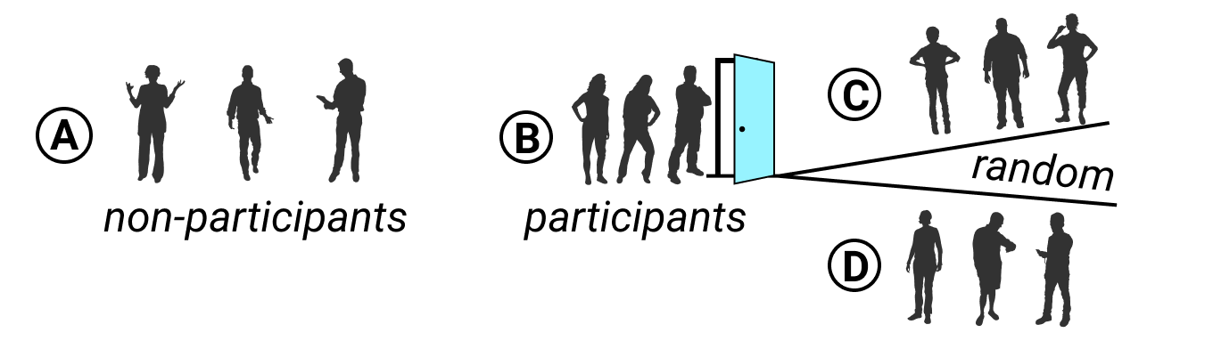
Figure 5.3: To evaluate program effectiveness, do not compare program non-participants (A) versus those who apply or volunteer to participate (B). Instead, randomly split all participants into two sub-groups (C and D). Credits: Silhouettes from Wee People font.
Bias warnings appear in several chapters of this book, because we continually need to be aware of different types that negatively influence our work at various stages of the data visualization process. Later in Chapter 14 you’ll learn how to recognize and reduce other types of biases when working with data, such as cognitive biases, algorithmic biases, intergroup biases, and mapping biases.
Summary
Although we do not claim to teach you statistical data analysis in this book, in this chapter we discussed several common-sense strategies to make meaningful comparisons while analyzing your data. You learned how to use words more precisely for comparing data, why and how to normalize data, and advice on watching out for biased comparisons. In prior chapters you built up your skills on refining your data story, working with spreadsheets, finding and questioning data, and cleaning up messy data. Now you can combine all of this knowledge and begin to create interactive charts and maps in the next few chapters.
Carl T. Bergstrom and Jevin D. West, Calling Bullshit: The Art of Skepticism in a Data-Driven World (Random House, 2020), https://www.google.com/books/edition/Calling_Bullshit/Plu9DwAAQBAJ, pp. 79, 104-133↩︎
Jonathan Rothbaum and Adam Bee, “Coronavirus Infects Surveys, Too: Nonresponse Bias During the Pandemic in the CPS ASEC” (US Census Bureau, Setember 15, 2020), https://www.census.gov/library/working-papers/2020/demo/SEHSD-WP2020-10.html.↩︎
On self-selection bias in school choice programs, researchers point out how traditional “hard data” on student demographics may not reveal subtle differences in parental attitudes and motivation between participants and non-participants. Kahlenberg and Potter write: “Imagine, for example, two low-income African American students attend an open house with their mothers for a charter school that has a strong ‘no excuses’ program, including large amounts of homework and classes on Saturday. After hearing the description, neither student wishes to take on the extra work involved; one mother says fine and leaves, while the other tells her child, you are going to take on this challenge, and I will support you. There is a difference between these two families that will not show up on race or income data but could nevertheless prove important.” Richard D. Kahlenberg and Halley Potter, A Smarter Charter: Finding What Works for Charter Schools and Public Education (Teachers College Press, 2014), https://books.google.com/books?isbn=0807755796, p. 54.↩︎