#StandWithUkraine - Stop the Russian invasion
Join us and donate. Since 2022 we have contributed over $5,000 in book royalties to Save Life in Ukraine & Ukraine Humanitarian Appeal & The HALO Trust, and we will continue to give!
Design Choropleth Colors & Intervals
This section takes a deeper dive into map design principles for choropleth maps. Your choices about how to represent data with colors dramatically shapes their appearance, so it’s very important to learn key concepts to ensure that your maps tell true and meaningful stories. Good choropleth maps make true and insightful geographic patterns clearly visible to readers, whether they are printed in black-and-white on paper or displayed in color on a computer screen. Furthermore, the best choropleth maps are designed to be interpreted correctly by people with colorblindness. For an excellent overview of visualization colors in general, see Lisa Charlotte Rost’s “Your Friendly Guide to Colors in Data Visualization” and “How to Pick More Beautiful Colors for Your Data Visualizations,” both on the Datawrapper blog.35
The best way to illustrate how color choices affect choropleth map design is with a wonderful online design assistant called ColorBrewer, created by Cynthia Brewer and Mark Harrower.36 Unlike other tools in this book, you do not upload data directly into ColorBrewer to generate your visualization. Instead, you select the type of data you wish to display in your choropleth map, and ColorBrewer will assist you by recommending color palettes that work best with your data story. Then you can export those color codes into your preferred choropleth mapping tool, as shown in the Datawrapper and Tableau Public tutorials below. See the ColorBrewer interface in Figure 7.5.
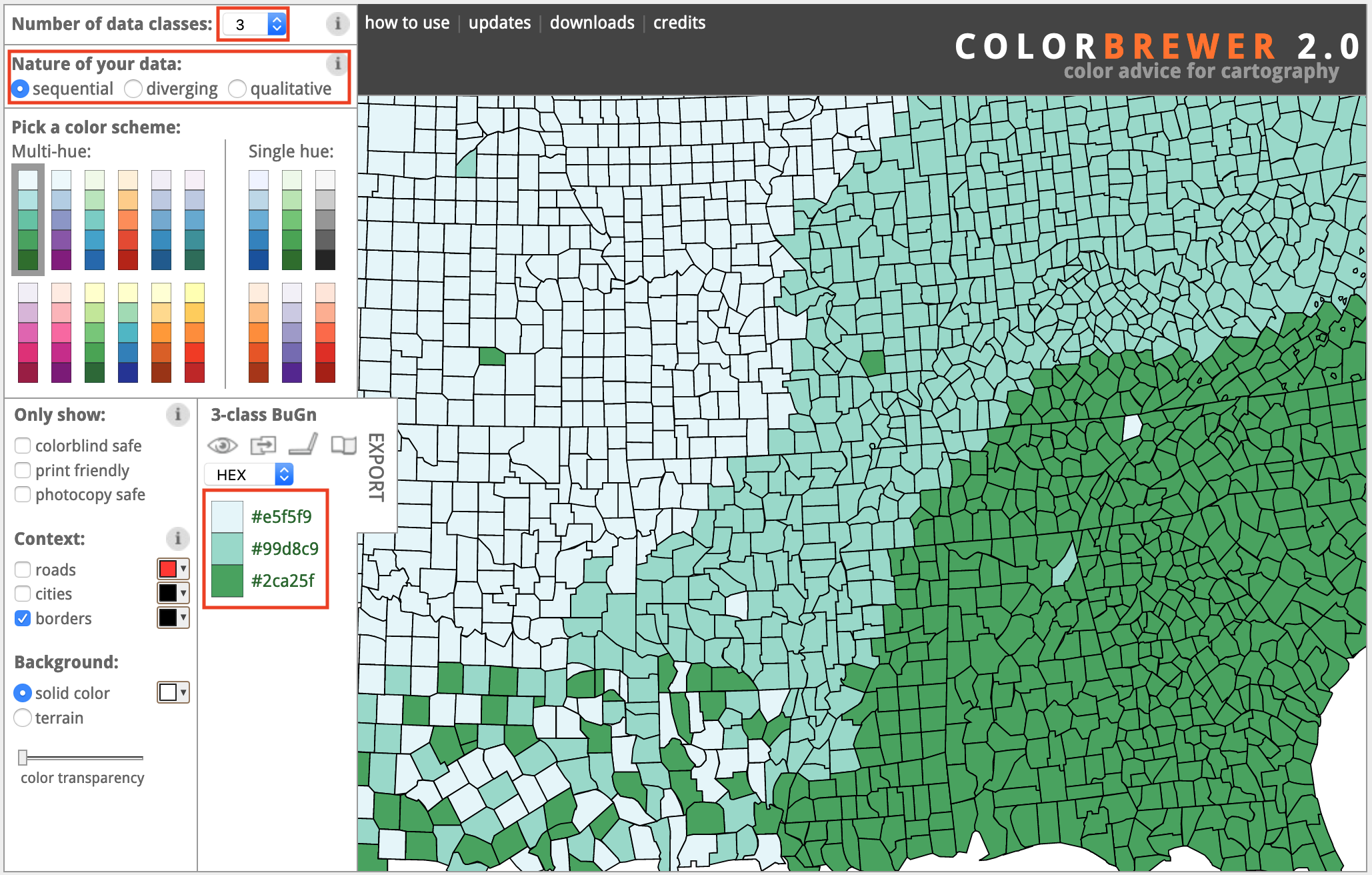
Figure 7.5: The ColorBrewer design assistant interface: data classes, type of color scheme, and recommended color codes.
In this section, we’ll focus on two important decisions that ColorBrewer can assist you with when designing choropleth maps: choosing the type of color palette (sequential, divergent, or qualitative) and the intervals to group together similar-colored data points.
When you open ColorBrewer, the top row asks you to select the number of data classes (also known as intervals or steps) in the color range of your choropleth map. ColorBrewer can recommend distinct colors for up to twelve data classes, depending on the type of scheme you select. But for now, use the default setting of 3, and we’ll return to this topic later when we discuss intervals in more detail further below.
Choose Choropleth Palettes to Match Your Data
One of the most important decisions you’ll make when designing a choropleth map is to select the type of palette. You’re not simply choosing a color, but the arrangement of colors to help readers correctly interpret your information. The rule is straightforward: choose an appropriate color palette that matches your data format, and the story you wish to tell.
ColorBrewer groups palettes into three types—sequential, diverging, and qualitative—as shown in Figure 7.6.
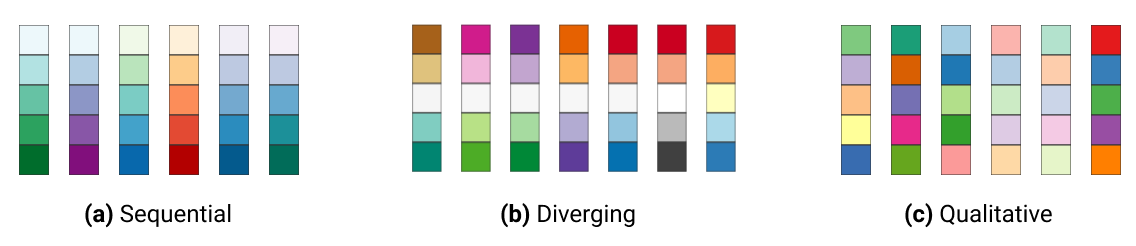
Figure 7.6: Sequential, diverging, and qualitative color palettes from ColorBrewer.
Sequential palettes work best to show low-to-high numeric values. Examples include anything that can be placed in sequence on a scale, such as median income, amount of rainfall, or percent of the population who voted in the prior election. Sequential palettes can be single-hue (such as different shades of blue) or multi-hue (such as yellow-orange-red). Darker colors usually represent higher values, but not always.
Diverging palettes work best to show numeric values above and below a standard level (such as zero, the average, or the median). They typically have two distinct hues to represent positive and negative directions, with darker colors at the extremes, and a neutral color in the middle. Examples include income above or below the median level, rainfall above or below seasonal average, or percentage of voters above or below the norm.
Qualitative palettes work best to show categorical data, rather than numeric scales. They typically feature unique colors that stand apart from one another to emphasize differences. Examples include different types of land use (residential, commercial, open space, water) or categories such as a stoplight-colored warning system (green, yellow, and red).
To illustrate the difference between sequential and diverging numeric values, compare the two maps that display the same data on income per capita in the contiguous US states in 2018 in Figure 7.7. The sequential color palette shows five shades of blue to represent the low-to-high range of income levels, and it works best for a data story that emphasizes the highest income levels, shown by the darker blue colors along the Northeastern coast from Maryland to Massachusetts. By contrast, the diverging color palette shows dark orange for below-average states, dark purple for above-average states, and a neutral color in the middle, and it works best for a data story that emphasizes an economic division between lower-income Southern states versus higher-income East Coast and West Coast states.
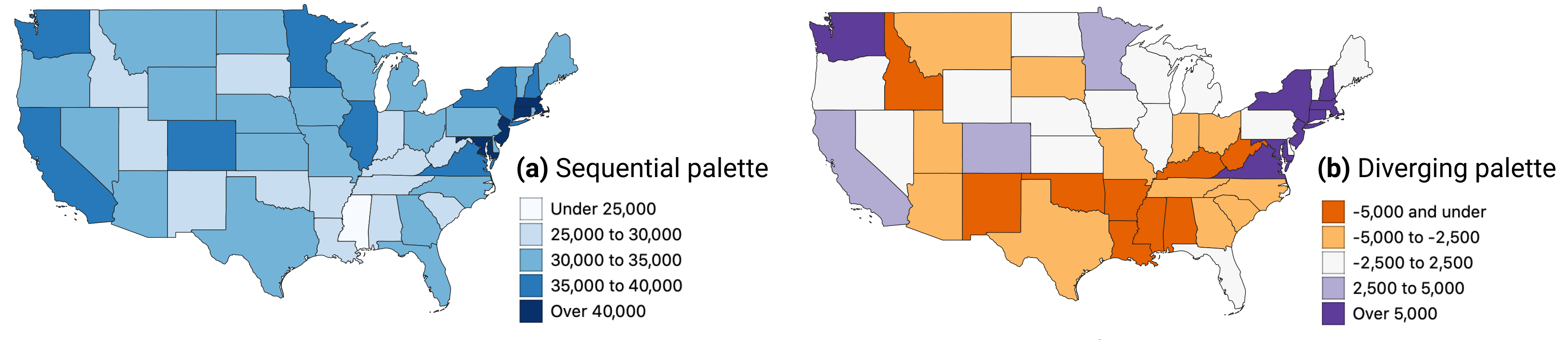
Figure 7.7: Sequential versus diverging color palettes to illustrate per capita income in US dollars in the contiguous states, from American Community Survey, 2018.
After you select data classes and a color palette, ColorBrewer displays alphanumeric codes that web browsers translate into colors. You can select hexadecimal codes (#ffffff is white), RGB codes (255,255,255 is white), or CMYK codes (0,0,0,0 is white), and export them in different formats, as shown in Figure 7.8, if your preferred map tool allows you to import color palettes.
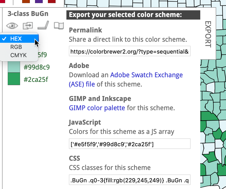
Figure 7.8: Click open the Export tab to display your color palette codes in various formats.
Choose Color Intervals to Group Choropleth Map Data
Another important design choice is color intervals, which determine how you group and display data on your choropleth map. This powerful set of decisions will dramatically shape how your map appears in readers’ eyes, and the message conveyed by your data story. You will need to consider several options in this multi-step decision-making process, and although there are few uniform design rules, we will offer guidance and recommendations. Since options for selecting intervals vary across different mapping tools, we will explain broad concepts in this section, with occasional screenshots from Datawrapper and Tableau Public, but will save the details for those specific tutorials later in the chapter.
Some mapping tools allow you to choose between two different types of color intervals to show movement up or down a data scale, as shown in Figure 7.9. Steps are clearly-marked color dividers, like a staircase, while continuous is a gradual change in color, like a ramp. Both go upward, but take you there in different ways.
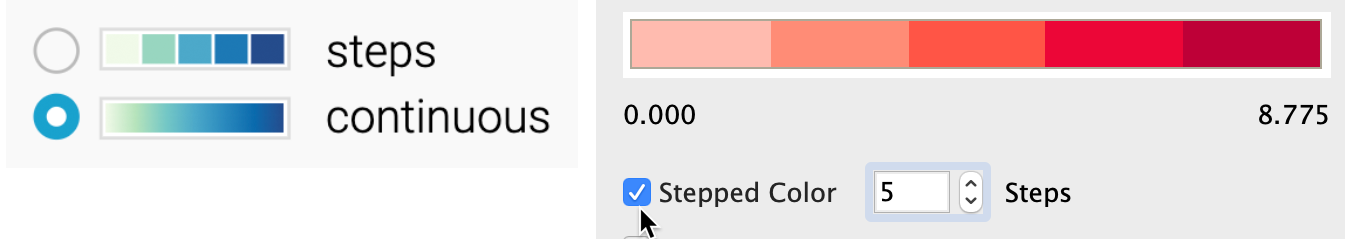
Figure 7.9: Steps versus continuous color intervals in Datawrapper (left) and Tableau Public (right).
If both options exist, which type of color interval is best: steps or continuous? There is no uniform map design rule about this, but consider these factors. On one hand, steps work best for data stories that show areas below or above a specific line or threshold, such as zones that will flood if the sea level rises by one meter. Also, since human eyes are not always good at distinguishing between hues, steps can help readers to quickly match colors from your map legend to your data. On the other hand, continuous works best for data stories that draw attention to subtle differences between neighboring areas, such as the wide range of values on an income scale. Read this Datawrapper Academy article on what to consider when creating choropleth maps. Overall, we advise you to make design choices that are both honest and insightful: tell the truth about the data and also draw attention to what matters in your data story.
If you choose steps, how many dividers should you use to slice up your data? Once again, there is no uniform rule, but reflect on these options and outcomes. Fewer steps creates a coarse map that highlights broad differences, while more steps creates a granular map that emphasizes geographic diversity between areas. However, simply adding more steps does not necessarily make a better map, because differences between steps become less visible to the human eye. Since the ColorBrewer design assistant was created specifically for steps (and does not show continuous options), we recommend experimenting by raising or lowering the Number of data classes (also known as steps) to visualize the appearance of different design choices, as shown in Figure 7.10. Make decisions with the best interests of your readers in mind, to represent your data in honest and insightful ways.
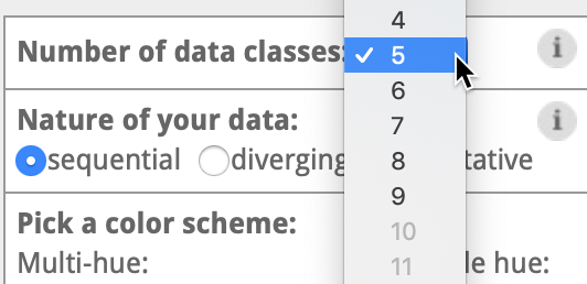
Figure 7.10: If you choose steps, experiment with ColorBrewer data classes and color palettes.
Some choropleth mapping tools also allow you to choose how to interpolate your data, meaning the method for grouping numbers to represent similar colors on your map. For example, Datawrapper displays two different sets of drop-down menus for interpolation options, depending on whether you chose steps or continuous, as shown in Figure 7.11.
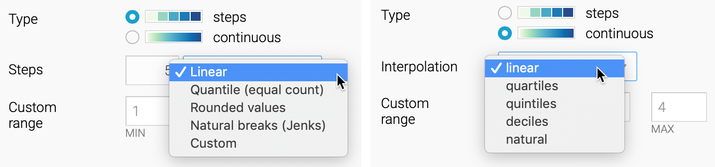
Figure 7.11: Interpolation options for steps (left) and continuous (right) in Datawrapper.
Before choosing how to interpolate, create a histogram chart in Google Sheets described in chapter 6 to gain a deeper understanding of how your data is distributed. Is your histogram evenly distributed with a symmetrical shape around the mean? Or is it skewed to one side, with one tail of outliers that is longer than the other? Compare the simplified histograms in Figure 7.12, which may influence your decision about how to interpolate, as described below.
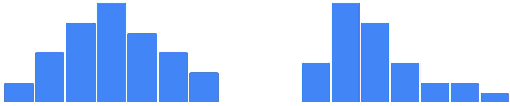
Figure 7.12: Histogram of evenly-distributed data (on right) versus skewed data with a longer tail to one side (on left).
In this introductory book, we can simplify the most common interpolation options in three basic categories:
Linear places your data values in a straight line, from lowest to highest. This method works best when the data are evenly distributed, or if you wish to draw attention to the low and high extremes in your data, since they will stand out in light and dark colors.
Quantiles divide your data values into groups of an equal number. More specifically, quartiles, quintiles, and deciles divide the values into four, five, or ten groups of equal quantity. This method works best when the data are skewed to one side, because the regrouping allows you to draw attention to diversity inside the data, rather than the extremes. Rounded values are similar to quantiles, but the decimals are replaced with rounded numbers that look nicer to readers’ eyes.
Natural breaks (Jenks) offers a compromise between linear and quantile methods. It groups data values that are close together, but maximizes differences with other groups. This method may work best with skewed data where you wish to draw attention to both internal diversity and extremes.
Which interpolation method is best? There are no uniform design rules, except that we advise against using Custom settings to manually place color intervals wherever you wish, since they are more likely to create misleading maps, as you’ll learn in Chapter 14: Detect Lies and Reduce Bias. Our best advice is to experiment with different interpolation methods, especially when working with skewed data, to better understand how these options shape the appearance of your choropleth maps and the data stories you tell with them.
Overall, Datawrapper Academy recommends that you make color intervals choices to help readers “see all the differences in the data” by fully utilizing all of the colors in your range, as shown in Figure 7.13. In other words, if your map displays only the lightest and darkest colors, you’re not sufficiently using the middle portion of your color range to highlight geographic patterns and diversity within your data. To do this, you’ll need to explore beyond the default map settings and test which options do the best job of telling an honest and insightful data story.
Tip: For a deeper dive into this topic, read Lisa Charlotte Muth, “How to choose an interpolation for your color scale,” in Datawrapper Blog, 2022.
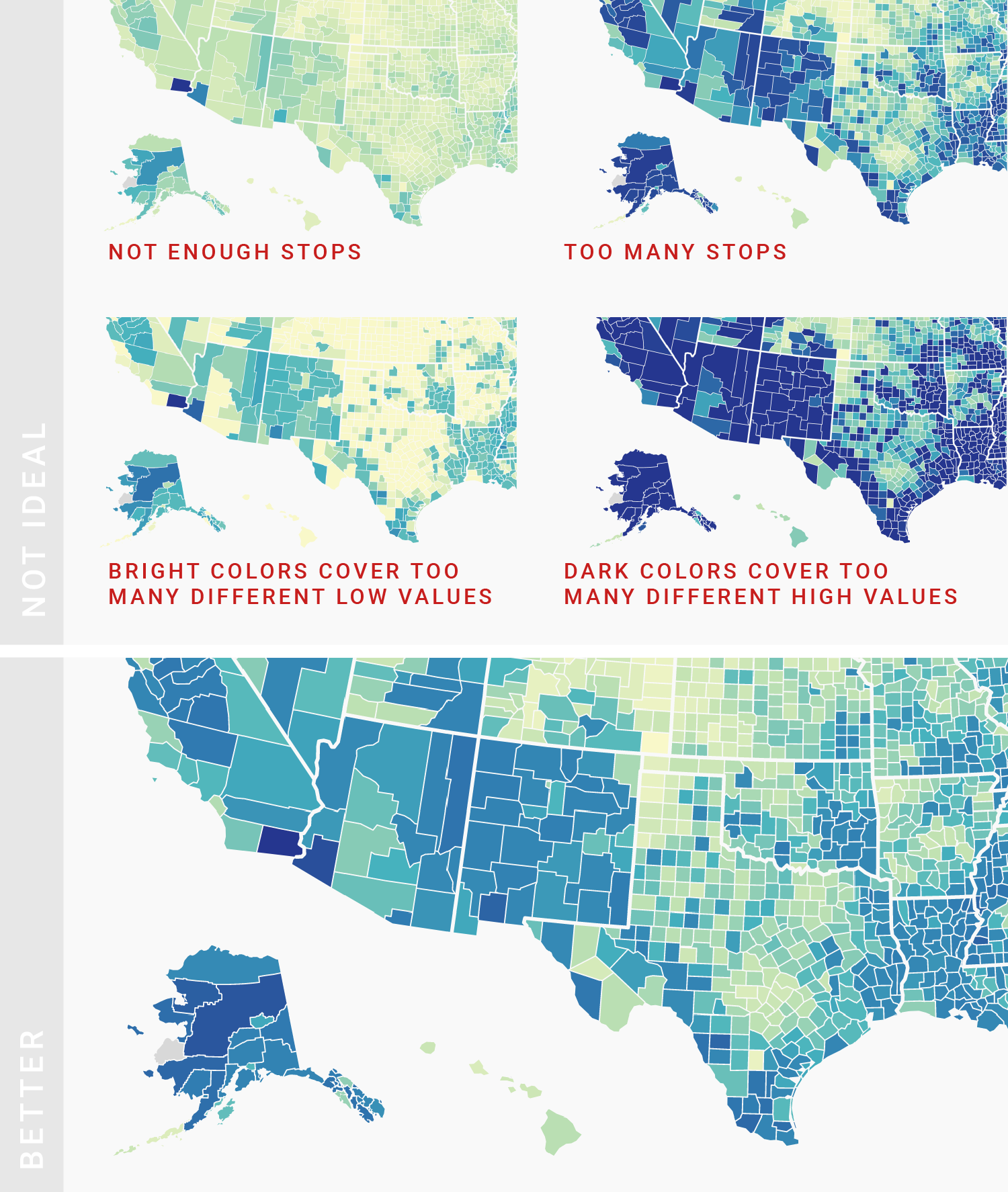
Figure 7.13: Use the full color range to show all of the differences in the data. Image by Datawrapper Academy, reprinted with permission.
Designing true and meaningful choropleth maps is challenging work. You will improve your skills the same way we did, by reading widely, looking at different maps, and testing various ways to visualize your data. Become more aware of how your decisions about color intervals can dramatically alter how the data appears to readers. Most important, create maps that focus on telling your story and truthfully representing the data.
Rost, “Your Friendly Guide to Colors in Data Visualisation”; Rost, “How to Pick More Beautiful Colors for Your Data Visualizations.”↩︎
See also Cynthia A. Brewer, Designing Better Maps: A Guide for GIS Users (Esri Press, 2016), https://www.google.com/books/edition/Designing_Better_Maps/gFErrgEACAAJ.↩︎