#StandWithUkraine - Stop the Russian invasion
Join us and donate. Since 2022 we have contributed over $5,000 in book royalties to Save Life in Ukraine & Ukraine Humanitarian Appeal & The HALO Trust, and we will continue to give!
Symbol Point Map with Datawrapper
We first introduced you to the free and easy-to-learn Datawrapper tool in Chapter 6: Chart Your Data. It’s also offers powerful features to create different types of maps, with professional-looking design elements. With Datawrapper you can start to work right away in your browser, with no account required unless you wish to save and share your work online.
In this section, you’ll learn how to create a symbol point map. Unlike the basic point map in the Google MyMaps tutorial, a symbol point map shows data for specific locations through shapes of varying size or color. In Figure 7.41, sample symbol map displays population change for 300 major US cities as point locations with two variables: circle size (for 2019 population size) and circle color (for percent change since 2010). Remember that we use point data to create symbol maps, but polygon data to create choropleth maps, which you’ll learn how to create in the following sections. Later we’ll explain how to embed your interactive Datawrapper maps on the web in Chapter 9.
Figure 7.41: Symbol point map of US city population growth with Datawrapper. Explore the interactive version.
Datawrapper splits the process of creating a map into four steps: select map, add data, visualize, then publish and embed. To create your own symbol point map, follow this tutorial.
- Open the US Cities Population Change 2010-2019 data in Google Sheets. Read the notes to understand its origin and some data issues. We downloaded city population data for 2010-2019 from the US Census. But during this time period, some cities were newly incorporated or merged with outlying areas, which skews their population data over time. Note also that we included data for Washington, DC (a major city not located in a US state) and for 5 major cities in Puerto Rico (not a state, but a US territory where residents are US citizens), so we’ll select an appropriate map to include them below.
Good maps often require cleaning up messy data as described in Chapter 4. In our spreadsheet we narrowed the original list down to about 300 cities with more than 100,000 residents in either 2010 or 2019. Also, we created a new column named Percent Change, which we calculated this way: (2019 - 2010) / 2010 * 100.
Tip: To simplify this tutorial, we previously geocoded the Latitude and Longitude of each city. See Chapter 2: Geocode Addresses in Google Sheets. To learn more about the pros and cons of geocoding within Datawrapper, read this Datawrapper Academy article about symbol location accuracy using addresses and place names.
- Open Datawrapper, click on Start Creating, then the New Map button, and select Symbol map as shown in Figure 7.42.
Figure 7.42: Start to create a symbol map in Datawrapper.
In the Select your map screen, search for USA > States and Territories to include Puerto Rico, rather than the USA > States option that appears closer to the top of the list. Proceed to the next screen.
In the Add your data screen, there are several options to upload your data. Since our sample data is in a Google Sheet, scroll down to Connect to a remote data set and select Connect Google Sheet. Copy and paste the link from the Google Sheet in the first step of this tutorial, as shown in Figure 7.43. When the green checkmark appears to confirm your Google Sheet is public and readable, click the blue Connect button, then Proceed to the next step.
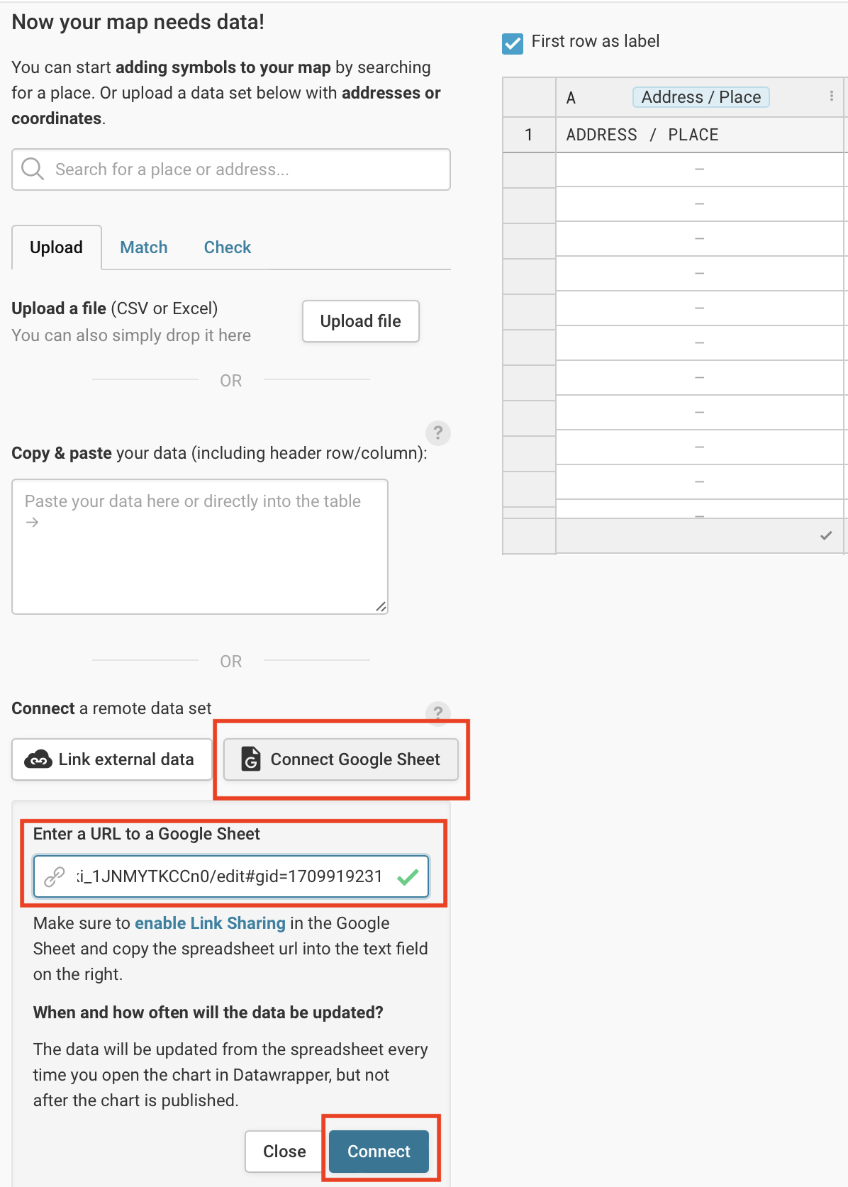
Figure 7.43: In the Connect to a remote data set section, paste the link to the Google Sheet.
- Click the Visualize button to Refine your map. Our goal is to display two variables: 2019 population as the circle size, and percent change as the circle color. Under Symbol shape and size, select the circle symbol, to be sized by Pop Estimate 2019, with a maximum symbol size of 25 pixels. Under Symbol colors, select the Percent Change 2010-2019 column, as shown in Figure 7.44.
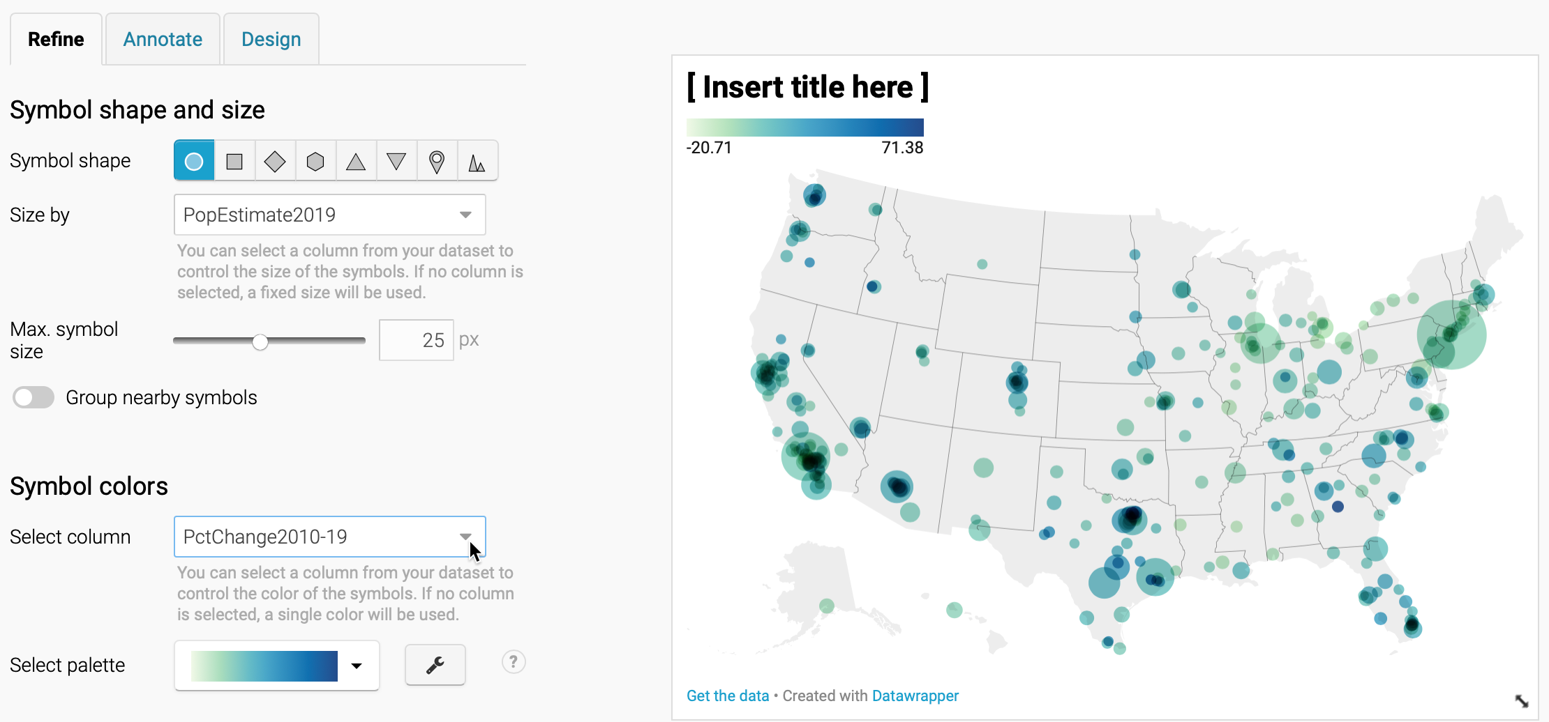
Figure 7.44: Refine your map by selecting data to display symbol shapes, sizes, and colors.
- Optionally, to customize the color palette and intervals to match our example, click the wrench symbol next to the palette. Click the Import colors button and you can paste in the five hexadecimal codes listed below from ColorBrewer, as described in the Choropleth Design section. The first code is dark pink, followed by a 4-class sequential green:
#d01c8b,#bae4b3,#74c476,#31a354,#006d2c. See Figure 7.45.
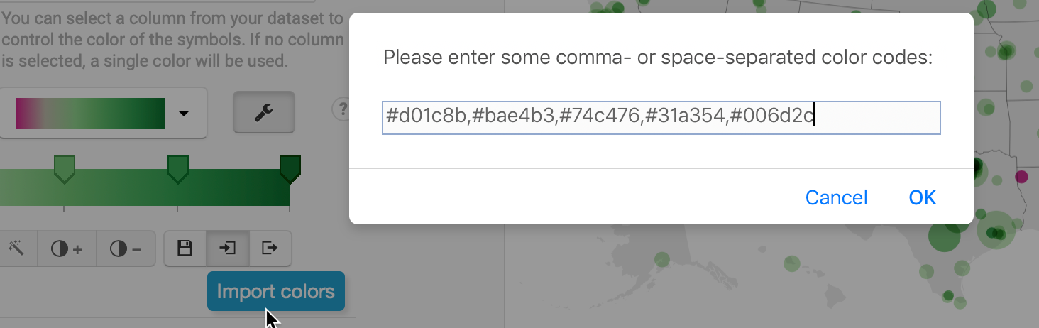
Figure 7.45: Create a new color palette by importing five hexadecimal color codes from ColorBrewer.
- To continue customizing intervals to match our example, set the steps to 5 and Custom. Manually type in custom intervals for below 0% (bright pink), 0 to 5% (light green), and so forth up the scale. Click the More options button, and under Legend, change Labels to custom, and click each label to edit the text that appears on the map menu, as shown in Figure 7.46. Learn more about these options in the Datawrapper Academy post on customizing your symbol map.
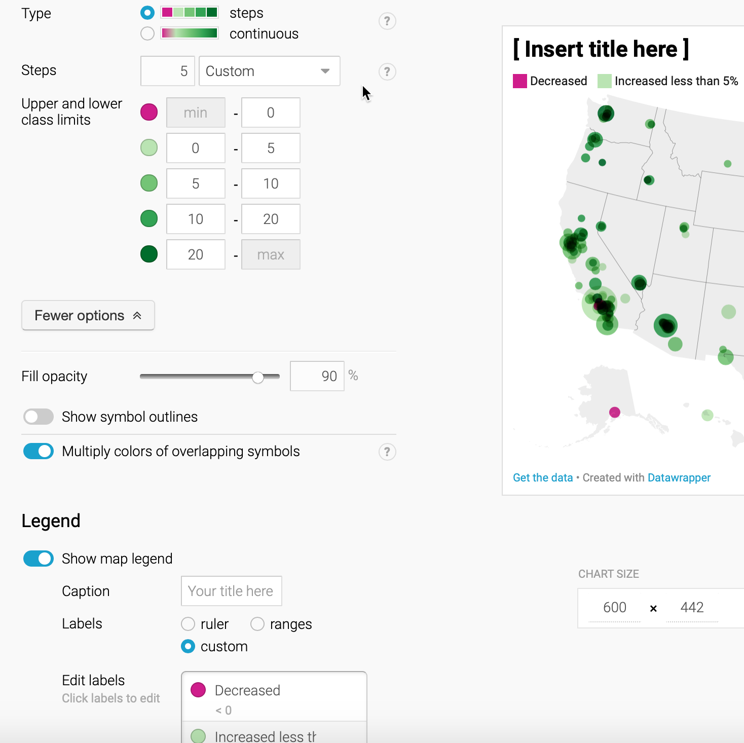
Figure 7.46: Customize the interval ranges and edit the legend.
Under the Visualize screen, click the Annotate tab to insert a title, source notes, credits, and customize the tooltips as described by Datawrapper Academy.
Click Proceed or advance to the Publish & Embed screen to share your work with others. If you logged into your free Datawrapper account, your work is automatically saved online in the My Charts menu in the top-right corner of the screen. Also, you can click the blue Publish button to generate the code to embed your interactive map on your website, as you’ll learn about in Chapter 9: Embed on the Web. In addition, you can add your chart to River if you wish to share your work more widely by allowing other Datawrapper users to adapt and reuse it. Furthermore, scroll all the way down and click the Download PNG button to export a static image of your map. Additional exporting and publishing options require a paid Datawrapper account. Or, if you prefer not to create an account, you can enter your email to receive the embed code.
For assistance and additional options, see the Datawrapper Academy support pages on symbol maps.
Now that you’ve created a symbol point map with Datawrapper, in the next section we’ll build our skills with this tool to create a choropleth map.