#StandWithUkraine - Stop the Russian invasion
Join us and donate. Since 2022 we have contributed over $5,000 in book royalties to Save Life in Ukraine & Ukraine Humanitarian Appeal & The HALO Trust, and we will continue to give!
- Scatter Chart
Scatter charts are best to show the relationship between two datasets, placed on the x- and y-axis, to reveal possible correlations. With Tableau Public, you can create an interactive scatter chart, where you can hover your cursor over points to view more details about the data. Organize your data in three columns, the same way as the Datawrapper scatter chart tutorial: the first column for data labels, the second column for the x-axis, and the third column for the y-axis. Then you can create an interactive scatter chart as shown in Figure 6.54, which illustrates a strong relationship between household income and test scores (above or below the national average for 6th grade math and English) in Connecticut public school districts. To learn more about the data and related visualizations, see Sean Reardon et al. at the Stanford Education Data Archive, Motoko Rich et al. at The New York Times, Andrew Ba Tran at CT Mirror/TrendCT, and this TrendCT GitHub repo.
Figure 6.54: Scatter chart in Tableau Public: Explore the interactive version. Data by CT Mirror/TrendCT and Stanford CEPA.
To create your own scatter chart using this sample data in Tableau Public, follow this tutorial.
Install Tableau Public and Connect Data
Download the CT Districts-Income-Grades sample data in Excel format, or view and download the Google Sheets version. The data file consists of three columns: district, median household income, and test score levels.
Install and start up the free Tableau Public desktop application for Mac or Windows. It may require several minutes to complete this process. Tableau Public’s welcome page includes three sections: Connect, Open, and Discover.
Under Connect, you can choose to upload a Microsoft Excel file, or choose Text file to upload a CSV file, or other options. Or to connect to a server, such as Google Sheets, click More… to connect to your account. After you successfully connect to your data source, you will see it under Connections in the Data Source tab. Under Sheets, you will see two tables, data and notes.
Drag the data sheet into Drag tables here area, as shown in Figure 6.55. You will see the preview of the table under the drag-and-drop area. You have successfully connected one data source to Tableau Public, and you are ready to build your first chart.
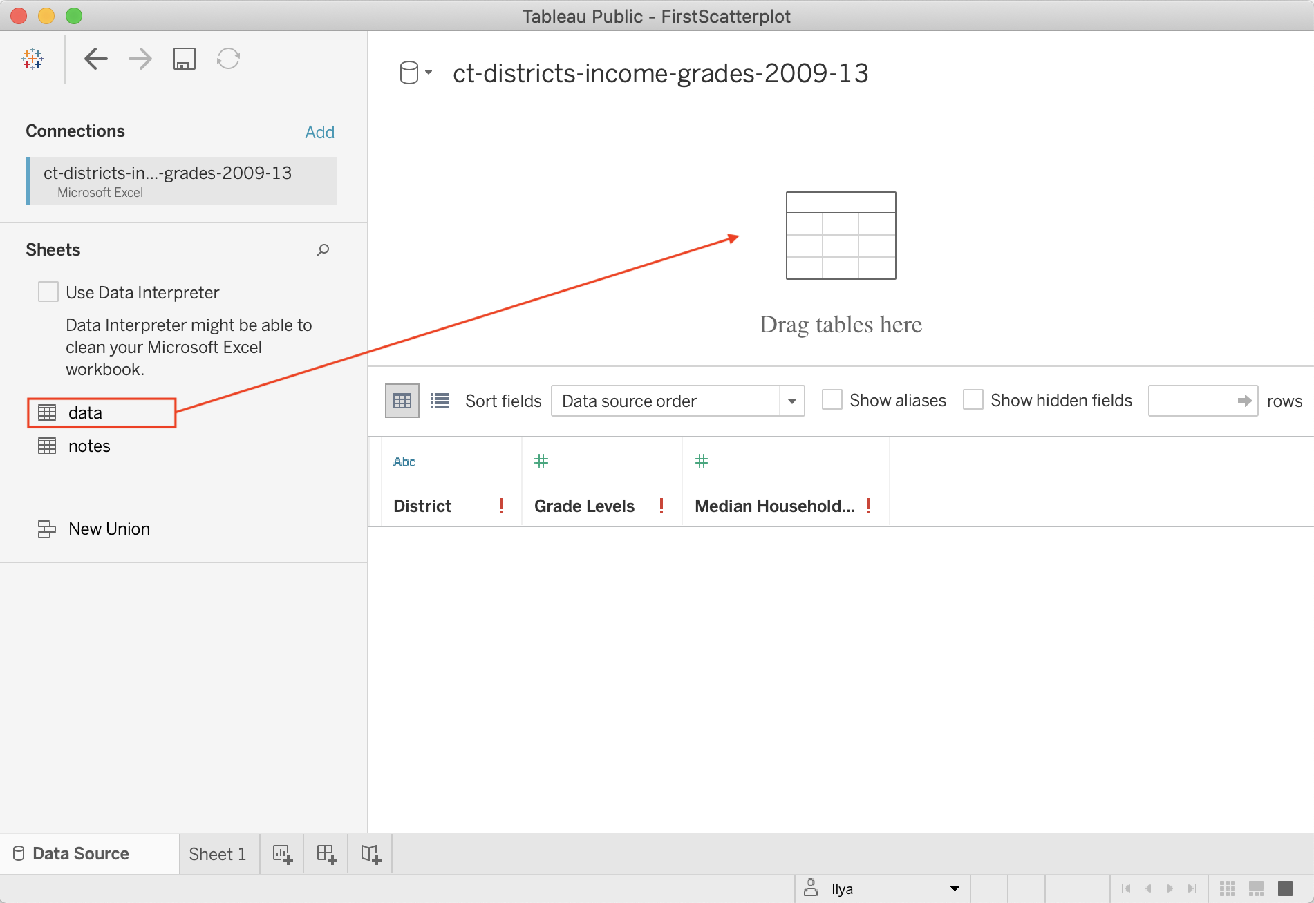
Figure 6.55: Drag data sheet into Drag tables here area.
Create Scatter Chart in the Worksheet
- In the Data source screen, click on the orange Sheet 1 tab (in the lower-left corner) to go to your worksheet, where you will build the chart.
Although it may feel overwhelming at first, the key is learning where to drag items from the Data pane (left) into the main worksheet. Tableau marks all data fields in blue (for discrete values, mostly text fields or numeric labels) or green (for continuous values, mostly numbers).
In your worksheet, drag the Grade Levels field into the Rows field above the charting area, which for now is just empty space. See Figure 6.56 for this dragging step and the following two steps. Tableau will apply a summation function to it, and you will see
SUM(Grade Levels)appear in the Rows row, and a blue bar in the charting area. It makes little sense so far, so let’s plot another data field.Drag Median Household Income to the Columns field, just above the Rows field. In general, choosing between Rows and Columns shelves can be challenging, but it is convenient to think of Columns shelf as representing your x-axis, and Rows as y-axis. Once again, Tableau will apply the summation function, so you will see
SUM(Median Household Income)in the Columns shelf. The bar chart will automatically transform into a scatter chart with just one data point in the upper-right corner, because the data for both is aggregated (remember theSUMfunction).We want to tell Tableau to disaggregate the household and grade levels variables. In other words, we want to introduce an extra level of granularity, or detail to our visualization. To do so, drag the District dimension into the Detail shelf of the Marks card. Now a real scatter chart will appear in the charting area. If you hover over points, you will see all three values associated with these points.
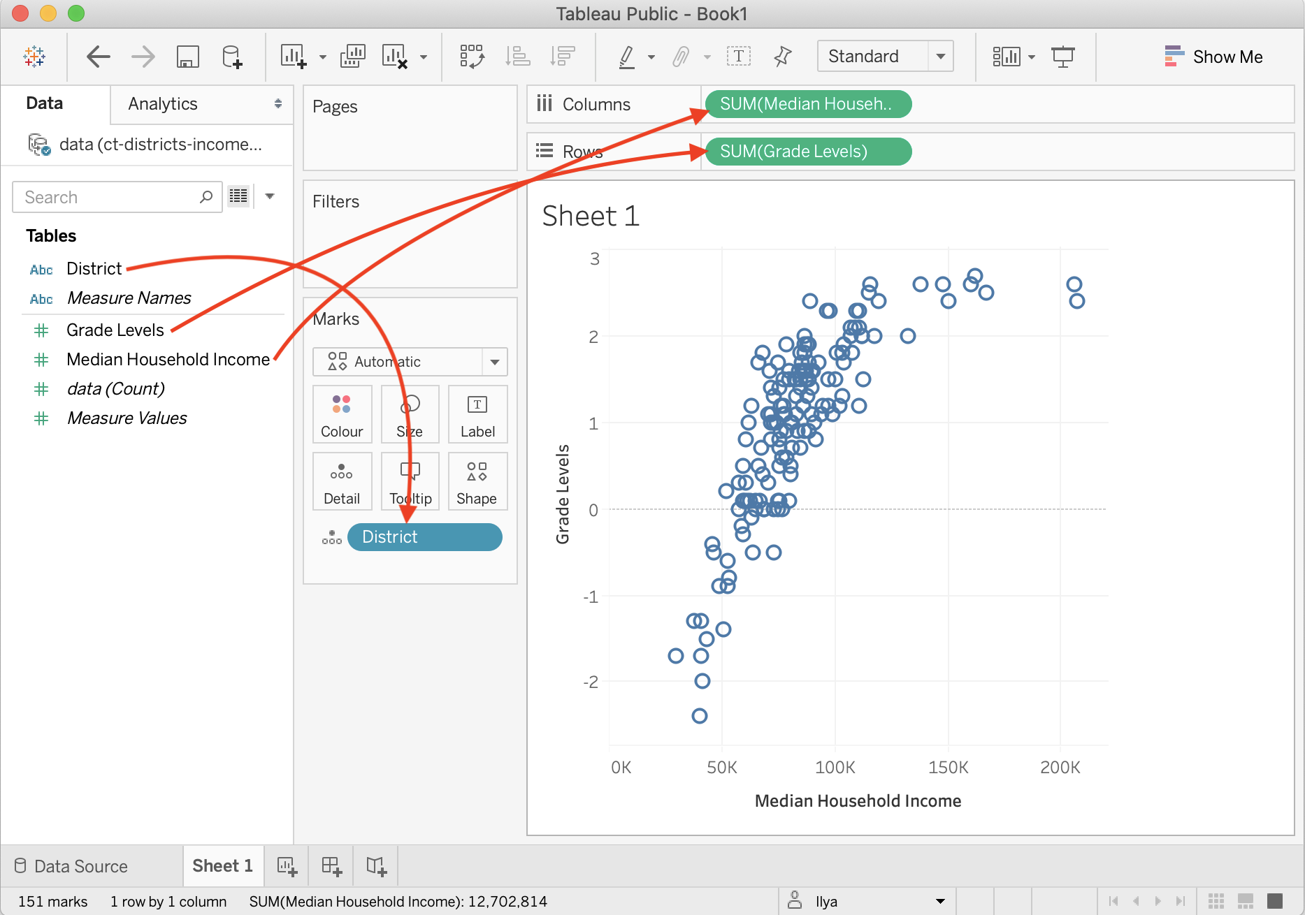
Figure 6.56: Drag data fields to the right locations in Tableau Public.
Add Title and Caption, and Publish
Give your scatter chart a meaningful title by double-clicking on the default Sheet 1 title above the charting area. Add more information about the chart, such as source of the data, who built the visualization and when, and other details to add credibility to your work. You can do so inside a Caption, a text block that accompanies your Tableau chart. In the menu, go to Worksheet > Show Caption. Double-click the Caption block that appears, and edit the text. As a result, your final worksheet will look like shown in Figure 6.57.
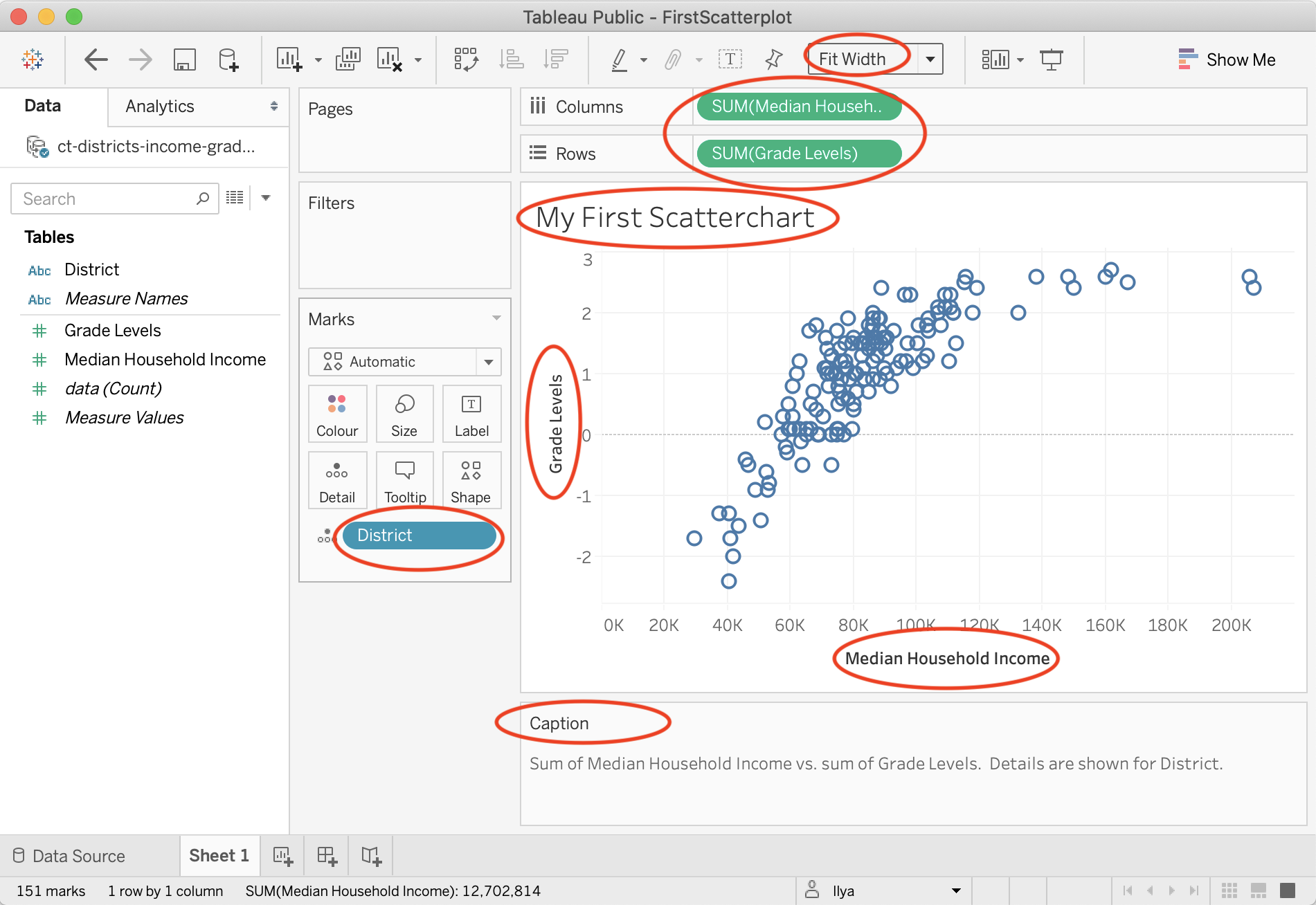
Figure 6.57: This scatter chart is ready to be published.
Tip: In the dropdown above the Columns shelf, change Standard to Fit Width to ensure your chart occupies 100 percent of available horizontal space.
To publish your interactive chart on the public web, go to File > Save to Tableau Public As…. A window to sign in to your account will pop up. If you don’t have an account, click Create one now for free at the bottom, and save the login details in your password manager.
After signing in, a window to set the workbook title will appear. Change the default Book1 title to something meaningful, as this name will appear in the public web address for your published work. Click Save.
After saving your workbook on the public web, Tableau Public will open up a window in your default browser with the visualization. In the green banner above the chart, click Edit Details to edit the title or description. Under Toolbar Settings, see the checkbox to Allow others to download or explore and copy this workbook and its data, and select the setting you wish, as shown in Figure 6.58. If you are publishing your visualization on the web, we also recommend that you keep this box checked so that others can download your data and see how you constructed it, to improve data accessibility for all.
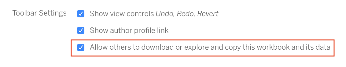
Figure 6.58: This scatter chart is ready to be published.
Tip: Your entire portfolio of Tableau Public visualizations is online at https://public.tableau.com/profile/USERNAME,
where USERNAME is your unique username.
See the Get the Embed Code section in Chapter 9 to insert the interactive version of your chart on a web page that you control.