#StandWithUkraine - Stop the Russian invasion
Join us and donate. Since 2022 we have contributed over $5,000 in book royalties to Save Life in Ukraine & Ukraine Humanitarian Appeal & The HALO Trust, and we will continue to give!
Chapter 11 Chart.js and Highcharts Templates
In Chapter 6: Chart Your Data, we looked at powerful drag-and-drop tools, such as Google Sheets, Datawrapper and Tableau Public to build interactive charts.
In this chapter, we will look into creating interactive charts using two popular JavaScript libraries, Chart.js and Highcharts. Since we don’t expect our readers to be proficient in JavaScript or any other programming language, we designed templates that you can copy to your own GitHub account, substitute data files, and publish them to the web without writing a single line of code. But for those of you who are code-curious, we will show how the JavaScript code in these templates can be customized.
Now, why would anyone prefer JavaScript to easy-to-use Datawrapper or Tableau, you may wonder? Well, a few reasons. Although JavaScript code may seem overwhelming and intimidating at first, it allows for greater customization in terms of colors, padding, interactivity, and data handling than most third-party tools can offer. In addition, you can never be sure that third-party apps will remain free, or at least have a free tier, forever, whereas open-source tools are here to stay, free of charge, as long as someone maintains the code.
Note: Although both libraries are open-source, Highcharts comes with a stricter license which allows it to be used for free for non-commercial projects only, such as personal, school, or non-profit organization website. Keeping that in mind, we primarily focus on Chart.js, which is distributed under MIT license that lets you use the library for commercial projects as well.
Table 11.1 lists all types of charts that we will look at in this chapter. Both libraries include many more default chart types that you can explore in Chart.js Samples and Highcharts Demos. However, we strongly advise against using some chart types, such as three-dimensional ones, for reasons we discussed in the Chart Design Principles section of Chapter 6.
| Chart | Best use and tutorials in this book |
|---|---|
Bar or Column Chart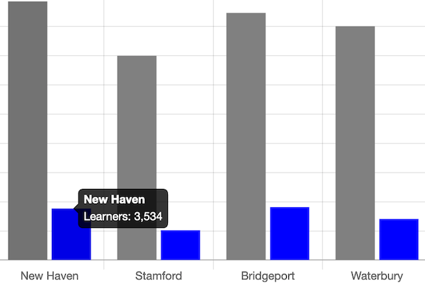 |
Best to compare categories side-by-side. If labels are long, use horizontal bars instead of vertical columns. Power tool: Bar or Column Chart with CSV data in Chart.js code template and tutorial |
Error Bars in a Bar/Column Chart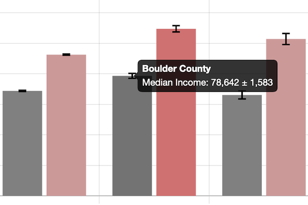 |
Best to show margin of error bars when comparing categories side-by-side. If labels are long, use horizontal bars instead of vertical columns. Power tool: Error Bars in Bar/Column Chart with CSV data in Chart.js code template and tutorial |
Line Chart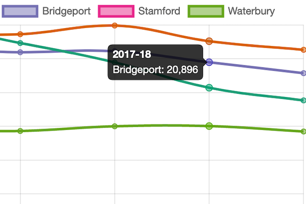 |
Best to show continuous data, such as change over time. Power tool: Line Chart with CSV data in Chart.js code template and tutorial. See tutorial note to modify line chart into stacked area chart. |
Annotated Line Chart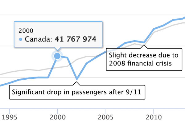 |
Best to add contextual notes inside chart of continuous data, such as change over time. Power tool: Annotated Line Chart with CSV data in Highcharts code template and tutorial |
Scatter Chart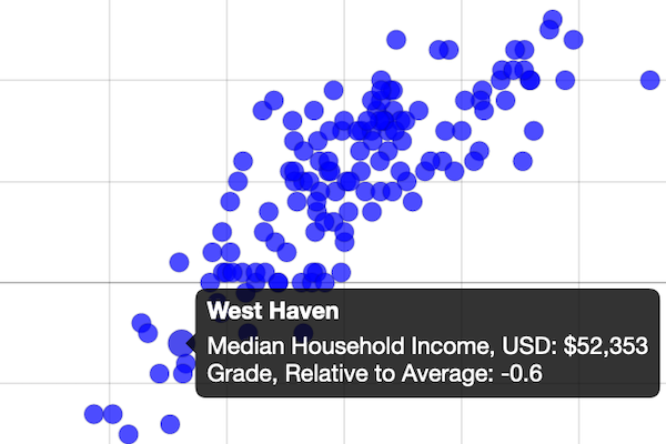 |
Best to show the relationship between two datasets as XY coordinates to reveal possible correlations. Power tool: Scatter Chart with CSV data in Chart.js code template and tutorial |
Bubble Chart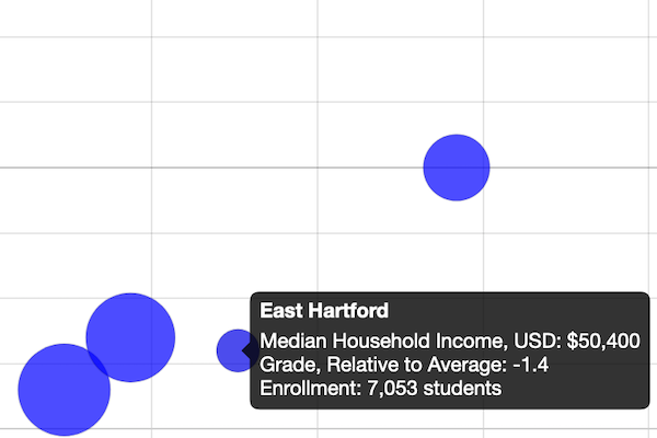 |
Best to show the relationship between three or four sets of data, with XY coordinates, bubble size, and color. Power tool: Bubble Chart with CSV data in Chart.js code template and tutorial |