#StandWithUkraine - Stop the Russian invasion
Join us and donate. Since 2022 we have contributed over $5,000 in book royalties to Save Life in Ukraine & Ukraine Humanitarian Appeal & The HALO Trust, and we will continue to give!
- Filtered Line Chart
Now that you’ve learned how to create a scatter chart in Tableau Public, let’s move on to a new type of chart that highlights the tool’s strengths. Instead of static charts, such as those found in print or PDFs, this book features interactive charts for their ability to display more data. But you can also design interactive charts to show only the amount of data you desire. In other words, your interactive visualization can become a data-exploration tool that allows users to “dig” and find specific data points and patterns, without overwhelming them with too much information at once.
In this tutorial, we will build an interactive filtered line chart with Tableau Public, to visualize how internet access has changed in different nations over time. Organize the data in three columns, as shown in Figure 6.59. The first column, Country Name, are the data labels that become the colored lines. The second column, Year, will appear on the horizontal x-axis. The third column, Percent Internet Users, are numeric values that appear on the vertical y-axis. Now you can create a filtered line chart with checkboxes, to show only selected lines on startup to avoid overwhelming users, while allowing them to toggle on other lines, and hover over each one for more details, as shown in Figure 6.60.
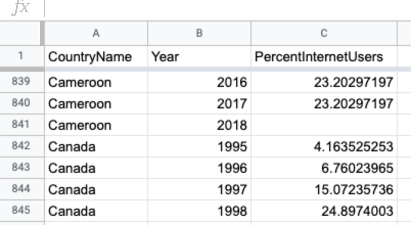
Figure 6.59: In a filtered line chart, organize the data in three columns: data labels, year, and numeric values.
Figure 6.60: Filtered Line chart: Explore the interactive version. Data from World Bank.
To create your own filtered line chart using this sample data in Tableau Public, follow this tutorial. We assume that you have already installed the free Tableau Public desktop application for Mac or Windows, and have already become familiar with the tool by completing the previous Scatter Chart with Tableau Public tutorial, since the steps below are abbreviated.
Connect Data to Tableau Public
Download the World Bank Internet Users 1995-2018 sample data in Excel format, or view and download the Google Sheets version. The file consists of three columns: data labels, year, and numeric values.
Open Tableau Public, and under the Connect menu, you can upload your data as a Microsoft Excel file, or choose Text file to upload a CSV file, or click More… to connect to a server and upload a Google Sheet from your account. After you successfully connect to your data source, you will see it under Connections in the Data Source tab. Under Sheets, you will see two tables,
dataandnotes. Drag thedatasheet into Drag tables here area to preview it.In the Data source screen, click on the orange Sheet 1 tab (in the lower-left corner) to go to your worksheet, where you will build the chart.
In your worksheet, your variables will be listed under Tables in the left-hand side. The original variables are displayed in normal font, the generated variables will be shown in italics (such as Latitude and Longitude, which Tableau guessed from the country names). Now you are ready to begin building your interactive chart.
Build and Publish a Filtered Line Chart
Drag the Year variable to Columns shelf. This will place years along the x-axis.
Drag the Percent Internet Users variable to Rows shelf to place them on the y-axis. The value in the shelf will change to
SUM(Percent Internet Users). You should see a single line chart that sums up percentages for each year. That is completely incorrect, so let’s fix it.In order to “break” aggregation, drag-and-drop Country Name to the Color shelf of the Marks card, as shown in Figure 6.61. Tableau will warn you that the recommended number of colors should not exceed 20. Since we will be adding checkbox filtering, ignore this warning, and go ahead and press the Add all members button.
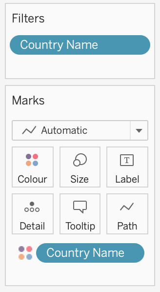
Figure 6.61: Drag Country Name to the Color shelf of the Marks card to break up the aggregated data.
At first, everything will look like a spaghetti plate of lines and colors! To add filtering, drag Country Name to the Filters card. In the Filter window, make sure all countries are checked, and click OK.
In the Filters card, click the dropdown arrow of the Country Name symbol, then scroll down and select Show Filter, as shown in Figure 6.62.
You will see a list of options with all checkboxes to appear on the right side of the chart. Click (All) to add/remove all options, and select a few countries to see how the interactive filtering works. The checkboxes you select at this stage will appear “on” in the published map. You may notice that some countries from your “on” selection got assigned the same value. The good news is, Tableau lets you change colors of individual datapoints (in our case, countries). From the Marks card, click Color shelf, and then Edit Colors…. Double-click a country from the Select Data Item: list to bring up a color picker window, pick your favorite color, and click OK. Although you can ensure that your pre-selected countries are painted in unique colors, there will be repetitions among other countries as your palette is limited to 20 colors. Unfortunately, there is little you can do to go around this.
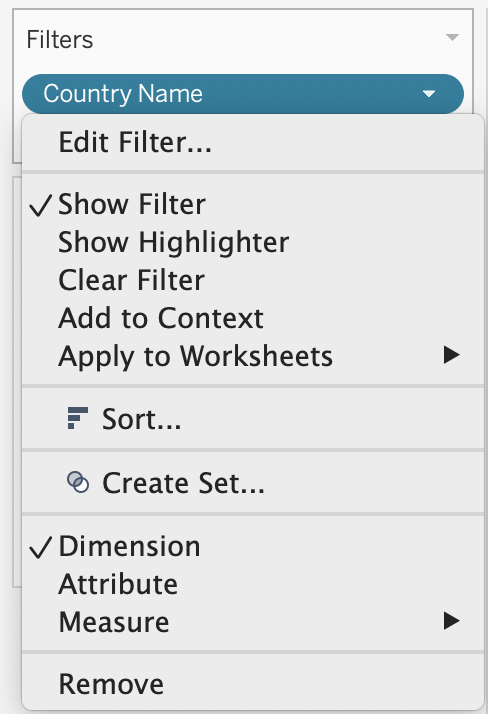
Figure 6.62: After you drag Country Name to the Filters card, make sure the Filter is displayed.
Double-click on the Sheet 1 title (above the chart) and replace it with a more meaningful title, such as “Internet Access by Country, 1995–2018.” In the menu, go to Worksheet > Show Caption to add a Caption block under the chart. Use this space to add source of your data (World Bank), and perhaps credit yourself as the author of this visualization.
Change Standard to Fit Width in the drop-down menu above the Columns shelf.
You may notice that the x-axis (Year) starts with 1994 and ends with 2020, although our data is for 1995–2018. Double-click on the x-axis, and change Range from Automatic to Fixed, with the Fixed start of 1995, and the Fixed end of 2018. Close the window and see that the empty space on the edges has disappeared.
Once your filtered line chart looks like the one shown in Figure 6.63, you are ready to publish. Go to File > Save to Tableau Public As…, and log into your account, or create one if you haven’t yet done so. Follow the prompts to publish your chart on the public web, or see the previous Scatter Chart in Tableau Public tutorial for more details.
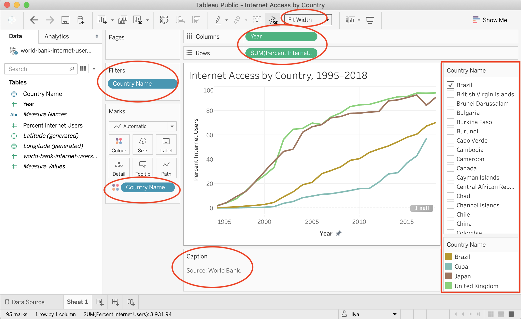
Figure 6.63: This workbook is ready to be published.
See the Get the Embed Code section of Chapter 9 to insert the interactive version of your chart on a web page that you control.
Summary
Congratulations on creating interactive charts that pull readers deeper into your story, and encourage them to explore the underlying data! As you continue to create more, always match the chart type to your data format and the story you wish to emphasize. Also, design your charts based on the principles and aesthetic guidelines outlined near the top of this chapter. While anyone can click a few buttons to quickly create a chart nowadays, your audiences will greatly appreciate well-designed charts that thoughtfully call their attention to meaningful patterns in the data.
In this chapter you learned how to create different types of interactive charts with Google Sheets, Datawrapper, and Tableau Public. For more advanced chart design with open-source code, see Chapter 11: Chart.js and Highcharts templates, which give you ever more control over how your design and display your data, but also requires learning how to edit and host code templates with GitHub in Chapter 10.
The next chapter on Map Your Data follows a similar format to introduce different map types, design principles, and hands-on tutorials to create interactive visualizations with spatial data. Later you’ll learn how to embed interactive charts on your web in Chapter 9.