#StandWithUkraine - Stop the Russian invasion
Join us and donate. Since 2022 we have contributed over $5,000 in book royalties to Save Life in Ukraine & Ukraine Humanitarian Appeal & The HALO Trust, and we will continue to give!
Chart Design Principles
There are so many different types of charts. However, just because data can be made into a chart does not necessarily mean that it should be turned into one. Before creating a chart, stop and ask: Does a visualized data pattern really matter to your story? Sometimes a simple table, or even text alone, can communicate the idea more effectively to your audience. Since creating a well-designed chart requires time and effort, make sure it enhances your data story.
Although not a science, data visualization comes with a set of principles and best practices that serve as a foundation for creating truthful and eloquent charts. In this section, we’ll identify some important rules about chart design. But you may be surprised to learn that some rules are less rigid than others, and can be “broken” when necessary to emphasize a point, as long as you honestly interpret the data.
To better understand this tension between following and breaking rules in data visualization, see Lisa Charlotte Rost’s thoughtful reflection on “What To Consider When Considering Data Vis Rules.” By articulating the unspoken rules behind good chart design, Rost argues that we all benefit by moving them into the public realm, where we can openly discuss and improve on them, as she had done in many Datawrapper Academy posts, which also beautifully visualize each rule. But Rost reminds us that rules also have a downside. First, following rules too closely can block creativity and innovation, especially when we look for ways to overcome challenges in design work. Second, since rules have emerged from different “theories of data visualization,” they sometimes contradict one another. One example of colliding rules is the tension between creating easy-to-grasp data stories versus those that reveal the complexity of the data, as it often feels impossible to do both. Rost concludes that the rules we follow reflect our values, and each of us needs to ask, “What do you want your data visualizations to be judged for?”——how good the designs look, or for how truthful they are, or how they evoke emotions, inform and change minds.31
To delve further into chart design, let’s start by establishing a common vocabulary about charts.
Deconstruct a Chart
Let’s take a look at Figure 6.1. It shows basic chart components that are shared among most chart types.
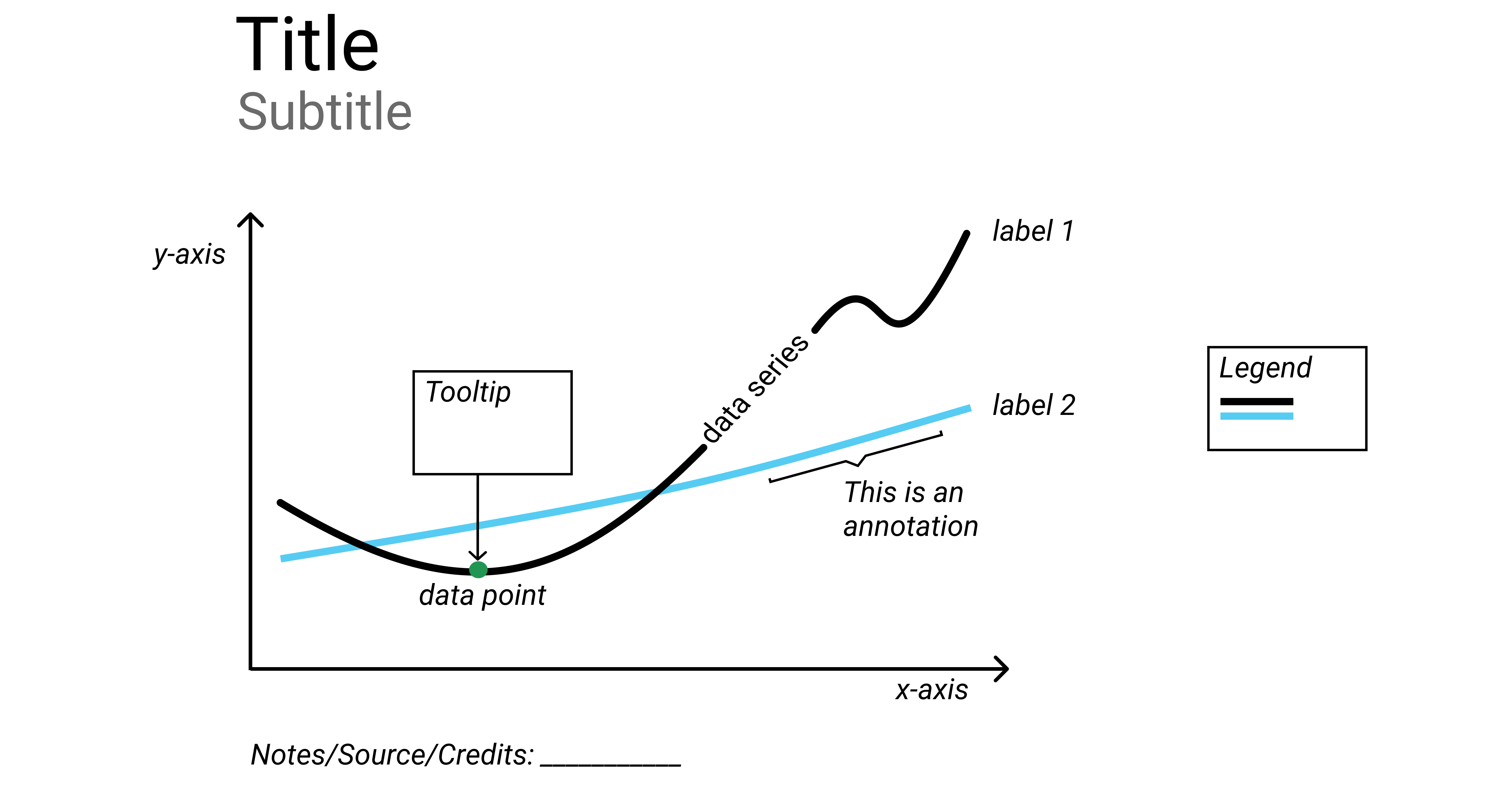
Figure 6.1: Common chart components.
A title is perhaps the most important element of any chart. A good title is short, clear, and tells a story on its own. For example, “Pandemic Hits Black and Latino Population Hardest”, or “Millions of Tons of Plastic Enter the Ocean Every Year” are both clear titles that quickly convey a larger story.
Sometimes your editor or audience will prefer a more technical title for your chart. If so, the two titles above could be changed, respectively, to “Covid-19 Deaths by Race in New York City, Spring 2020” and “Tons of Plastic Entering the Ocean, 1950–2020.”
A hybrid strategy is to combine a story-oriented title with a more technical subtitle, such as: “Pandemic Hits Black and Latino Population Hardest: Covid-19 Deaths by Race in New York City, Spring 2020.” If you follow this model, make your subtitle less prominent than your title by decreasing its font size, or changing its font style or color, or both.
Horizontal (x) and vertical (y) axes define the scale and units of measure.
A data series is a collection of observations, which is usually a row or a column of numbers, or data points, in your dataset.
Labels and annotations are often used across the chart to give more context. For example, a line chart showing US unemployment levels between 1900 and 2020 can have a “Great Depression” annotation around 1930s, and “Covid-19 Impact” annotation for 2020, both representing spikes in unemployment. You might also choose to label items directly instead of relying on axes, which is common with bar charts. In that case, a relevant axis can be hidden and the chart will look less cluttered.
A legend shows symbology, such as colors and shapes used in the chart, and their meaning (usually values that they represent).
You should add Notes, Data Sources, and Credits underneath the chart to give more context about where the data came from, how it was processed and analyzed, and who created the visualization. Remember that being open about these things helps build credibility and accountability.
If your data comes with uncertainty (or margins of error), use error bars to show it, if possible. If not, accompany your chart with a statement like “the data comes with uncertainty of up to 20% of the value”, or “for geographies X and Y, margins of error exceed 10%”. This will help readers assess the reliability of the data source.
In interactive charts, a tooltip is often used to provide more data or context once a user clicks or hovers over a data point or a data series. Tooltips are great for complex visualizations with multiple layers of data, because they declutter the chart. But because tooltips are harder to interact with on smaller screens, such as phones and tablets, and are invisible when the chart is printed, only rely on them to convey additional, nice-to-have information. Make sure all essential information is visible without any user interaction.
Some Rules are More Important than Others
Although the vast majority of rules in data visualization are open to interpretation, as long as you honestly interpret the data, here are two rules that cannot be bent: zero-baselines for bar and column charts, and 100-percent baselines for pie charts.
Bar and Column Charts Must Begin at Zero
Bar and column charts use length and height to represent value, therefore their value axis must start at the zero baseline. This ensures that a bar twice the length of another bar represents twice its value. Figure 6.2 contrasts a good and a bad example. The same rule applies to area charts, which display filled-in area underneath the line to represent value. Starting the baseline at a number other than zero is a trick commonly used to exaggerate differences in opinion polls and election results, as we describe later in Chapter 14: Detect Lies and Reduce Bias

Figure 6.2: Start your bar chart at zero.
But the zero-baseline rule does not apply to line charts. According to visualization expert Alberto Cairo, line charts represent values through the position and angle of the line, rather than its height or length. Starting a line chart at a number other than zero does not necessarily distort its encoded information because our eyes rely on its shape to determine its meaning, rather than its proximity to the baseline.32 For example, compare both the right and left sides of Figure 6.3, where both are correct.
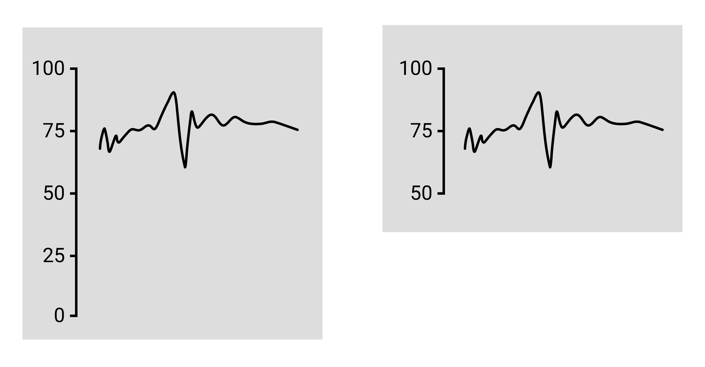
Figure 6.3: Since line charts do not require a zero baseline, both sides are correct.
Furthermore, while forcing a line chart to begin at the zero baseline is acceptable, it may not produce the best visualization for your data story. In Figure 6.4, the left side shows a line chart that starts the vertical axis at zero, but as a result the line appears very flat at the top of the chart and hides changes in values. The right side shows a line chart where the vertical axis was reduced to match the range of values, which results in a clearer depiction of change. Both sides are technically correct, and in this case, the right side is a better fit for the data story. Still, you need to be cautious, because as you’ll learn in the How to Lie with Charts section of Chapter 14, people can mislead us by modifying the vertical axis, and there is no uniform rule about where it belongs on a line chart.
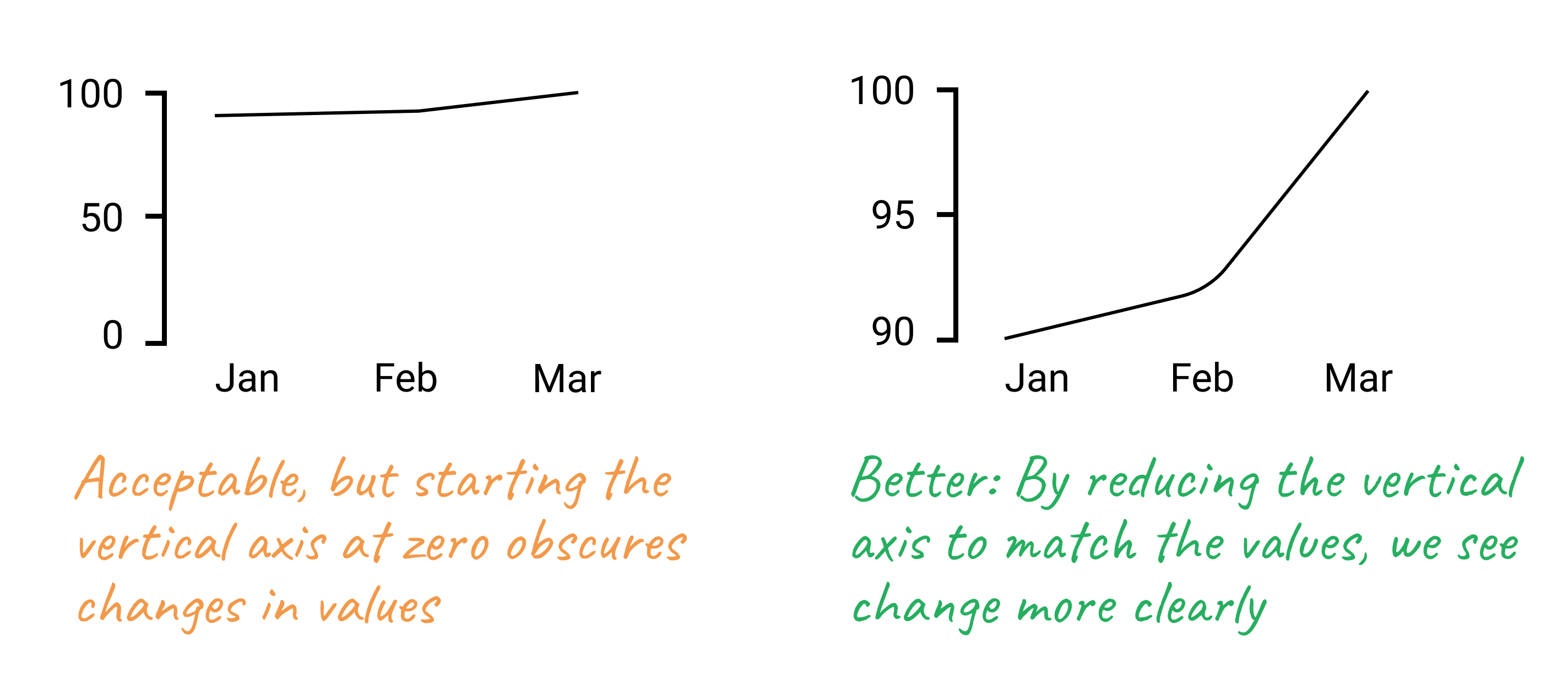
Figure 6.4: While the line chart with the zero baseline is acceptable, the line chart with a modified baseline more clearly tells a data story about change.
Pie Charts Represent 100%
Pie charts is one of the most contentious issues in data visualization. Most dataviz practitioners will recommend avoiding them entirely, saying that people are bad at accurately estimating sizes of different slices. We take a less dramatic stance, as long as you adhere to the recommendations we give in the next section.
But the one and only thing in data visualization that every single professional will agree on is that pie charts represent 100% of the quantity. If slices sum up to anything other than 100%, it is a crime. If you design a survey titled Are you a cat or a dog person? and allow both “cat” and “dog” checkboxes to be selected, forget about putting the results into a pie chart.
Chart Aesthetics
Remember that you create a chart to help the reader understand the story, not to confuse them. Decide if you want to show raw counts, percentages, or percent changes, and do the math for your readers.
Avoid chart junk
Start with a white background and add elements as you see appropriate. You should be able to justify each element you add. To do so, ask yourself: Does this element improve the chart, or can I drop it without decreasing readability? This way you won’t end up with so-called “chart junk” as shown in Figure 6.5, which includes 3D perspectives, shadows, and unnecessary elements. They might have looked cool in early versions of Microsoft Office, but let’s stay away from them today. Chart junk distracts the viewer and reduces chart readability and comprehension. It also looks unprofessional and doesn’t add credibility to you as a storyteller.
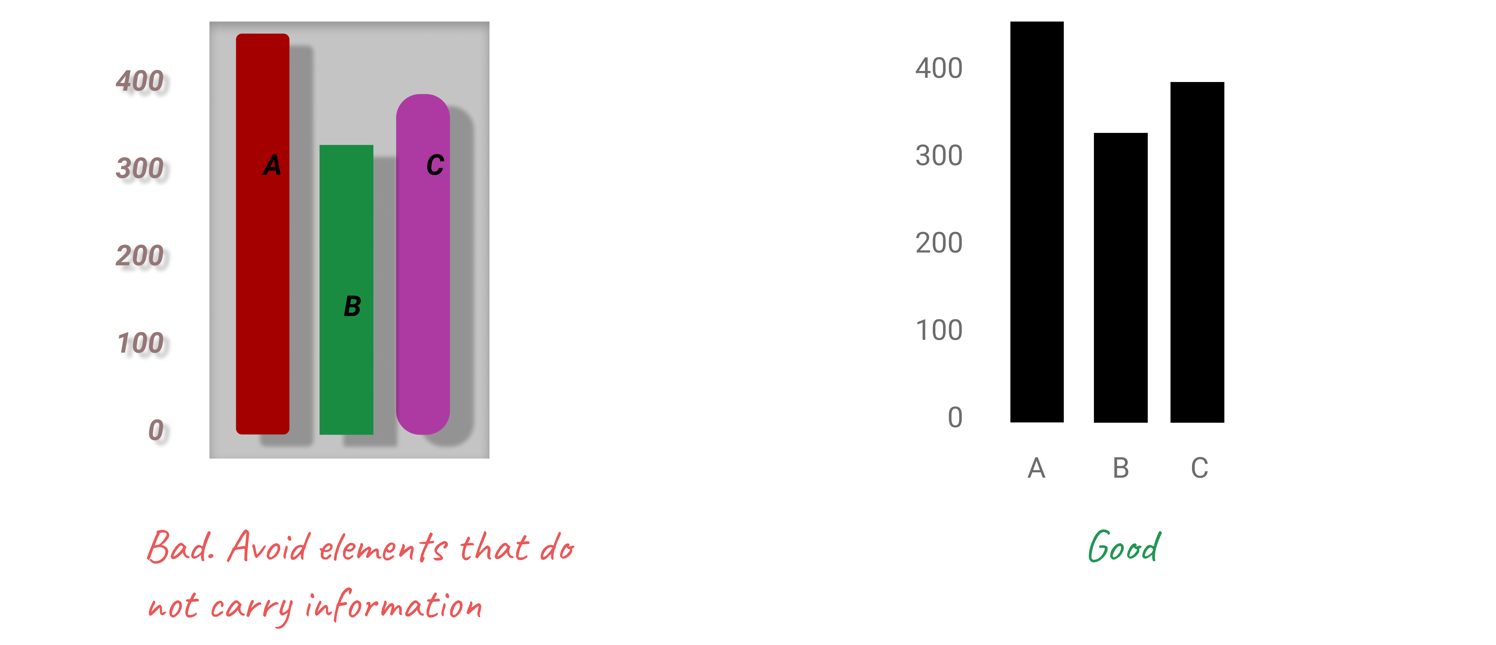
Figure 6.5: Chart junk distracts the viewer, so stay away from shadows, 3D perspectives, unnecessary colors and other fancy elements.
Do not use shadows or thick outlines with bar charts, because the reader might think that decorative elements are part of the chart, and thus misread the values that bars represent.
The only justification for using three dimensions is to plot three-dimensional data, which has x, y, and z values. For example, you can build a three-dimensional map of population density, where x and y values represent latitude and longitude. In most cases, however, three dimensions are best represented in a bubble chart, or a scatterplot with varying shapes and/or colors.
Beware of pie charts
Remember that pie charts only show part-to-whole relationship, so all slices need to add up to 100%. Generally, the fewer slices—the better. Arrange slices from largest to smallest, clockwise, and put the largest slice at 12 o’clock. Figure 6.6 illustrates that.
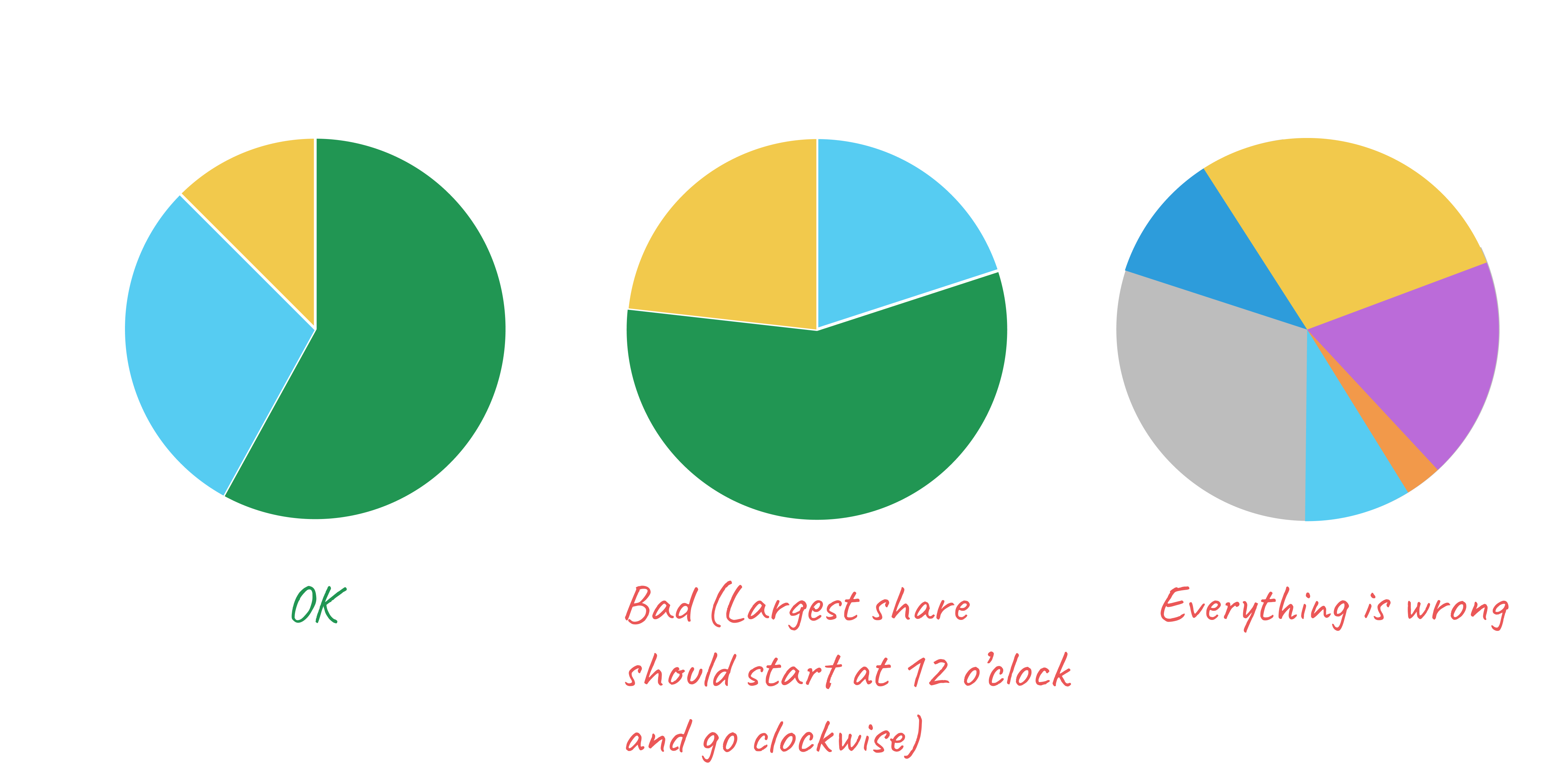
Figure 6.6: Sort slices in pie charts from largest to smallest, and start at 12 o’clock.
If your pie chart has more than five slices, consider showing your data in a bar chart, either stacked or split, like Figure 6.7 shows.
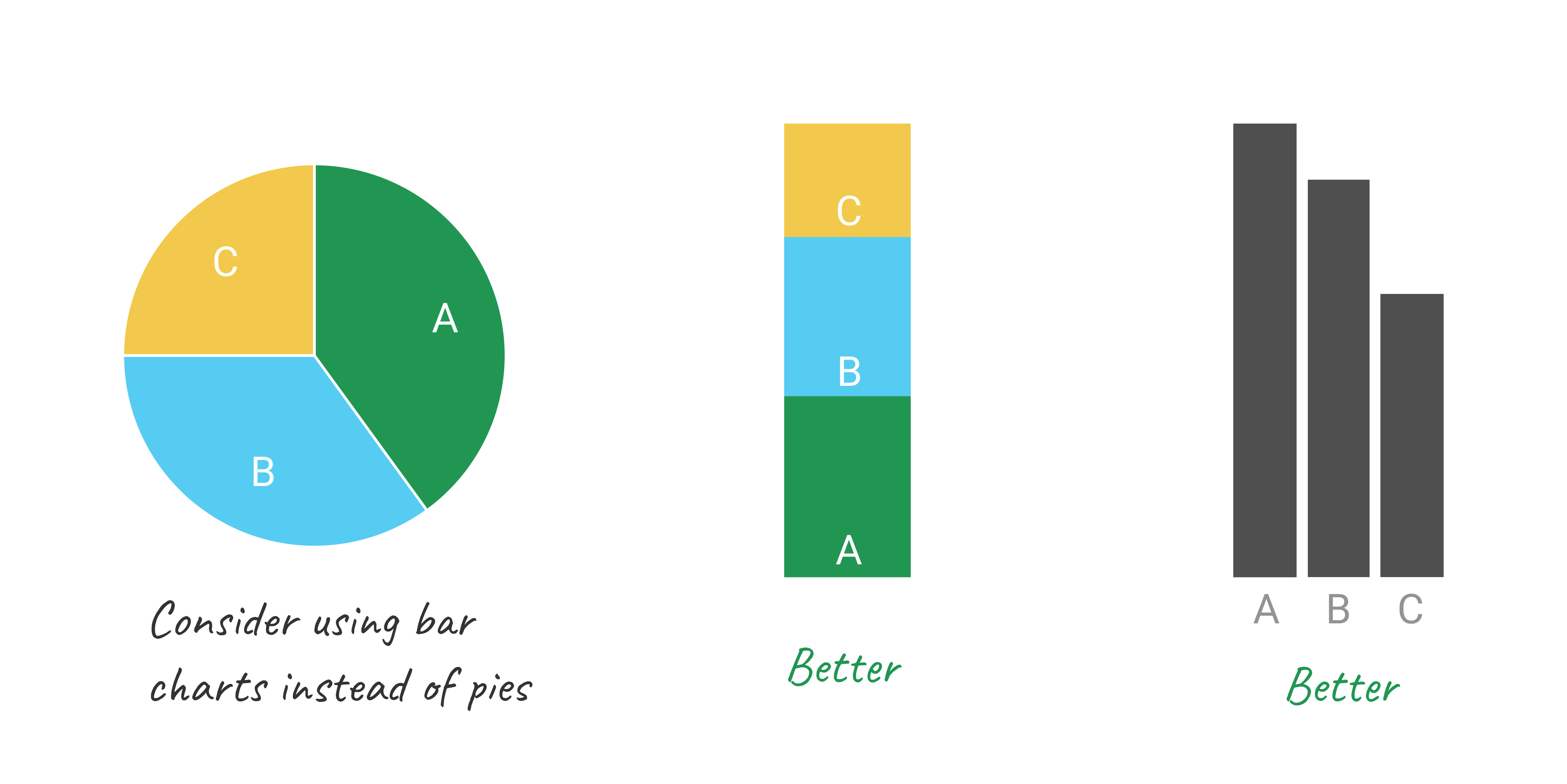
Figure 6.7: Consider using bar charts instead of pies.
Don’t make people turn their heads to read labels
When your column chart has long x-axis labels that have to be rotated (often 90 degrees) to fit, consider turning the chart 90 degrees so that it becomes a horizontal bar chart. Take a look at Figure 6.8 to see how much easier it is to read horizontally-oriented labels.

Figure 6.8: For long labels, use horizontal bar charts.
Arrange elements logically
If your bar chart shows different categories, consider ordering them, like is shown in Figure 6.9. You might want to sort them alphabetically, which can be useful if you want the reader to be able to quickly look up an item, such as their town. Ordering categories by value is another common technique that makes comparisons possible. If your columns represent a value of something at a particular time, they have to be ordered sequentially, of course.

Figure 6.9: Use logical ordering for your bars, such as alphabetical or by value.
Do not overload your chart
When labelling axes, choose natural increments that space equally, such as [0, 20, 40, 60, 80, 100], or [1, 10, 100, 1000] for a logarithmic scale. Do not overload your scales.
Keep your typography simple, and use (but do not overuse) bold type to highlight major insights.
Consider using commas as thousands separators for readability (1,000,000 is much easier to read than 1000000).
Be careful with colors
In this section, we would like to briefly introduce three important rules about colors. First, remember that in most cases monochromatic (single-hue) charts suffice, and there may be no need to introduce the extra dimension of color at all.
Second, refer to the color wheel and standard harmony rules when choosing your palette. Consider the rule of complementary colors—opposites in the color wheel—to find color pairs, such as blue and orange or yellow and purple. Analogous colors, or neighbors in the color wheel, make good palettes, such as orange, red, and pink.
Third, stay away from pure saturated colors and instead choose their “earthier” versions, such as olive green instead of bright green, or navy instead of neon blue.
Once you have chosen the color palette for your visualization, ask yourself:
Is there a conflict of meaning between colors and the phenomenon they represent? Am I using red to represent profit or green to represent death rate? This question is complex as colors carry different associations for different social groups and cultures, but try to exercise your best sensitivity.
Can people with color blindness interpret your chart? Palettes that contain reds and greens, or yellows and blues can be challenging. Consider using Color Oracle or another simulator to make sure your visualization is accessible.
Will the colors be distinguishable in black-and-white? Even if you don’t expect viewers printing your chart, they may. You can use Color Oracle or another simulator to check that your colors have different brightness levels and look distinguishable in grayscale. Figure 6.10 shows some good and bad examples of color use.
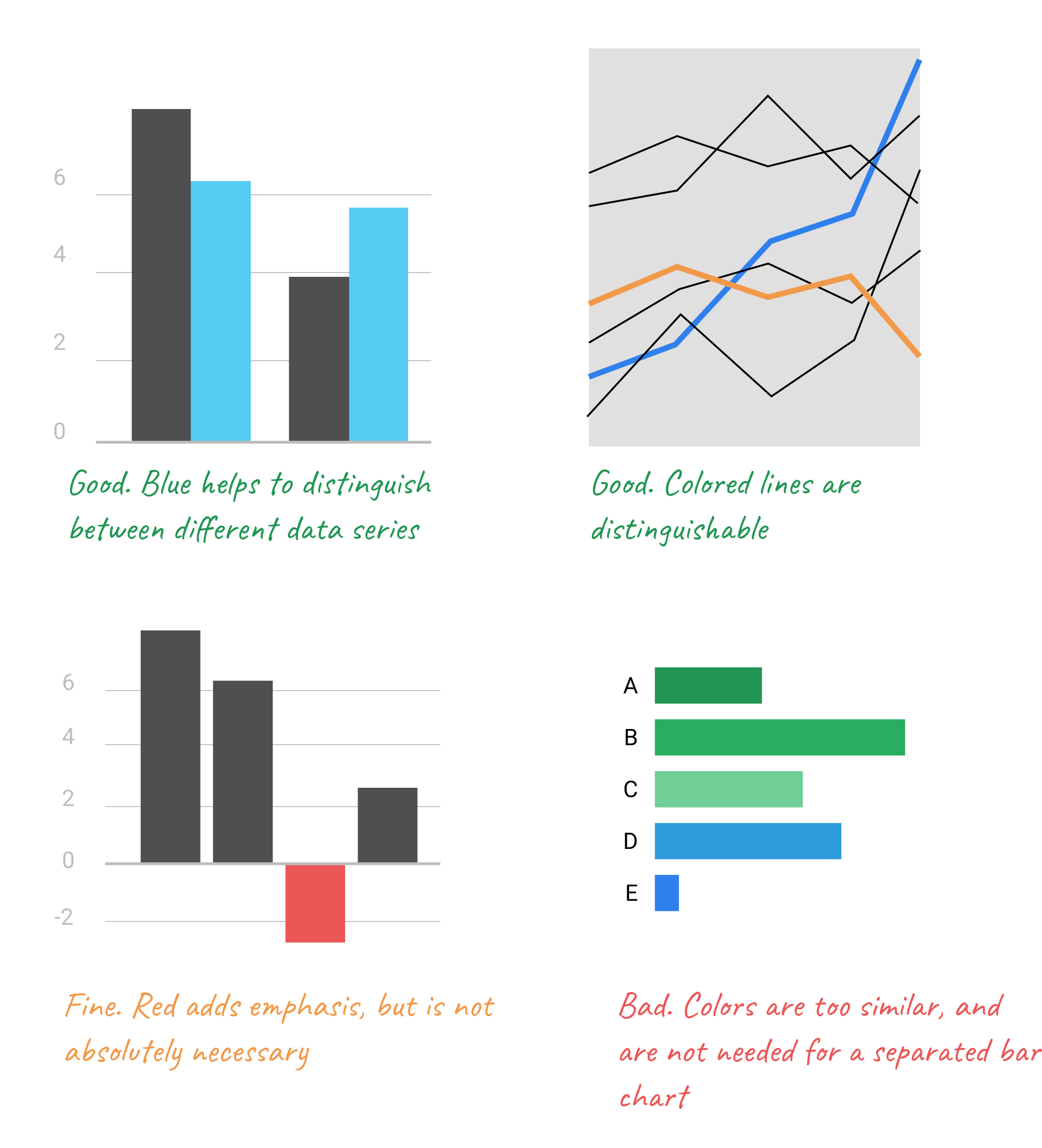
Figure 6.10: Don’t use colors just for the sake of it.
The use of color is a complex topic, and there are plenty of books and research devoted to it. For an excellent overview, see Lisa Charlotte Rost’s “Your Friendly Guide to Colors in Data Visualization” and “How to Pick More Beautiful Colors for Your Data Visualizations,” both on the Datawrapper blog.33
If you follow our advice, you should end up with a de-cluttered chart as shown in Figure 6.11. Notice how your eyes are drawn to the bars and their corresponding values, not bright colors or secondary components like the axes lines.
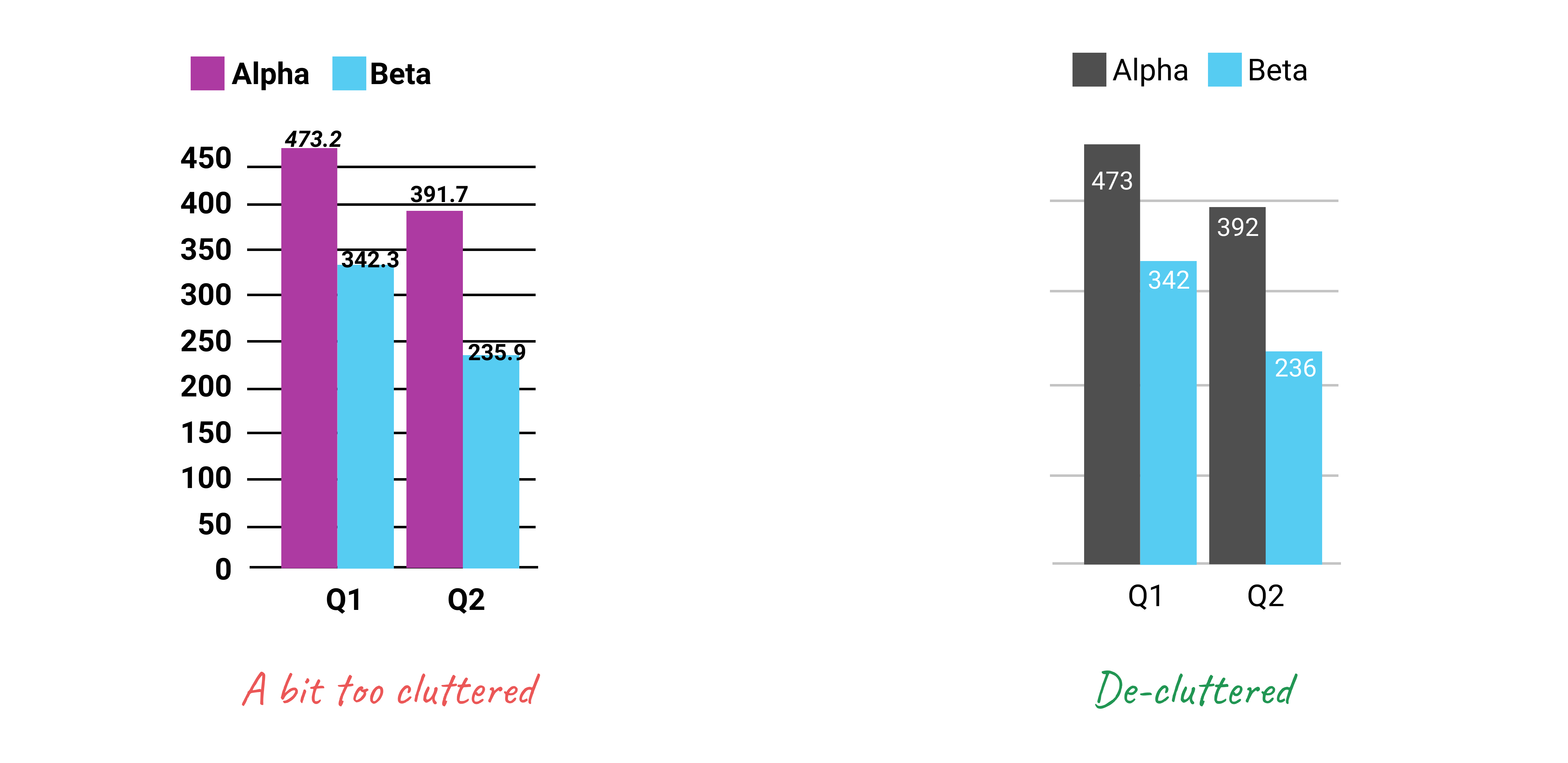
Figure 6.11: Make sure important things catch the eye first.
In summary, good chart design requires training your eyes and your brain to understand what works and what fails when telling data stories. Build up your data visualization muscles by looking at lots of different charts, both bad and good ones. For example, browse through both the Data Is Beautiful and Data is Ugly pages on Reddit. Read comments by other readers, but develop your own opinions, which may not necessarily match those expressed by others. Also, it’s a fun way to learn!
Lisa Charlotte Rost, “What to Consider When Considering Data Vis Rules” (Lisa Charlotte Rost, November 27, 2020), https://lisacharlotterost.de/datavisrules.↩︎
Cairo, How Charts Lie, 2019, p. 61.↩︎
Lisa Charlotte Rost, “Your Friendly Guide to Colors in Data Visualisation” (Datawrapper Blog, July 31, 2018), https://blog.datawrapper.de/colorguide/; Lisa Charlotte Rost, “How to Pick More Beautiful Colors for Your Data Visualizations” (DataWrapper Blog, September 4, 2020), https://blog.datawrapper.de/beautifulcolors/index.html.↩︎