#StandWithUkraine - Stop the Russian invasion
Join us and donate. Since 2022 we have contributed over $5,000 in book royalties to Save Life in Ukraine & Ukraine Humanitarian Appeal & The HALO Trust, and we will continue to give!
Pivot Points into Polygon Data
If you deal with geographical data, you may find yourself in a situation where you have a list of addresses which need to be counted (aggregated) by area and displayed as a polygon map. In this case, a simple pivot table in a spreadsheet software can solve the problem.
Note: A special case of a polygon map is a choropleth map, which represents polygons that are colored in a particular way to represent underlying values. A lot of polygon maps end up being choropleth maps, so we will be using this term a lot in this book.
Let’s take a look at a list of all hospitals (https://data.cms.gov/provider-data/dataset/xubh-q36u) that are registered with the Medicare program in the US, made available by The Centers for Medicare & Medicaid Services. The dataset has information on each hospital’s name, location (nicely divided into Address, City, State, and ZIP Code columns), a phone number, and some other indicators, such as mortality and patient experience.
Imagine you’re asked to create a choropleth map of total hospitals by US state. Instead of showing individual hospitals as points, you want darker shades of blue to represent states with more hospitals, as shown in Figure 13.30.
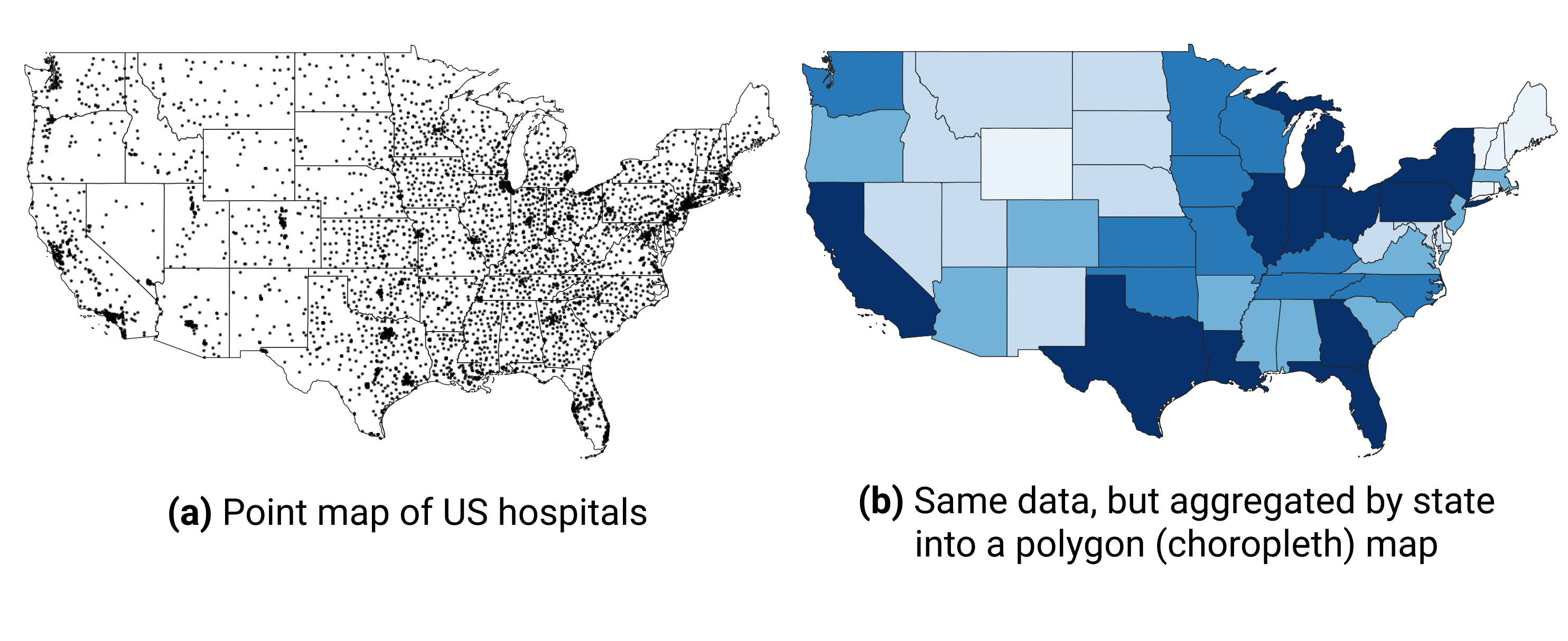
Figure 13.30: You can count addresses by state (or other area) to produce polygon, or choropleth, maps instead of point maps.
First, save the database to your local machine by clicking the “Download this dataset” button to the right of the table, as shown in Figure 13.31.
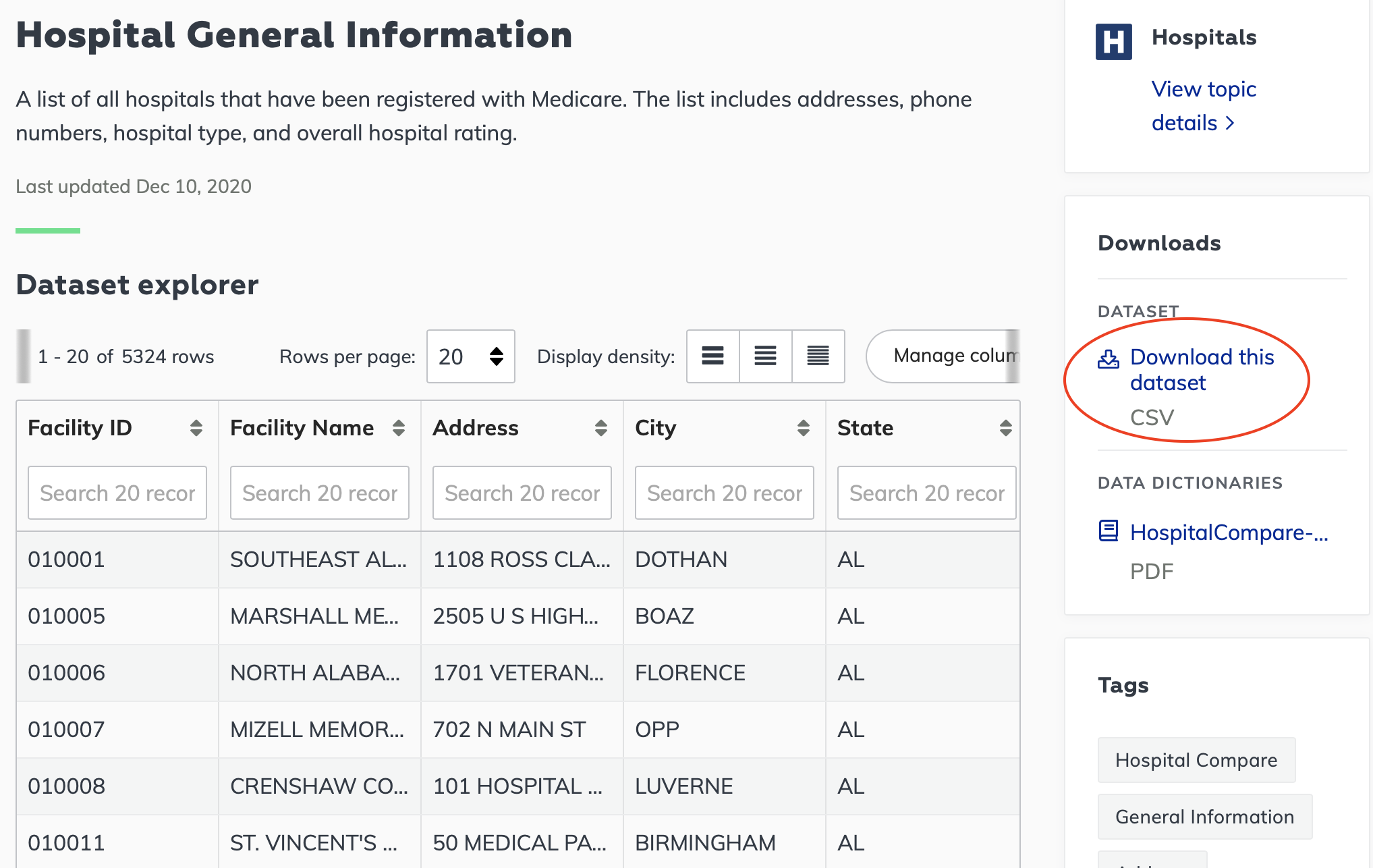
Figure 13.31: Export the entire dataset as a CSV.
Next, open the file in your favorite spreadsheet tool. If you use Google Sheets, use File > Import > Upload to import CSV data. Make sure your address columns are present, and move on to creating a pivot table (in Google Sheets, go to Data > Pivot table, make sure the entire data range is selected, and click Create). In the pivot table, set Rows to State, because we want to get counts by state. Next, set pivot table’s Values to State—or really any other column that has no missing values—and choose Summarize by: COUNTA. Voila!
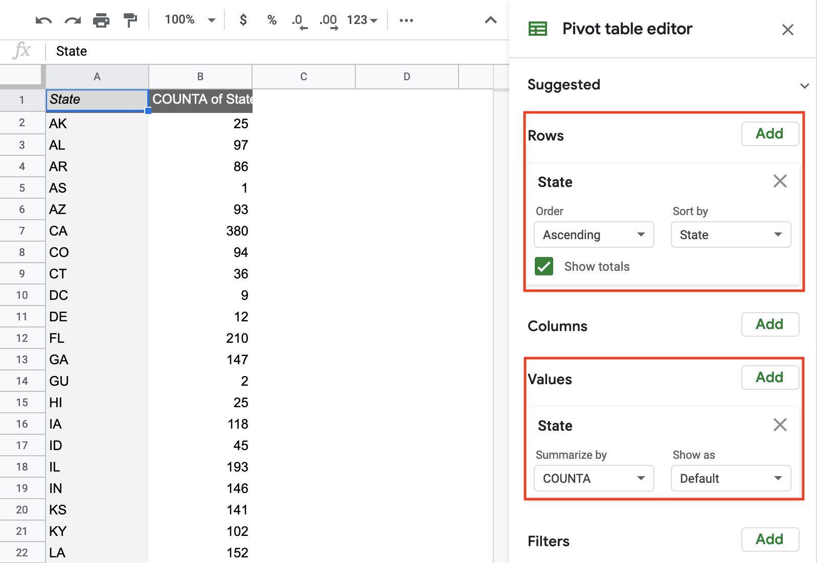
Figure 13.32: Use pivot tables in any spreadsheet software to count addresses per area (such as state, county, of zip code).
Your aggregated dataset is ready, so save it as a CSV. If you use Google Sheets, go to File > Download > Comma-separated values (.csv, current sheet). You can now merge this dataset with your polygons manually using editing capabilities of GeoJson.io, or merge it all in one go using powerful Mapshaper.
Summary
In this chapter, we delved into geospatial data and the GeoJSON format. You also learned how to use various open-source tools to find geodata, convert and create vector data, and edit and join these layers with spreadsheet data. You also “warped” historical raster map images by georeferencing them onto modern maps. Finally, you acquired some additional strategies to bulk geocode large batches of US addresses, and to pivot point-level data into polygons for use in choropleth maps.
In the next chapter, we will discuss how to detect lies and reduce bias in charts and maps, so that you become a more critical consumer of visualizations as well as a better data storyteller.