#StandWithUkraine - Stop the Russian invasion
Join us and donate. Since 2022 we have contributed over $5,000 in book royalties to Save Life in Ukraine & Ukraine Humanitarian Appeal & The HALO Trust, and we will continue to give!
- Histograms
Histograms are best to show the distribution of raw data, by displaying the number of values that fall within defined ranges, often called buckets or bins. Creating a histogram can be a great way to better understand what your data looks like to inform your decision-making when designing more advanced visualizations, such as choropleth maps, as you’ll learn in Chapter 7. Although histograms may look similar to column charts, the two are different. First, histograms show continuous data, and usually you can adjust the bucket ranges to explore frequency patterns. For example, you can shift histogram buckets from 0-1, 1-2, 2-3, etc. to 0-2, 2-4, etc. By contrast, column charts show categorical data, such as the number of apples, bananas, carrots, etc. Second, histograms do not usually show spaces between buckets because these are continuous values, while column charts show spaces to separate each category.
In this section, you’ll create two types of histograms in Google Sheets: quick histograms using the Column stats menu versus regular histograms using the Chart menu, and the advantages of each method. For both tutorials we’ll use the same data: the average calorie supply per capita for 174 countries in 2017, compiled by the United Nations Food and Agriculture Organization, accessed through Our World In Data. Note that methods for measuring food supply vary across nations and over time, and estimate the amount of food availability, rather than actual consumption.
Quick Histograms with Google Sheets Column Stats
Open the sample data on Average Daily Calorie Supply per capita by country 2017 in Google Sheets, log in with your account, and go to File > Make a Copy to create a version you can edit in your Google Drive.
To create a quick histogram in Google Sheets, select any column, then go to Data > Column stats, and click the Distribution button in the sidebar to view a histogram for that column, as shown in Figure 6.27. The advantage is that this method is very fast, and you can quickly create histograms for other columns in the same sheet using the arrows near the top of the sidebar (
< >). However, you cannot manually adjust the bucket ranges or make other edits to these quick histograms, and you cannot embed them on the web as you can with regular charts in Google Sheets.

Figure 6.27: To create a quick histogram in a Google Sheet, select a column, then go to Data - Column stats - Distribution.
Histograms are designed to show broad patterns of data distribution, not individual values. The histogram in Figure 6.27 shows that while most nations have an average daily supply around 2,800 calories per capita, 8 nations have fewer than 2,000, and 11 nations have more than 3,500. Without annotations, histograms don’t tell us the names of those outlier countries. But they do offer a better sense of the shape of the data distribution.
Regular Histograms with Google Sheets Charts
Compare the quick histogram created with Column stats in Figure 6.27 with the regular histogram created with Charts in Figure 6.28. You’ll notice that in the regular histogram, you can define the bucket ranges, display dividers, and add titles and labels to provide more context to readers. Also, the interactive version of the regular histogram allows users to float their cursor to see underlying data on the count for each column.
Figure 6.28: Regular histogram chart: Explore the full-screen interactive version.
To create a regular histogram in Google Sheets, open the sample data on Average Daily Calorie Supply per capita by country 2017 in Google Sheets, log in with your account, and go to File > Make a Copy to create a version you can edit in your Google Drive.
Select only one column with numerical values as shown in Figure 6.29.
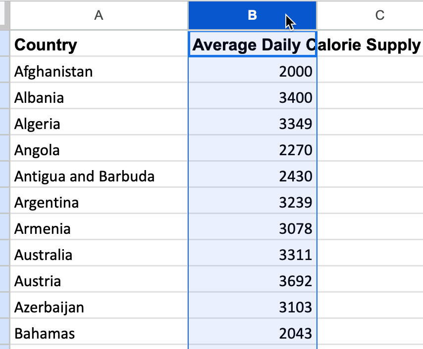
Figure 6.29: Select only one column with values to create a histogram.
- Go to Insert > Chart. If Google Sheets does not automatically select Histogram chart as the Chart type in Chart editor, use the dropdown and select it manually, near the bottom of the list in the Other category, as shown in Figure 6.30
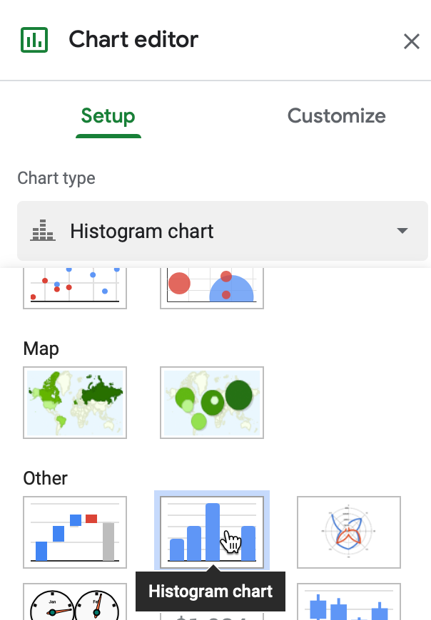
Figure 6.30: If not shown automatically, go to the Chart Editor sidebar and select Setup - Chart type - Other - Histogram.
- You can manually set the range of each bucket and round the breakpoints to whole numbers (such as multiple of 1, 5, or 100), if this makes sense for the distribution of your data. In the Chart Editor, go to Customize > Histogram > Bucket size. Larger intervals will contain more data points and will appear wider, while smaller intervals will contain fewer points and appear narrower.
Note: Currently, Google Sheets does not allow users to remove decimal points in the x-axis label of a histogram, even when all of the breakpoints are integers.
Optionally, you can break down the column into individual items (in our case, countries), which will appear as blocks with white boundaries. To do this, go to Customize > Histogram > Show item dividers.
In the Chart Editor, customize further to add a Chart title, a subtitle to describe the source, and also vertical and horizontal axis titles to help readers interpret the chart.
Since the regular histogram is created using the Charts feature, you can choose to Publish it and copy the embed code for the interactive version, as you’ll learn in Chapter 9: Embed on the Web.
Now that you’ve learned how to create histograms to show the distribution of raw data, in the next section we’ll move on to other types of Google Sheets chart types, such as pie, line, and area charts.