#StandWithUkraine - Stop the Russian invasion
Join us and donate. Since 2022 we have contributed over $5,000 in book royalties to Save Life in Ukraine & Ukraine Humanitarian Appeal & The HALO Trust, and we will continue to give!
Table Design Principles
Let’s begin with some principles of good table design, similar to how we learned about chart design in Chapter 6 and map design in Chapter 7. Jonathan Schwabish, an economist who specializes in creating policy-relevant data visualizations, offers advice on creating tables that communicate clearly with multiple audiences.37 Here’s a summary of several of his key points, which also appear in Figure 8.1.
Make column headers stand out above the data.
Use light shading to separate rows or columns.
Left-align text and right-align numbers for easier reading.
Avoid repetition by placing labels only in the first row.
Group and sort data to highlight meaningful patterns.
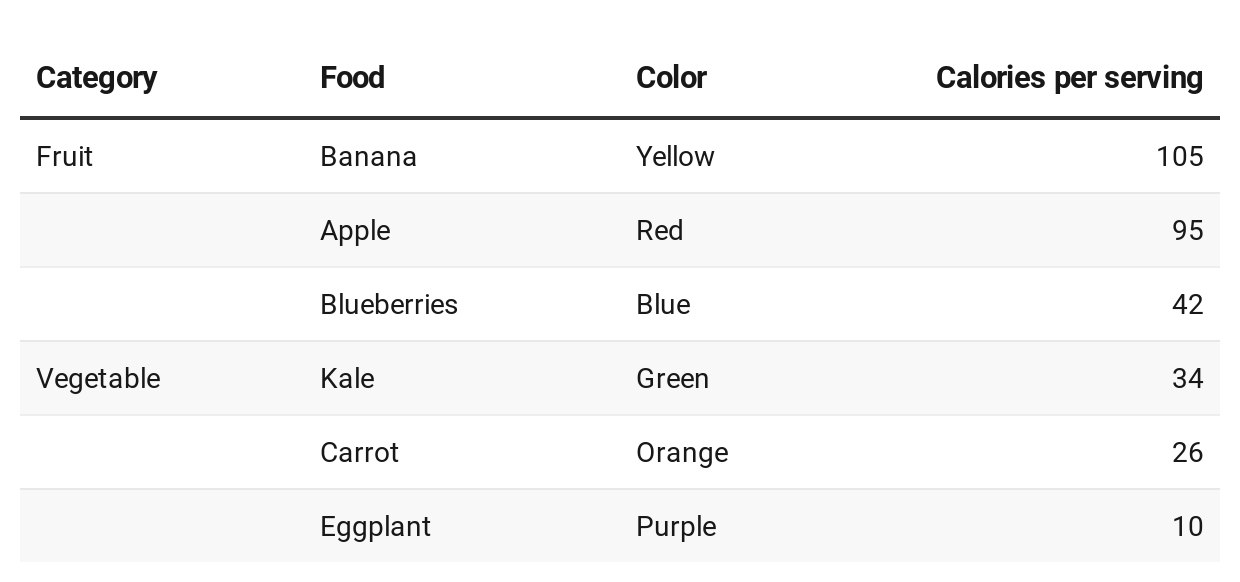
Figure 8.1: A sample table that illustrates selected design principles.
In addition, Schwabish and others recommend using color to highlight key items or outliers in your data, a topic we’ll discuss later in Chapter 15: Tell and Show Your Data Story.
When creating cross-tabulations to illustrate data correlations and possible causal relationships, statistician Joel Best offers two more design recommendations.38
Place the independent variable (the suspected cause) at the top in the column headers, and the dependent variable (the possible effect) on the side for each row.
Calculate percentages from raw numbers in a vertical direction going downward, so that each value of the independent variable (the suspected cause) totals 100 percent.
Let’s apply these latter design principles by constructing two different tables that calculate percentages, the bad way versus the better way, with data from the Pfizer coronavirus vaccine trial study results that were reported in November 2020. In this blind trial, 43,661 volunteers were randomly divided into two groups, about 21,830 each. One group received the vaccine and the other group received a placebo, so these were the independent variables (the suspected causal factors). Researchers watched closely and observed these dependent variables (the possible effects): 162 people in the placebo group became infected with the virus, compared to 8 people in the vaccine group.39.
Table 8.1 calculates the percentages of this trial in the wrong direction—horizontally—and confuses the reader about the relationship between cause and effect, especially in the last row.
| Vaccine | Placebo | Total | |
|---|---|---|---|
| Infected | 4.7% (8) | 95.3% (162) | 100% (170) |
| Not infected | 50.2% (21,822) | 49.8% (21,668) | 100% (43,490) |
But Table 8.2 calculates percentages in the correct direction—vertically—which more clearly shows how the vaccine is correlated with lower infection rates. Researchers determined that this was a strong causal relationship, and received approval to distribute the vaccine.
| Vaccine | Placebo | |
|---|---|---|
| Infected | 0.04% (8) | 0.74% (162) |
| Not infected | 99.96% (21,822) | 99.26% (21,668) |
| Total | 100% (21,830) | 100% (21,830) |
Overall, the core principles of table design reflect similar concepts we previously discussed in chart and map design. Organize your presentation of the data with the readers’ eyes in mind, to focus their attention on the most important elements of your interpretation, to help them take away the key points. Do the visualization work for them, so that you don’t have to rely on them to draw the same mental connections in their own minds. Remove any clutter or unnecessary repetition that stands in the way of these goals. Most importantly, tell true and meaningful stories about the data.
Now that you understand several key principles of table design, see how several are built directly into the Datawrapper tool featured in the next section.
Jon Schwabish, “Thread Summarizing ’Ten Guidelines for Better Tables’” (Twitter, August 3, 2020), https://twitter.com/jschwabish/status/1290323581881266177; Jonathan A. Schwabish, “Ten Guidelines for Better Tables,” Journal of Benefit-Cost Analysis 11, no. 2 (2020/ed): 151–78, https://doi.org/10.1017/bca.2020.11; Jonathan Schwabish, Better Data Visualizations: A Guide for Scholars, Researchers, and Wonks (Columbia University Press, 2021), https://cup.columbia.edu/book/better-data-visualizations/9780231193115.↩︎
Joel Best, More Damned Lies and Statistics: How Numbers Confuse Public Issues (Berkeley, CA: University of California Press, 2004), https://www.google.com/books/edition/More_Damned_Lies_and_Statistics/SWBr7D6VavoC, pp. 31-35.↩︎
Carl Zimmer, “2 Companies Say Their Vaccines Are 95% Effective. What Does That Mean?” The New York Times: Health, November 20, 2020, https://www.nytimes.com/2020/11/20/health/covid-vaccine-95-effective.html, Dashiell Young-Saver, “What Does 95% Effective Mean? Teaching the Math of Vaccine Efficacy” (New York Times Learning Network, December 14, 2020), https://int.nyt.com/data/documenttools/teaching-the-math-of-vaccine-effectiveness/190b272f891868c7/full.pdf.↩︎