#StandWithUkraine - Stop the Russian invasion
Join us and donate. Since 2022 we have contributed over $5,000 in book royalties to Save Life in Ukraine & Ukraine Humanitarian Appeal & The HALO Trust, and we will continue to give!
- Annotated Charts
An annotated chart is best to highlight specific data or add contextual notes inside the visualization. Well-designed annotations can help answer the “so what?” question by briefly noting the significance of data in the chart, with greater detail in the sentences or paragraphs that follow. Be cautious with annotations, because it’s important to avoid adding unnecessary “chart junk,” as described in Chart Design Principles section of this chapter.
You can add annotations to any chart created with Datawrapper, and we’ll illustrate how with a line chart about US unemployment data from 2000-2020, since adding a bit of historical context often helps readers to better understand data stories about change over time. To create a line chart in Datawrapper, organize your data the same way you did in the Google Sheets line chart tutorial above. Place units of time (such as months-years) in the first column, and numerical data values (such as the unemployment rate) in the second column. Now you’re ready to create an interactive line chart with annotations, as shown in Figure 6.36. Since 2000, the unemployment rate has peaked three times, but the tallest peak occurred during the 2020 economic crisis sparked by the Covid pandemic.
Figure 6.36: Line chart with annotation: Explore the interactive version. Data from US Federal Reserve Open Data.
Create your own annotated line chart in Datawrapper by following this tutorial:
Open the US Unemployment Seasonally Adjusted 2000-2020 sample data in Google Sheets and go to File > Make a Copy to create your own version in your Google Drive. Or go to File > Download to export a CSV or Excel version to your computer.
Open Datawrapper in your browser and click Start Creating. We recommend that you create a free account to better manage your visualizations, but it’s not required.
In the Upload Data screen, click Import Google Spreadsheet and paste the link to the data in the shared Google Sheet above, as shown in Figure 6.37, then click Proceed. To upload a Google Sheet, the Share setting must be changed from Private, the default setting, to Anyone with the link can view at minimum. Also, if you update cells in your Google Sheet, they will be updated automatically in a linked Datawrapper chart, but not after your chart is published online. Alternatively, you can upload data by copying and pasting it into the data table window, or uploading an Excel or CSV file.
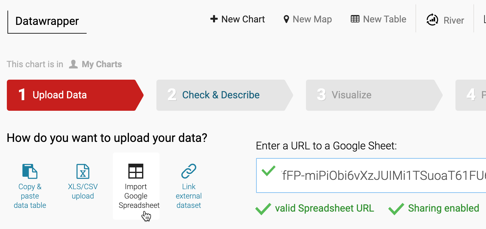
Figure 6.37: To upload data from a shared Google Sheet, click the button and paste the link.
- In the Check and Describe screen, inspect your data to make sure that numbers appear in blue, dates in green, and text in black type, and click Proceed.
Tip: If needed, at the bottom of the Check and Describe screen there is a button that will transpose your data (swap rows and columns), which is useful in cases where the data you receive is organized in the opposite direction from what Datawrapper expects. But our sample data does not need to be transposed, since it’s organized correctly.
In the Visualize screen, Datawrapper will attempt to guess the chart type you desire, based on the data format. If you entered our sample data correctly, it will correctly display a line chart. But if not, you can select a different chart type.
Click the Annotate tab near the top-left of the Visualize screen. Type in a meaningful title, such as “US Unemployment Rate, Seasonally Adjusted, 2000-2020.” Also, add a data source, such as “US Federal Reserve Open Data”, and a link to the source, such as the shared Google Sheet or the Federal Reserve Open Data web page. Finally, in the byline line, add your name or organization to credit the people who created this chart. You’ll see all of these details and links appear automatically at the bottom of your chart, to add credibility to your work.
Scroll down further in the Annotate tab to the Text annotations section, and click the button to add one. Draw a pink rectangle to place your annotation on the chart, where unemployment rose sharply from 2008 to 2010, and type “Great Recession” into the text field, as shown in Figure 6.38. This helps readers to place the Great Recession in historical context. Click the button a second time to add another text annotation, place it around the second unemployment peak in 2020, and type “Covid Pandemic” into the text field to offer readers a comparison. You can fine-tune the style and position of annotations with additional options further down on the screen.
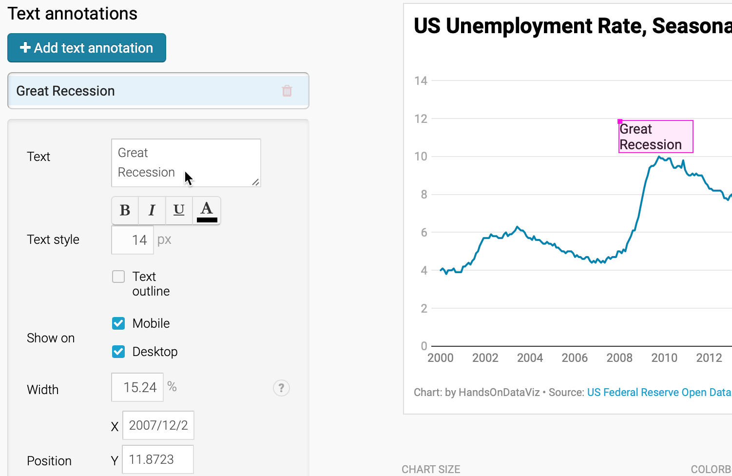
Figure 6.38: Add text annotations by drawing a pink rectangle and typing in the text.
- Scroll down further in the Annotate tab to the Highlight range section, and click the button to add one to the chart. Click inside the chart to draw a pink lines from December 2007 to June 2009, which will highlight that portion of the chart in gray, as shown in Figure 6.39. This period represents the official beginning and ending of the US Great Recession in the eyes of economists, although unemployment continued to grow for the population at large. To highlight other official recession periods, draw two more ranges: March–November 2001 and February–October 2020 (the most current data as we write this). Once again, you can fine-tune the style and positioning of a highlighted range with additional options further down the screen.
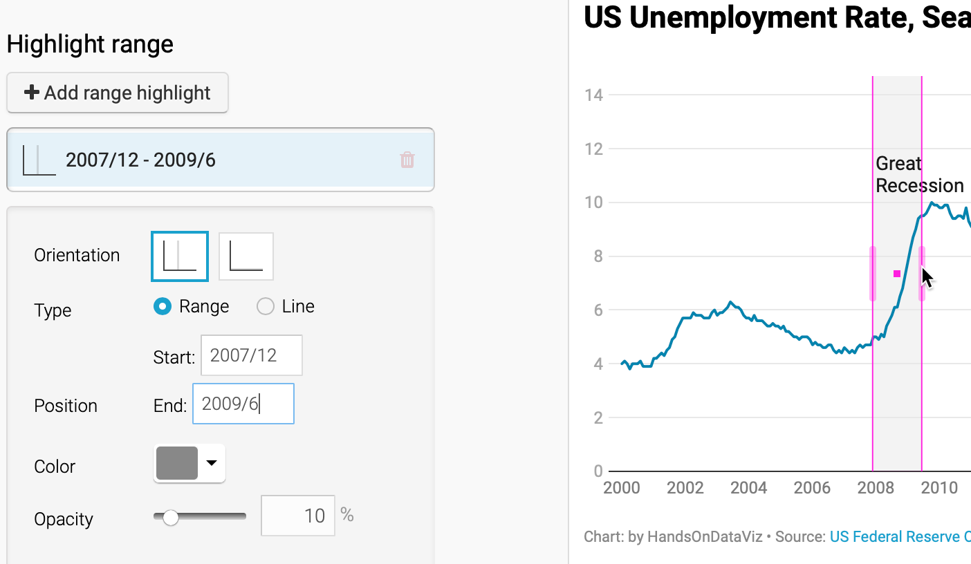
Figure 6.39: Add a range highlight by “drawing” a rectangular bar on the chart.
- Click Proceed or advance to the Publish & Embed screen to share your work with others. If you logged into your free Datawrapper account, your work is automatically saved online in the My Charts menu in the top-right corner of the screen. Also, you can click the blue Publish button to generate the code to embed your interactive chart on your website, as you’ll learn about in Chapter 9: Embed on the Web. In addition, you can add your chart to River if you wish to share your work more widely by allowing other Datawrapper users to adapt and reuse your chart. Furthermore, scroll all the way down and click the Download PNG button to export a static image of your chart. Additional exporting and publishing options require a paid Datawrapper account. Or, if you prefer not to create an account, you can enter your email to receive the embed code.
Tip: See this Datawrapper Academy article to create a line chart with confidence intervals, which are similar to error bars.
Congratulations on creating your first interactive Datawrapper chart. Now let’s use Datawrapper to create a new type of chart, called a range chart.