#StandWithUkraine - Stop the Russian invasion
Join us and donate. Since 2022 we have contributed over $5,000 in book royalties to Save Life in Ukraine & Ukraine Humanitarian Appeal & The HALO Trust, and we will continue to give!
Summarize Data with Pivot Tables
Pivot tables are another powerful feature built into spreadsheet tools to help you reorganize your data and summarize it in a new way, hence the name “pivot.” Yet pivot tables are often overlooked by people who were never taught about them, or have not yet discovered how to use them. Let’s learn this skill using the reader survey sample dataset we described at the top of the chapter. Each row represents an individual reader, including their occupation and prior level of experience with data visualization. You’ll learn how to “pivot” this individual-level data into a new table that displays the total number of reader responses by two categories: occupation and experience level.
Open this Google Sheet of Hands-On Data Visualization reader public survey responses in a new tab in your browser. Log into your Google Drive account, and go to File > Make a Copy to edit your own version.
Or, if you have already created your own copy for the prior section on Formulas and Functions, delete row 2 that contains our calculations, because we don’t want those getting mixed into our pivot table.
Go to Insert > Pivot Table, and on the next screen, select Create in a new sheet, as shown in Figure 2.30. The new sheet will include a Pivot Table tab at the bottom.
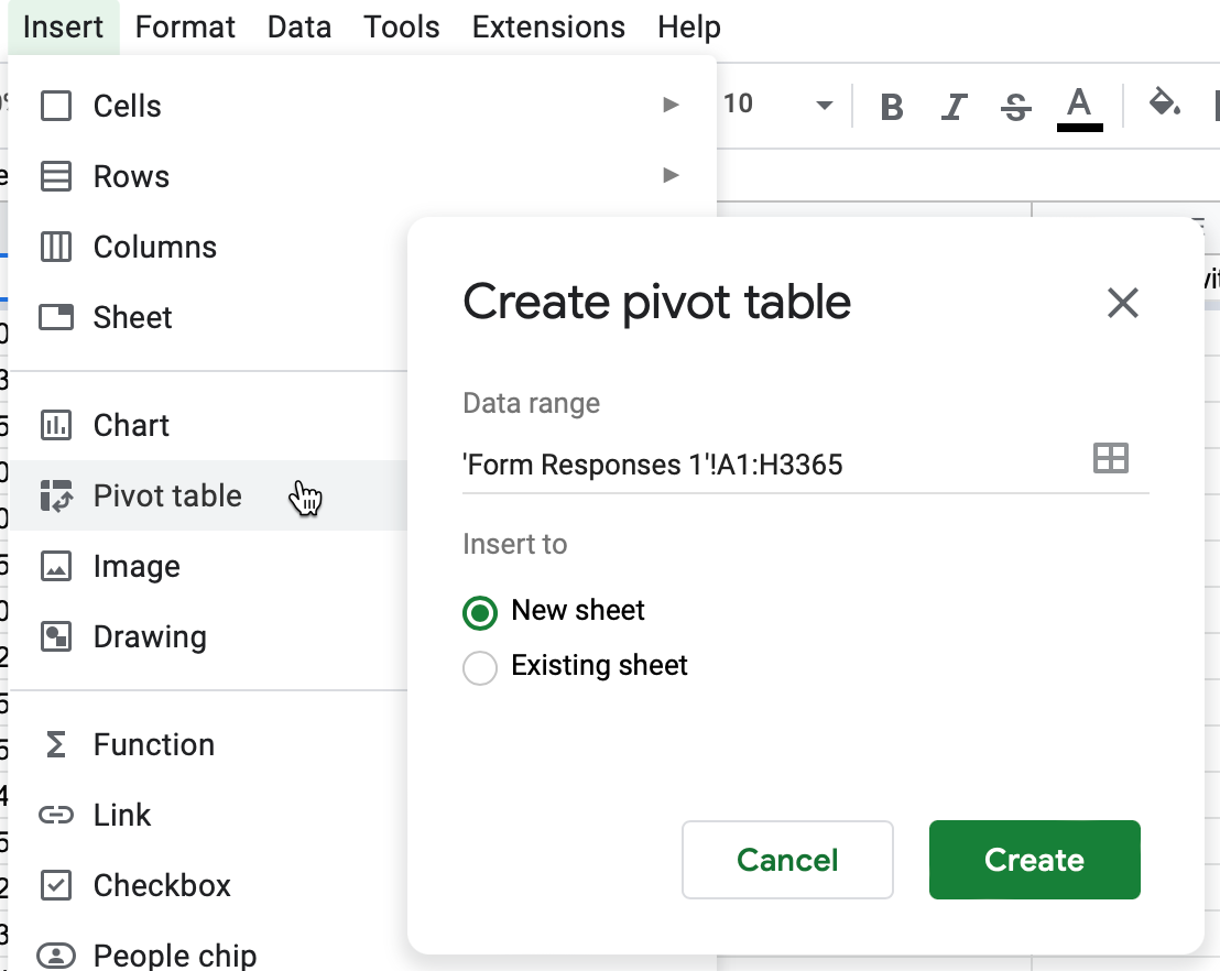
Figure 2.30: Go to Insert - Pivot Table, and create in a new sheet.
- In the Pivot table editor screen, you can regroup data from the first sheet by adding rows, columns, and values. First, click the Rows Add button and select Occupation, which displays the unique entries in that column, as shown in Figure 2.31.
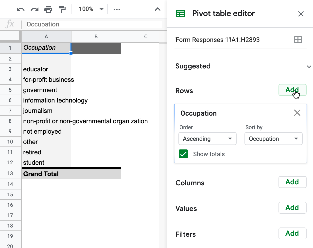
Figure 2.31: In the Pivot table editor, click the Rows Add button and select Occupation.
- Next, to count the number of responses for each entry, click the Values Add button and select Occupation again. Google Sheets will automatically summarize the values by COUNTA, meaning it displays the frequency of each textual response, as shown in Figure 2.32.
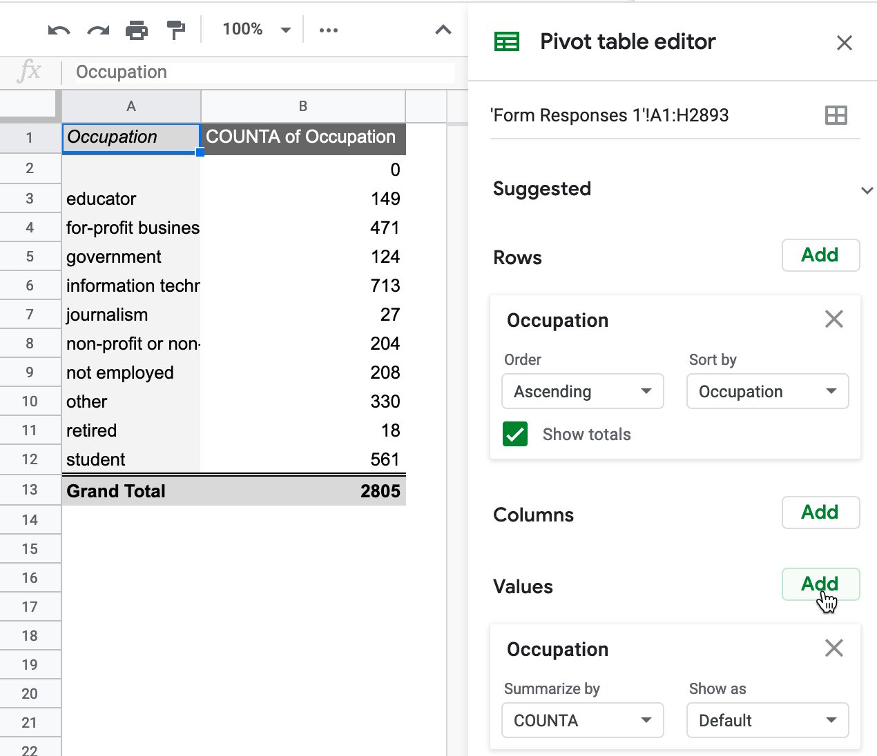
Figure 2.32: In the Pivot table editor, click the Values Add button and select Occupation.
Currently, the top three occupations listed by readers are information technology, for-profit business, and student. Since this is a live spreadsheet, these rankings may change as more readers respond to the survey.
- Furthermore, you can create a more advanced pivot cross-tabulation of occupation and experience among reader responses. Click on the Columns button to add Experience with data visualization, as shown in Figure 2.33.
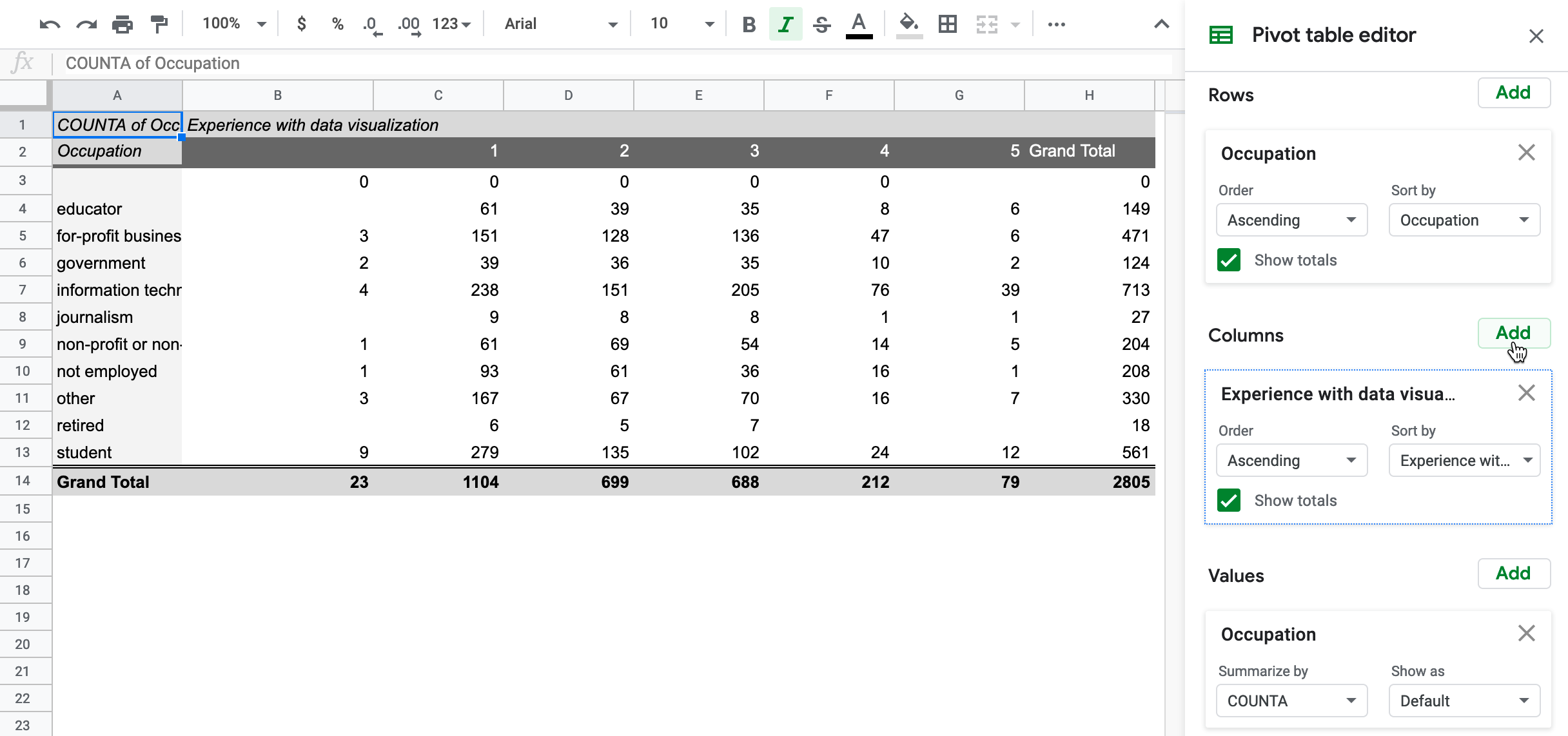
Figure 2.33: In the Pivot table editor, click the Columns Add button and select Experience with data visualization.
To go one step further, Filter the data to limit the pivot table results by another category. For example, in the drop-down menu, you can click the Filters Add button, select Years of school, then under Filter by values select Clear, then check 20 to display only readers who listed 20 or more years.
Deciding how to add Values in the Pivot table editor can be challenging, because there are multiple options to summarize the data, as shown in Figure 2.34. Google Sheets will offer its automated guess based on the context, but you may need to manually select the best option to represent your data as desired. Three of the most common options to summarize values are:
- SUM: the total value of numeric responses (What is the total years of schooling for readers?)
- COUNT: frequency of numeric responses (How many readers listed 20 years of schooling?)
- COUNTA: frequency of text responses (How many readers listed occupation as “educator”)
Although Google Sheets pivot tables display raw numbers by default, under the Show as drop-down menu you can choose to display them as percentages of the row, of the column, or of the grand total.
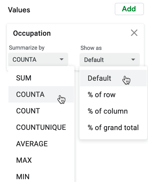
Figure 2.34: In the Pivot table editor, see multiple options to summarize Values.
While designing pivot tables may look differently across other spreadsheet tools, the concept is the same. Learn more about how pivot tables work in the support pages for Google Sheets or LibreOffice or Microsoft Excel. Remember that you can download the Google Sheets data and export to ODS or Excel format to experiment with pivot tables in other tools.
Now that you’ve learned how to regroup and summarize data with pivot tables, in the next section you’ll learn a related method to connect matching data columns across different spreadsheets using XLOOKUP.