#StandWithUkraine - Stop the Russian invasion
Join us and donate. Since 2022 we have contributed over $5,000 in book royalties to Save Life in Ukraine & Ukraine Humanitarian Appeal & The HALO Trust, and we will continue to give!
Precisely Describe Comparisons
Sometimes we make poor comparisons because we fail to clarify our meaning of commonly-used words that can have different definitions. Three troublesome words are average, percent, and causes. We use them loosely in everyday conversation, but they require more precision when working with data.
Imagine a series of numbers: 1, 2, 3, 4, 5. When calculating the average, by hand or with a built-in spreadsheet formula as described in chapter 2, we add up the sum and divide by the count of numbers. A more precise term is the mean, which in this case equals 3. A different term is the median, which refers to the number in the middle of the ordered series, also known as the 50th percentile, which in this case is also 3.
When working with data, the terms median and percentile are more useful terms when making comparisons because they resist the influence of outliers at the extreme ends of the series. For example, imagine the same numbers as above, but replace the 5 with 100 to serve as an outlier. Suddenly the mean jumps up to 22, but the median remains the same at 3, as shown in Figure 5.1. There’s an old joke that when a billionaire walks into a room, everyone becomes a millionaire—on average—but the median barely changes. Since we ordinary people don’t actually become richer by the presence of the billionaire outlier among us, the median is a better term to make meaningful comparisons about the overall distribution of the data.
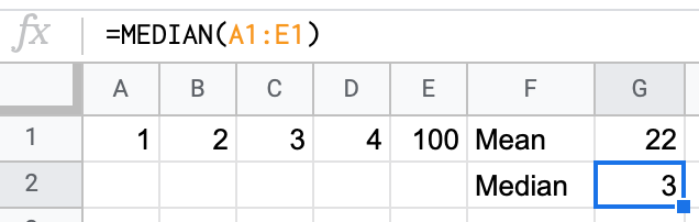
Figure 5.1: The median is a more useful comparative term than average or mean because it resists the influence of outliers.
Percentage is another common term, which nearly everyone intuitively grasps as a ratio of parts per hundred. For example, an old 1970s commercial for Trident gum claimed that “4 out of 5 dentists surveyed recommend sugarless gum for their patients who chew gum”.24 Even if you’re too young to remember that slogan, or wonder how that survey was actually conducted, or are puzzling over how the fifth dentist resisted such intense peer pressure, we all understand that 4 out of 5 dentists is equivalent to 4/5 = 0.8 = 80%.
But confusion arises sometimes when people hastily compare percentages, so we need to carefully choose our words. One term is percent change (also called relative change), which works best when comparing old versus new values. Percent change is calculated by the difference between new and old values, divided by the absolute value of the old value, or (New value - Old value) / |Old value|. For example, if 4 dentists recommended sugarless gum in 1970, but peer pressure finally prevailed and 5 dentists recommend it in 2020, we calculate the percent change as (5-4)/4 = 1/4 = 0.25 = 25%.
Another term is percentage point difference, which works best when comparing old versus new percentages and is calculated by subtracting one from the other. For example, if 80 percent of dentists recommended sugarless gum in 1970, but 100 percent recommended it in 2020, we could compare the two figures by calculating the difference as New percentage - Old percentage = 100% - 80% = 20 percentage point difference.
When we precisely use each term, there are two correct ways to compare these figures. One way is to state that “The number of dentists who recommended sugarless gum increased 25 percent over time.” Another way is to state that “The percentage of dentists who recommended sugarless gum increased 20 percentage points over time.” Both statements are accurate. Even if someone confuses the two terms, there’s not a big gap between a “25 percent change” and a “20 percent point increase” in this particular example.
But consider a different example where someone intentionally misleads you with imprecise wording about percentages. Imagine a politician who proposes to raise the sales tax on products and services you purchase from 5 to 6 percent. If that politician says, “it’s only a 1 percent increase,” they’re wrong. Instead, there are two truthful ways describe this change. One way is to state that the tax “will increase 20 percent” because (6-5)/5 = 0.20. Another way is to state that the tax “will increase by 1 percentage point” because 6% - 5% = 1 percentage point difference. See why the politician preferred to say it in their misleading way, rather than either of the two correct ways? Don’t let anyone fool you by describing how percentages change with very loose wording, and be precise about its meaning in your own work to avoid confusing other people.
A final recommendation about using more precise language is to be cautious with words that suggest a cause-and-effect relationship in your data. In everyday conversation, there are many ways that we loosely imply that a causal relationship, where an action directly results in a reaction. For example, when we say one thing “leads to” another, or “promotes” growth, or “sparks” change, those words suggest causality. While that’s fine in daily conversation, we need to choose our words more carefully when discussing data, using three concepts. The first step is to describe any correlation between two variables, which means to show how they are associated or related interdependently. But statisticians always warn us that correlation does not imply causation. The fact that two things are related does not necessarily mean that one causes the other to happen. In order to show causation, we must take the second step of proving both correlation and demonstrating a persuasive theory for how one factor (sometimes called the independent variable) creates a change in another factor (called the dependent variable). Third, we need to identify and isolate any confounding variables that we have not considered that may also influence the cause-and-effect relationship. While the details are beyond the scope of this book, be mindful of the concepts—and choose your words carefully—when working with data.
See also table design recommendations for showing data correlations and possible causal relationships in Chapter 8: Table Your Data.
Now that you have a clearer understanding of how to use key words to describe data relationships more precisely, in the next section you’ll build on this knowledge and adjust data to create more meaningful comparisons.
Andrew Adam Newman, “Selling Gum With Health Claims,” The New York Times: Business, July 27, 2009, https://www.nytimes.com/2009/07/28/business/media/28adco.html.↩︎