#StandWithUkraine - Stop the Russian invasion
Join us and donate. Since 2022 we have contributed over $5,000 in book royalties to Save Life in Ukraine & Ukraine Humanitarian Appeal & The HALO Trust, and we will continue to give!
Sort and Filter Data
Spreadsheet tools help you to dig deeper into your data and raise the stories you find to the surface. A basic step in organizing your data is to sort a table by a particular column, to quickly view its minimum and maximum values, and the range that lies in between. A related method is to filter an entire table to display only rows that contain certain values, to help them stand out for further study among all of the other entries. Both of these methods become more powerful when your spreadsheets contain hundreds or thousands of rows of data. To learn how to sort and filter, let’s explore the reader survey sample dataset we described at the top of the chapter.
Open this Google Sheet of Hands-On Data Visualization reader public survey responses in a new tab in your browser.
Login to your Google Sheets account, and go to File > Make a Copy to create your own version that you can edit.
Before sorting, click the upper-left corner of the sheet to select all cells, as shown in Figure 2.22. When the entire sheet becomes light blue, and all of the alphabetical column and numerical row headers become dark grey, this confirms you’ve selected all cells.
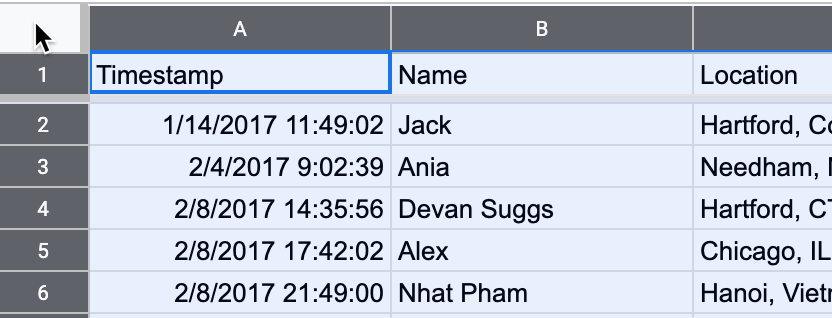
Figure 2.22: Click the upper-left corner to select all cells before sorting.
Warning: If you forget to select all cells, you might accidentally sort one column independently of the others, which will scramble your dataset and make it meaningless. Always select all cells before sorting!
- In the top menu, go to Data > Sort Range > Advanced Range Sorting Options to review all of your sort options. In the next screen, check the Data has header row box to view the column headers in your data. Let’s sort the Experience with data visualization column in ascending order (from A-Z), as shown in Figure 2.23, to display the minimum at the top, the maximum at the bottom, and the range in between.
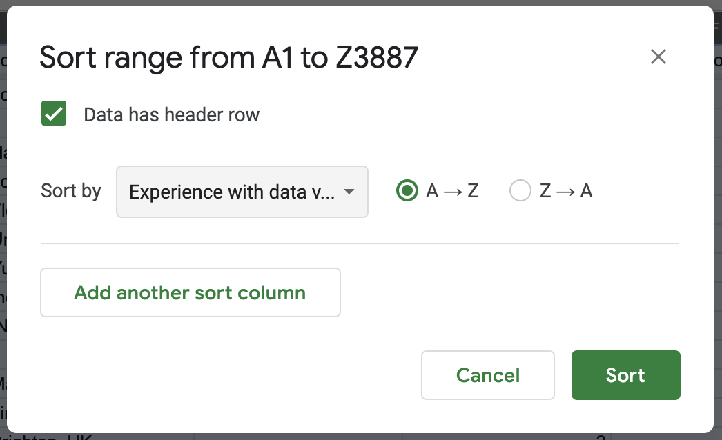
Figure 2.23: Go to Data - Sort Range - Advanced Range Sorting Options, check the header row box, and sort by Experience with dataviz in ascending order.
Scroll through your sorted data and you’ll see that over 1,000 readers rated themselves as beginners (level 1) with data visualization.
Tip: When working with large spreadsheets, you can “freeze” the first row so that column headers will still appear as you scroll downward. In Google Sheets, go to View > Freeze and select 1 row, as shown in Figure 2.24. You can also freeze one or more columns to continuously display when scrolling sideways. LibreOffice has a same option to View > Freeze Rows and Columns, but Excel has a different option called Window > Split.
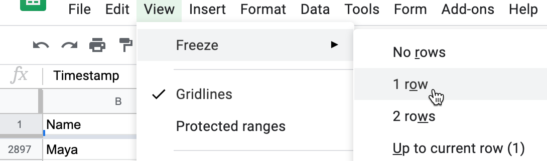
Figure 2.24: In Google Sheets, go to View - Freeze to select the number of rows to continuously display when scrolling downward.
- Now let’s try filtering your sheet. Go to Data > Create a Filter, which inserts downward arrows in each column header. Click on the downward arrow-shaped toggle in the Occupation column, and see options to display or hide rows of data. For example, look under Filter by values, then click the “Clear” button to undo all options, then click only educator to display only rows with that response, as shown in Figure 2.25. Click “OK”.
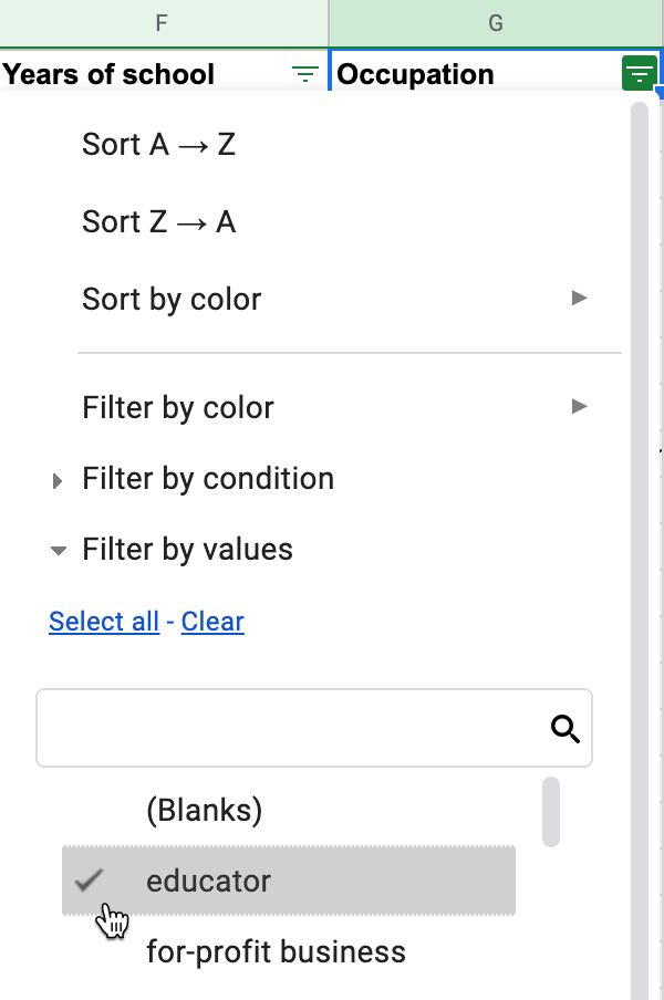
Figure 2.25: Go to Data - Create a Filter, click the downward arrow in the Occupation column, select only educator.
Now your view of reader responses is sorted by experience, and filtered to show only educators. Scroll through their one-sentence goals for learning about data visualization. How to do they compare to your own goals? In the next section, we’ll learn how to start analyzing your data with simple formulas and functions.