#StandWithUkraine - Stop the Russian invasion
Join us and donate. Since 2022 we have contributed over $5,000 in book royalties to Save Life in Ukraine & Ukraine Humanitarian Appeal & The HALO Trust, and we will continue to give!
How to Lie with Maps
One of the best ways to learn how to detect lies is to intentionally manipulate a map, and tell two (or more) opposing stories with the same data. You’ll learn what to watch out for when viewing other people’s maps, and think more carefully about the ethical issues when you design your own. We’ll focus our attention on choropleth maps that use shading or color to represent values in geographic areas, because they are a topic of considerable mischief. This exercise was inspired by geographer Mark Monmonier’s classic book by the same name, How to Lie with Maps, originally published in 1991, now in its third edition.50
Before we get started, review the map design principles in Chapter 7 to avoid common mistakes when designing choropleth maps. For example, in most cases you should avoid mapping raw counts (such as the total number of people with a disease) and instead show relative rates (such as the percentage of people with a disease), because a raw count map would generally show that most people live in urban rather than rural areas. Also, this section assumes that you’re already familiar with the steps for creating a Choropleth map with Datawrapper in Chapter 7.
Let’s return to the two maps in the Introduction of this book, where we presented two different interpretations of world income inequality. In particular, Figure 0.3 colored the US in medium blue which suggested its level of inequality was similar to other nations, while Figure 0.4 made the US stand out in dark blue at the highest tier of inequality. We argued that both were truthful interpretations. You’ll understand the concepts more clearly by following this hands-on tutorial to recreate both maps, plus one more. First, let’s examine the data and upload it to Datawrapper to start making our choropleth maps.
Open the world income top 1 percent data in Google Sheets, and go to File > Make a Copy to create a version that you can edit in your own Google Drive.
Examine the data and read the notes. Overall, this data offers one way to make international comparisons about income distribution by showing “how big a slice of the pie” is held by the richest 1 percent in each nation. Each row lists a nation and its three-letter code, along with the percent share of pre-tax national income held by the top 1 percent of the population, and the most recent year when this data was collected by the World Inequality Database. For example, in Brazil, the top 1 percent of the population held 28.3 percent of the nation’s income in 2015, while in the United States, the top 1 percent held 20.5 percent in 2018.
Note: To be clear, social scientists have developed many other ways to compare the distribution of income or wealth across nations, and this topic is beyond the scope of this book. In this tutorial we capture this complex concept using one easy-to-understand variable: percent share of pre-tax national income held by the top 1 percent of the population in each nation.
Since we cannot directly import this Google Sheet into our Datawrapper mapping tool, go to File > Download to export the first tab in CSV format to your computer.
Open the Datawrapper visualization tool in your browser and upload your CSV map data. Select New Map, select Choropleth map, and select World, then Proceed. In the Add your data screen, scroll down below the table and select the Import your dataset button, then the Start Import button, then click here to upload a CSV file, and upload the CSV file you created in the step above. Click to confirm that the first column is Matched as ISO code, click Continue, then click to confirm that the Percent Share column is Matched as Values, then click Go and Proceed to visualize your map.
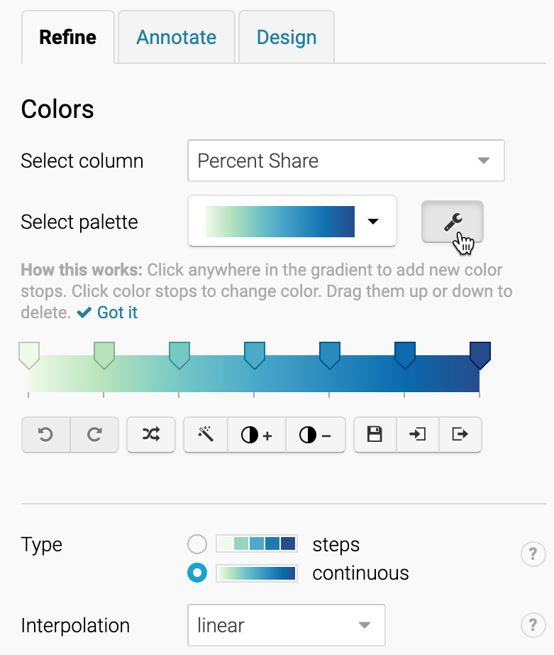
In the Visualize screen, in the Colors section of the Refine tab Select palette, click the wrench symbol to open up the color settings, as shown in Figure 14.11. Let’s skip past the light-green-to-blue color palette, which you can modify later, and let’s focus on settings for color ranges.

Figure 14.11: Click the wrench symbol to open the color settings.
Modify the map color ranges
While we never blindly accept the default visualization, it’s a good place to begin. The default map displays a continuous type of range, with a linear interpolation of data values. This means that the map places all of the values in a straight line, from the minimum of 5% to the maximum of 31%, and assigns each value to a color along the gradient, as shown in Figure 14.12. Notice that the US (20.5%) blends in with a medium blue color, just above the midpoint in this range.
Figure 14.12: Income inequality map with continuous range and linear interpolation. Explore the interactive version.
Create a second map with the same data but different settings. Change the Type setting to steps, and adjust to 3 steps, using Natural breaks (Jenks) interpolation, as shown in Figure 14.13. This means that the map now places all of the values in three ascending groups. Natural breaks offers a compromise between using colors to highlight the outliers versus diversity inside the range. Notice that the US (still 20.5%) now stands out in a dark blue color at the top third of this range (19% or above).
Figure 14.13: Income inequality map with 3 steps and natural breaks interpolation. Explore the interactive version.
The first map portrays US income inequality to be similar to most nations, while the second map places the US at the higher end of the color scale. Which map is misleading? Which one is truthful? If you prefer clear and definitive rules in map design, this answer may frustrate you. Although the two maps generate very different impressions in our eyes, both maps present accurate data that is clearly labeled, based on reasonable and truthful interpretations of the data.
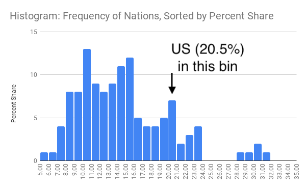
To understand what’s happening behind the scenes with your choropleth map, visualization expert Alberto Cairo recommends creating a histogram to better understand the data distribution. Go back to the data in the Google Sheet and create a histogram, as we described in chapter 7 to view the frequency of nations when sorted by percent share into “buckets”, as shown in Figure 14.14. While most nations are clumped around the median, this is not a normal distribution curve, because a handful are outliers near the 30 percent mark. In the first map, which used continuous type and linear interpolation, the US appeared closer to the median and blended in with a medium blue. By contrast, the second map used 3 steps and natural breaks, which meant that the US appeared in the top range and stood out in dark blue.

Figure 14.14: Histogram of income inequality map data.
So how should we make decisions when designing choropleth maps? Similar to the chart section, there are few universal rules, but several wise recommendations. First and foremost, always look for better ways to use map color ranges to show true and meaningful differences in the data, rather than hiding them out of sight. Datawrapper Academy recommends finding “a compromise between honesty and usefulness” when creating choropleth maps. In other words, tell the truth when displaying evidence and use design choices to emphasize an interpretation that calls our attention to what’s most important in the data story. For example, a linear interpolation works best to emphasize extreme lows and highs, while quantiles or other non-linear groupings reveal more geographic diversity in the middle ranges. Datawrapper Academy also recommends using a continuous color palette to show nuances in the data, unless your data story has a compelling reason to display discrete steps to emphasize regions above or below certain thresholds. If you choose steps, increasing the number of steps will display more contrast in your map, but too many steps can give the mistaken impression that light- and dark-colored regions are very different, when in fact their numbers may vary only slightly. Whatever you decide, avoid the temptation to manually adjust a map’s settings in ways that manipulate its appearance to fit a preconceived point of view. In sum, show us a story and tell the truth. You may need to create several maps with different settings to decide which one is the best compromise.
Now that you have a clearer idea of how to lie with charts and maps, let’s examine a related topic: recognizing and reducing data bias.
Monmonier, How to Lie with Maps, Third Edition.↩︎