#StandWithUkraine - Stop the Russian invasion
Join us and donate. Since 2022 we have contributed over $5,000 in book royalties to Save Life in Ukraine & Ukraine Humanitarian Appeal & The HALO Trust, and we will continue to give!
Normalize Choropleth Map Data
We introduced the concept of normalizing data in Chapter 5: Make Meaningful Comparisons. Normalization means adjusting data that was collected using different scales into a common scale, in order to make more appropriate comparisons. For example, it makes little sense to compare the total number of Covid cases between nations with very different populations, such as 9.61 million cases in the United States (estimated population 328.2 million) and 0.49 million cases in Belgium (estimated population 11.5 million) as of November 6, 2020. A better strategy is to normalize the data by comparing cases per capita (such as 2,928 cases per 100,000 in the United States versus 4,260 per 100,000 in Belgium) to adjust for prior differences in population.
If you forget to normalize data for a choropleth map, and display raw counts rather than relative values (such as percentages or rates per capita), you’ll often end up recreating a meaningless map of population centers, rather than the phenomenon you’re trying to measure. you often end up showing population centers, instead of the phenomenon that you’re trying to measure. For example, compare two maps shown in Figure 7.14. They both are about Covid-19 cases in the continental US as of June 26, 2020. Figure 7.14a shows total number of recorded cases per state, and Figure 7.14b shows Covid-19 cases adjusted by the state’s population. Darker colors represent higher values. Do you notice any differences in spatial patterns?
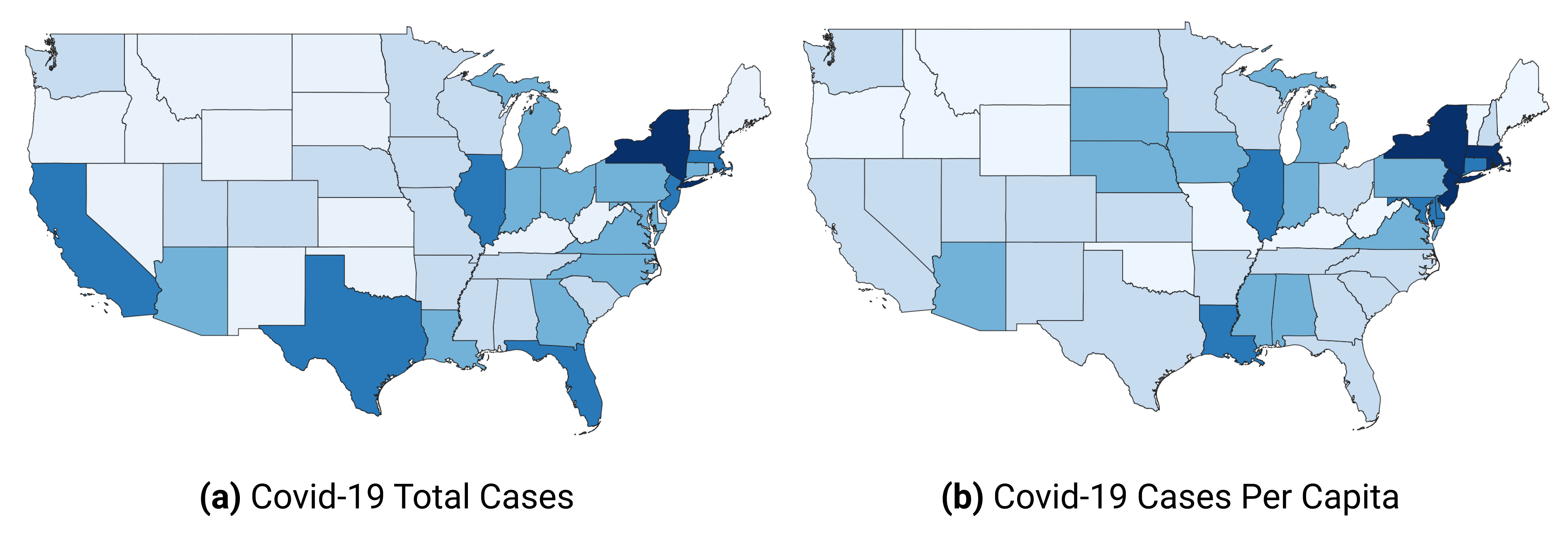
Figure 7.14: Choropleth maps work best with normalized values.
Both maps show Covid-19 data collected by the New York Times and published on GitHub. In the map in Figure 7.14b, we normalized values by dividing the total number of cases by the population in each state, according to the 2018 US Census American Community Survey, the most recent data available on the day of writing. We did not add legends and other important cartographic elements so that you can better focus on interpreting spatial patterns. In both cases, we used Jenks natural breaks for classification.
What are the worst-hit states according to the map showing total Covid-19 counts (shown in Figure 7.14a)? If you are familiar with the US geography, you can quickly tell that these are New York, New Jersey, Massachusetts, Florida, Illinois, Texas, and California. But five of these happen to be some of the most populous states in the US, so it makes sense that they will also have higher Covid-19 cases.
Now, how about the map in Figure 7.14b? You can see that New York and its neighbors, including New Jersey and Massachusetts, have by far the highest rates per capita (per person), which we saw in the first map. But you can also see that in fact California, Texas, and Florida were impacted to a lesser extent than the map on the left had suggested. So the map with per-capita values is a much better illustration to the story about New York being the first epicenter of the Covid-19 crisis in the United States.
At this point, you should have a better idea of key principles and best practices in map design. Now that we’ve covered key concepts for interactive maps in general, and choropleth maps in particular, we will pivot to a series of hands-on tutorials with our recommended tools. Our first tutorial shows how to design a locator point map with a basic polygon area in Datawrapper. In our second tutorial, we will create a point map with custom icons in Google MyMaps to show information about specific locations with pop-up windows. In our final tutorial, we will build a symbol point map in Datawrapper that uses colored circles of varying sizes to represent population change for specific cities. Our final tutorials in this chapter will return to the topic of designing choropleth maps in Datawrapper and also in Tableau Public in order to compare these two tools.