#StandWithUkraine - Stop the Russian invasion
Join us and donate. Since 2022 we have contributed over $5,000 in book royalties to Save Life in Ukraine & Ukraine Humanitarian Appeal & The HALO Trust, and we will continue to give!
Datawrapper Table with Sparklines
In this section, you’ll learn how to create an interactive table with Datawrapper, the free online drag-and-drop visualization tool we previously introduced to create charts in Chapter 6 and maps in Chapter 7. You can start creating in Datawrapper right away in your browser, even without an account, but signing up for a free one will help you to keep your visualizations organized. Remember that you’ll probably still need a spreadsheet tool, such as Google Sheets, to compile and clean up data for large tables, but Datawrapper is the best tool to create and publish the interactive table online.
You’ll also learn how to create sparklines, or tiny line charts that quickly summarize data trends. This chart type was refined by Edward Tufte, a Yale professor and data visualization pioneer, who described sparklines as “datawords… intense, simple, word-sized graphics.”40 While Tufte envisioned sparklines on a static sheet of paper or PDF document, you’ll create them inside an interactive table, as shown in Figure 8.2. Readers can search by keyword, sort columns in ascending or descending order, and scroll through pages of sparklines to quickly identify data trends that would be difficult to spot in a traditional numbers-only table.
Figure 8.2: Table with sparklines. Explore the interactive version.
In this tutorial, you’ll create an interactive table with sparklines to visualize differences in life expectancy at birth from 1960 to 2018 for over 195 nations around the world. Overall, life expectancy gradually rises in most nations, but a few display “dips” that stand out in the tiny line charts. For example, Cambodia and Vietnam both experienced a significant decrease in life expectancy, which corresponds with the deadly wars and refugee crises in both nations from the late 1960s to the mid-1970s. Sparklines help us to visually detect patterns like these, which anyone can investigate further by downloading the raw data through the link at the bottom of the interactive table.
While it’s possible to present the same data in a filtered line chart as shown in Chapter 6, it would be difficult for readers to spot differences when shown over 180 lines at the same time. Likewise, it’s also possible to present this data in a choropleth map as shown in Chapter 7, though it would be hard for readers to identify data for nations with smaller geographies compared to larger ones. In this particular case, when we want readers to be able to search, sort, or scroll through sparklines for all nations, the best visualization is a good table.
To create your own interactive table with sparklines, follow this tutorial, which we adapted from Datawrapper training materials and their gallery of examples:
To simplify this tutorial, we downloaded life expectancy at birth from 1960 to 2018 by nation, in CSV format, from the World Bank, one of the open data repositories we listed in Chapter 3: Find and Question Your Data. In our spreadsheet, we cleaned up the data, such as removing nations with 5 or fewer years of data reported over a half-century, as described in the Notes tab in the Google Sheet. Using the XLookup spreadsheet method from Chapter 2, we merged in columns of two-letter nation codes and continents from Datawrapper. We also created two new columns: one named Life Expectancy 1960 (intentionally blank for the sparkline to come) and Difference (which calculates the difference between the earliest and the most recent year of data available, in most cases from 1960 to 2018). See the Notes tab in the Google Sheet for more details.
Go to Datawrapper, click on Start Creating, and select New Table in the top navigation. You are not required to sign in, but if you wish to save your work, we recommend that you create a free account.
In the first Upload Data tab, select Import Google Spreadsheet, paste in the web address of our cleaned-up Google Sheet, and click Proceed. Your Google Sheet must be shared so that others can view it.
Inspect the data in the Check and Describe tab. Make sure that the First row as label box is checked, then click Proceed.
In the Visualize screen, under Customize Table, check two additional boxes: Make Searchable (so that users can search for nations by keyword) and Stripe Table (to make lines more readable).
Let’s use a special Datawrapper code to display tiny flags before each country’s name. In the Nation column, each entry begins with a two-letter country code, surrounded by colons, followed by the country name, such as
:af: Afghanistan. We created the Nation column according to the Combine Data into One Column section of Chapter 4: Clean Up Messy Data.
Note: To learn more about flag icons, read the Datawrapper post on this topic and their list of country codes and flags on GitHub.
- In the Visualize screen, under Customize columns, select the third line named Nation. Then scroll down and push the slider to Replace country codes with flags, as shown in Figure 8.3.
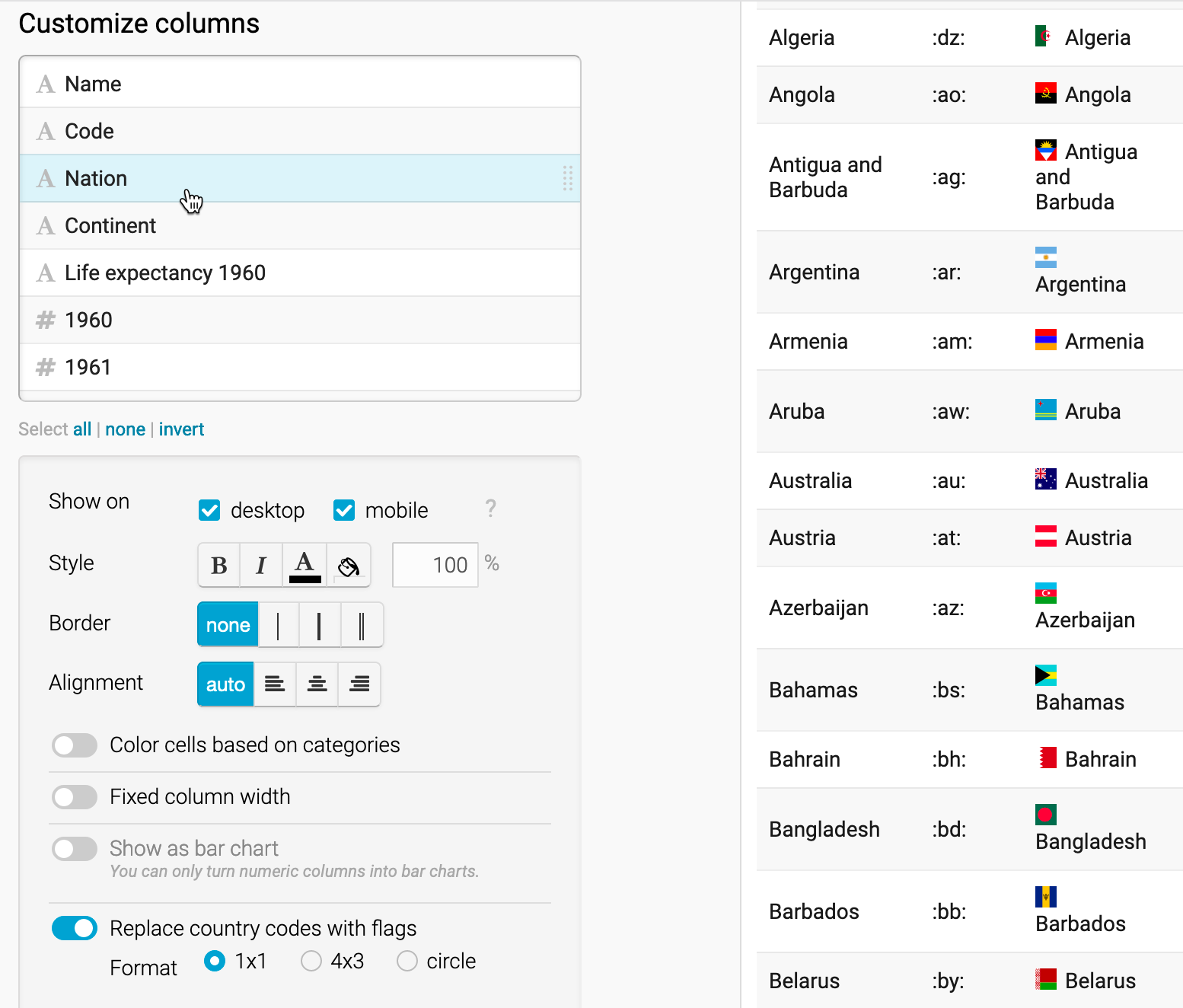
Figure 8.3: Customize the Nation column and push slider to replace codes with flags.
Let’s hide the first two columns, since they’re no longer necessary to display. In the Visualize screen under Customize columns, select the Name column, then scroll down and un-check the boxes to Show on desktop and mobile. Repeat this step for the Code column. A “not visible” symbol (an eye with a slash through it) appears next to each customized column to remind us that we’ve hidden it.
Now let’s color-code the Continent column to make it easier for readers to sort by category it in the interactive table. In the Visualize screen under Customize columns, select the Continent column, then scroll down and push the slider to select Color cells based on categories. In the drop-down menu, select the column Continent, and click on the Background: customize colors button. Select each continent and assign them different colors, as shown in Figure 8.4.
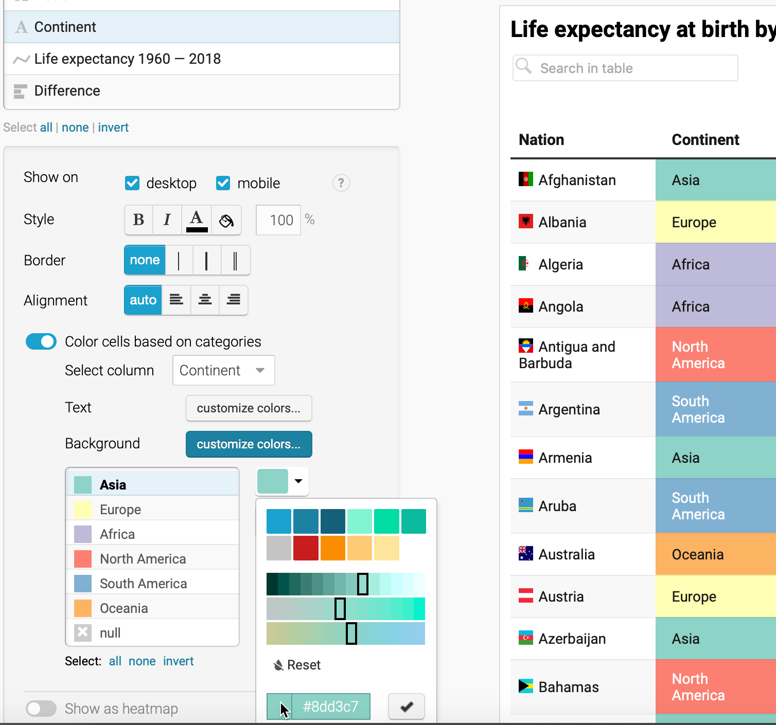
Figure 8.4: Customize the Continent column and push slider to color cells based on categories.
Tip: To choose colors for the six continents, we used the ColorBrewer design tool as described in Chapter 7, and selected a 6-class qualitative scheme. Although this tool is designed primarily for choropleth maps, you can also use it to choose table and chart colors.
- Now let’s prepare our data to add sparklines, or tiny line charts, to visually represent change in the Life expectancy 1960 column, which we intentionally left blank for this step. Before you begin, you must change this column from textual data (represented by the A symbol in the Customize columns window) to numerical data (represented by the # symbol). At the top of the screen, click on the 2. Check and Describe arrow to go back a step. (Datawrapper will save your work.) Now click on the table header to edit the properties for column E: Life Expectancy 1960. On the left side, use the drop-down menu to change its properties from auto (text) to Number, as shown in Figure 8.5. Then click Proceed to return to the Visualize window.
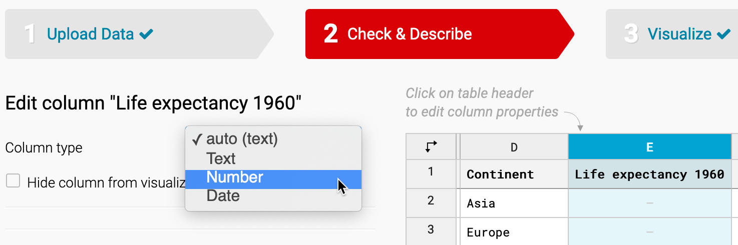
Figure 8.5: Go back to Check & Describe to change the properties of column E from textual to numerical data.
- To create the sparklines, in the Visualize screen under Customize columns, select all of the columns from Life expectancy 1960 down to 2018. To select all at once, click on one column, then scroll down and shift-click on the next-to-last column. Then scroll down the page and click the Show selected columns as tiny chart button, as shown in Figure 8.6. These steps will create the sparklines in the column and automatically rename it to Life expectancy 1960–2018, as shown in Figure 8.7.
Tip: By design, we initially named this column Life expectancy 1960, because when we selected several columns to create sparklines, the tool added –2018 to the end of the new column name.
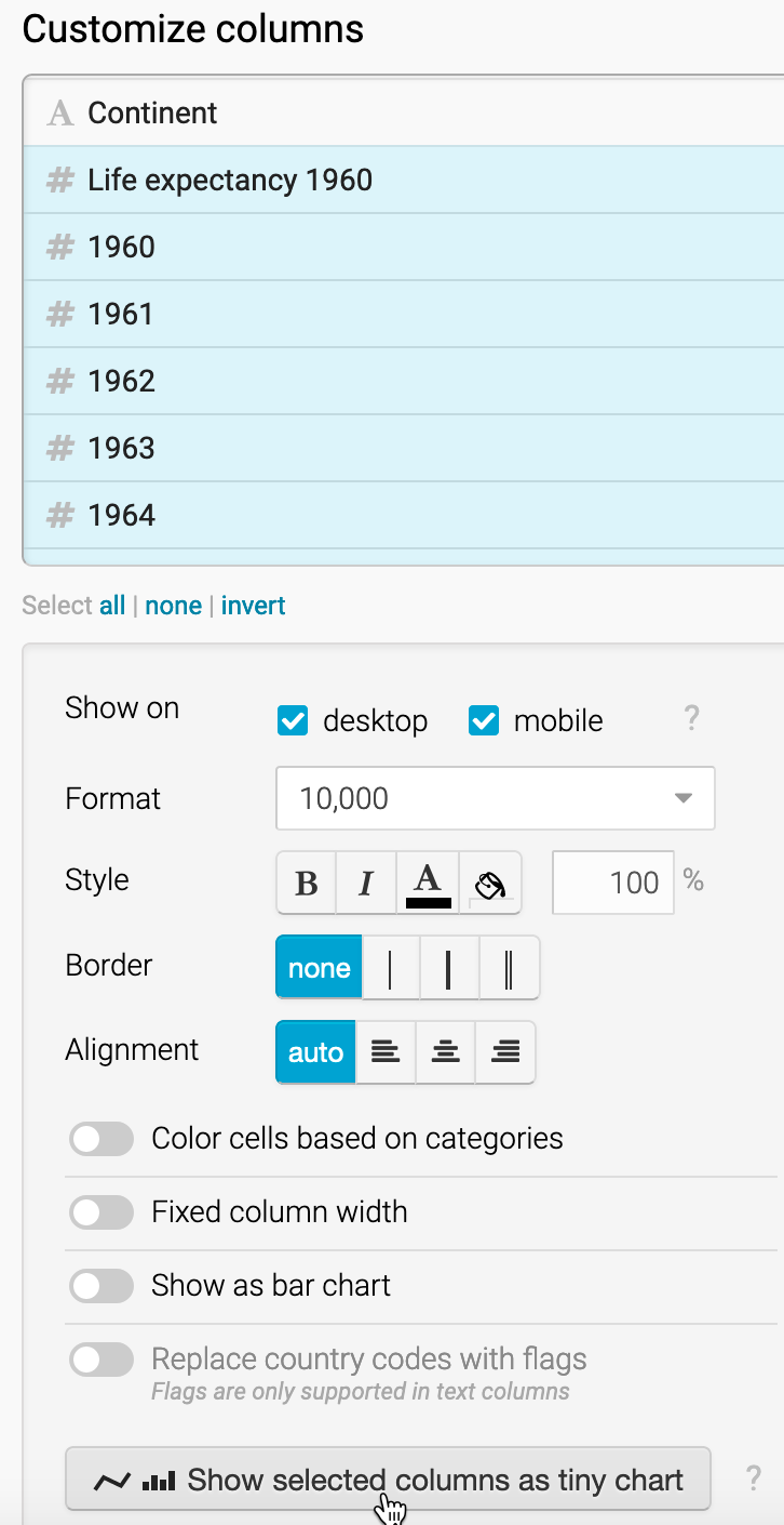
Figure 8.6: Shift-click to select all columns from Life expectancy 1960–2018 down to 2018, then click on Show selected columns as tiny chart.
- Let’s add one more visual element: a bar chart to visually represent the Difference column in the table. In the Visualize screen under Customize columns, select Difference. Then scroll down and push the slider to select Show as bar chart, as shown in Figure 8.7. Also, select a different bar color, such as black, to distinguish it from the continent colors.
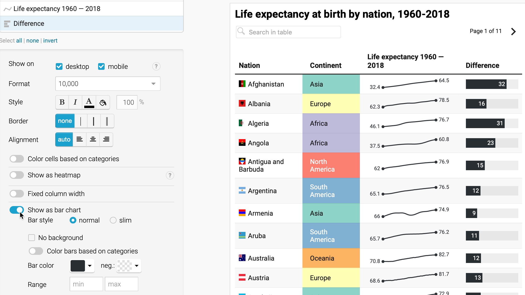
Figure 8.7: Select the Difference column and Show as bar chart.
In the Visualize screen, click the Annotate tab to add a title, data source, and byline.
Click on Publish & Embed to share the link to your interactive table, as previously shown in Figure 8.2. If you logged into your free Datawrapper account, your work is automatically saved online in the My Charts menu in the top-right corner of the screen. Also, you can click the blue Publish button to generate the code to embed your interactive chart on your website, as you’ll learn about in Chapter 9: Embed on the Web. In addition, you can add your chart to River if you wish to share your work more widely by allowing other Datawrapper users to adapt and reuse your chart. Furthermore, scroll all the way down and click the Download PNG button to export a static image of your chart. Additional exporting and publishing options require a paid Datawrapper account. Or, if you prefer not to create an account, you can enter your email to receive the embed code.
To learn more, we highly recommend the Datawrapper Academy support pages, the extensive gallery of examples, and well-designed training materials.
Edward R. Tufte, Beautiful Evidence (Graphics Press, 2006), http://books.google.com/books?isbn=0961392177, pp. 46-63.↩︎