#StandWithUkraine - Stop the Russian invasion
Join us and donate. Since 2022 we have contributed over $5,000 in book royalties to Save Life in Ukraine & Ukraine Humanitarian Appeal & The HALO Trust, and we will continue to give!
Recognize Bad Data
When your data search produces some results, another key step is to open the file, quickly scroll through the content, and look for any warning signs that it might contain “bad data.” If you fail to catch a problem in your data at an early stage, it could lead to false conclusions and diminish the credibility of all of your work. Fortunately, members of the data visualization community have shared multiple examples of problems we’ve previously encountered, to help save newer members from making the same embarrassing mistakes. One popular crowd-sourced compilation by data journalists was The Quartz Guide to Bad Data. Watch out for spreadsheets containing these “bad data” warning signs:
- Missing values: If you see blank or “null” entries, does that mean data was not collected? Or maybe a respondent did not answer? If you’re unsure, find out from the data creator. Also beware when humans enter a
0or-1to represent a missing value, without thinking about its consequences on running spreadsheet calculations, such as SUM or AVERAGE. - Missing leading zeros: One of the zip codes for Hartford, Connecticut is
06106. If someone converts a column of zip codes to numerical data, it will strip out the leading zero and appear as6106. Similarly, the US Census Bureau lists every place using a FIPS code, and some of these also begin with a meaningful zero character. For example, the FIPS code for Los Angeles County, California is037, but if someone accidentally converts a column of text to numbers, it will strip out the leading zero and convert that FIPS code to37, which may break some functions that rely on this code being a 3-digit number, or may make some people interpret it as a 2-digit state code for North Carolina instead. - 65536 rows or 255 columns: These are the maximum number of rows supported by older-style Excel spreadsheets, or columns supported by Apple Numbers spreadsheet, respectively. If your spreadsheet stops exactly at either of these limits, you probably have only partial data. As we wrote this, the BBC reported that Public Health England lost thousands of Covid test results due to this row limit in older Excel spreadsheets.
- Inconsistent date formats: For example, November 3rd, 2020 is commonly entered in spreadsheets in the US as
11/3/2020(month-day-year), while people in other locations around the globe commonly type it as3/11/2020(day-month-year). Check your source. - Dates such as January 1st 1900, 1904, or 1970: These are default timestamps in Excel spreadsheets and Unix operating systems, which may indicate the actual date was blank or overwritten.
- Dates similar to
43891: When you typeMarch 1during the year 2020 into Microsoft Excel, it automatically displays as1-Mar, but is saved using Excel’s internal date system as43891. If someone converts this column from date to text format, you’ll see Excel’s 5-digit number, not the dates you’re expecting.
Other ways to review the quality of data entry in any spreadsheet column are to sort or pivot the data as described in Chapter 2, or to create a histogram as you will learn in Chapter 6. These methods enable you to quickly inspect the range of values that appear in a column and to help you identify bad data.
Also beware of bad data due to poor geocoding, when locations have been translated into latitude and longitude coordinates that cannot be trusted. For example, visualization expert Alberto Cairo describes how data appeared to show that Kansas residents viewed more online pornography than other US states. But on closer examination, the internet protocol (IP) addresses of many viewers could not be accurately geocoded, perhaps because they sought to maintain their privacy by using virtual private networks (VPN) to disguise their location. As a result, the geocoding tool automatically placed large numbers of users in the geographic center of the contiguous US, which happens to be in Kansas.18 Similarly, when global data is poorly geocoded, the population booms on imaginary “Null Island,” which is actually a weather buoy located in the Atlantic Ocean at the intersection of the prime meridian and the equator, where the latitude and longitude coordinates are 0,0. For these reasons, carefully inspect geocoded data for errors caused by tools that mistakenly place results in the exact center of your geography, as shown in Figure 3.4.
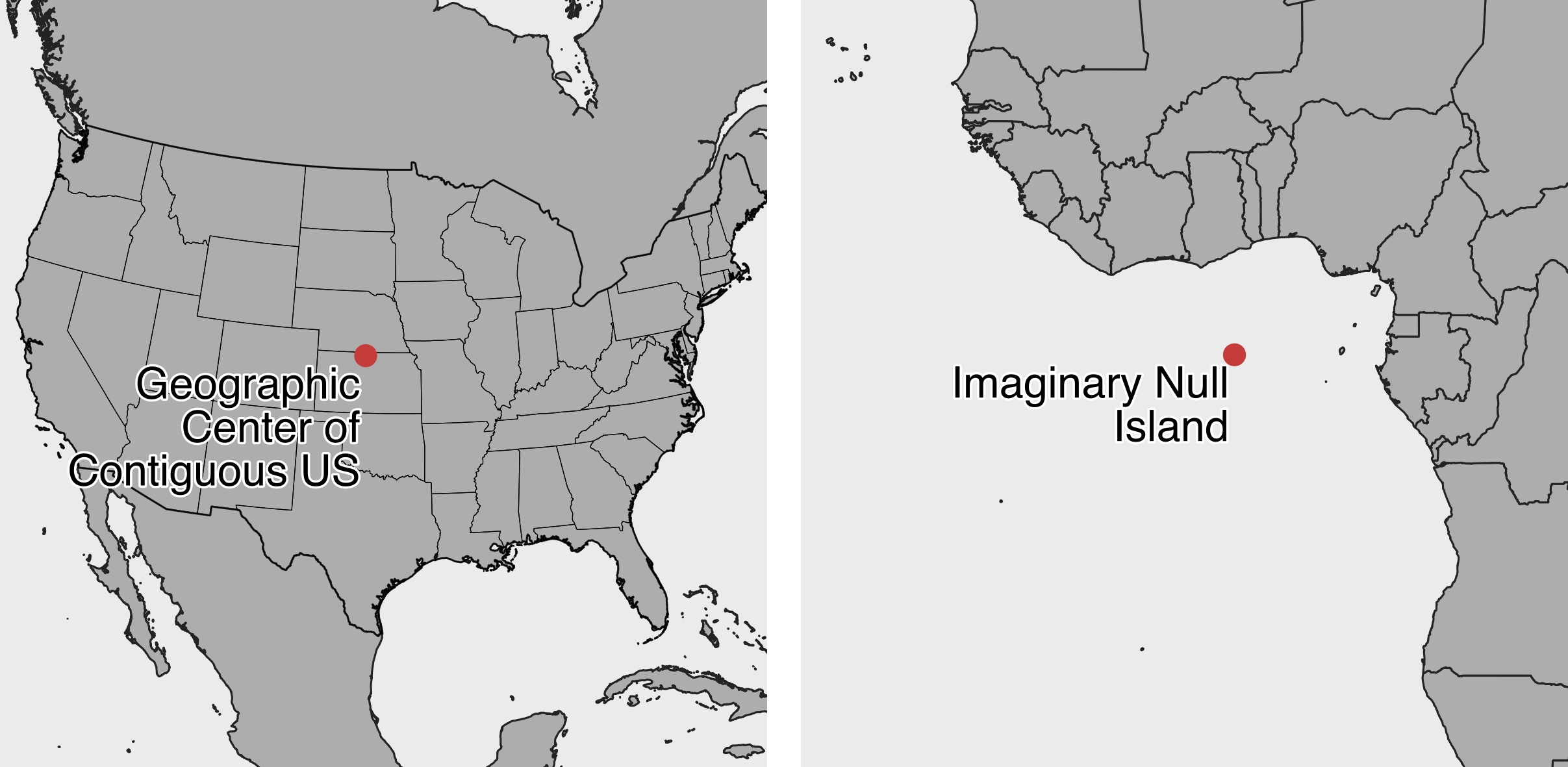
Figure 3.4: Beware of bad geocoding that automatically places data in the geographic center of the contiguous United States (in northern Kansas), or on imaginary Null Island in the Atlantic Ocean (the location of coordinates 0,0).
What should you do when you discover bad data in your project? Sometimes small issues are relatively straightforward and do not call into question the integrity of the entire dataset. Sometimes you can fix these using methods we describe in Chapter 4: Clean Up Messy Data. But larger issues can be more problematic. Follow the source of your data stream to try to identify where the issue began. If you cannot find and fix the issue on your own, contact the data provider to ask for their input, since they should have a strong interest in improving the quality of the data. If they cannot resolve an important data issue, then you need to pause and think carefully. In this case, is it wiser to continue working with problematic data and add a cautionary note to readers, or should you stop using the dataset entirely and call attention to its underlying problem? These are not easy decisions, and you should ask for opinions from colleagues. In any case, never ignore the warning signs of bad data.
Finally, you can help to prevent bad data from occurring by following key steps we’ve outlined above. Give meaningful names to your data files, and add source notes in a separate tab about when and where you obtained it, along with any definitions or details about what it claims to measure and how it was recorded. Explain what any blanks or null values mean, and avoid replacing those with zeroes or other symbols. Always watch out for formatting issues when entering data or running calculations in spreadsheets.
In the next section, you’ll learn more questions to help you understand your data at a deeper level.
Cairo, How Charts Lie, 2019, pp. 99-102↩︎