#StandWithUkraine - Stop the Russian invasion
Join us and donate. Since 2022 we have contributed over $5,000 in book royalties to Save Life in Ukraine & Ukraine Humanitarian Appeal & The HALO Trust, and we will continue to give!
Current Map with Socrata Open Data
This type of map shows current data because it continuously pulls the most up-to-date from an open data repository, which you learned about in chapter 3. The advantage of creating visualizations directly on an open data platform is that your chart or map is directly linked to the source. Some government agencies frequently update selected open data repositories where current information matters, such as fire or police calls, property data, or public finances. Whenever an administrator revises the contents of an open data repository, your chart or map will automatically display the most current information. However, if the government agency stops updating the repository or switches to a different platform, your visualization will no longer show current information or it may break entirely.
Socrata is a company that provides an open data repository service that many government agencies use to make open data available to the public. It offers user-friendly ways to view, filter, and export data. In addition, the Socrata platform includes built-in support to create interactive charts and maps, which can be embedded in other websites (including your own). You can search for publicly-available datasets on Socrata’s Open Data Network.
In this section, we will build an interactive point map of fatal crashes involving cars in New York City, which continuously updates to display points over the past 365 days, as shown in Figure 7.69. Our interactive map pulls data from the Motor Vehicle Collisions - Crashes public repository on New York City’s OpenData Portal, based on the Socrata platform. As long as government administrators continue to update this dataset on this platform, your map should always display the most recent data for the past 12 months.
Figure 7.69: Map of fatal crashes in NYC during the past year, continuously updated from a Socrata open data repository. See interactive version.
To build your own continuously-updated point map with this Socrata open data repository, follow this tutorial. Anyone can create a map using public data hosted by Socrata, but you need to be a registered Socrata user in order to save and share your map. Only datasets that have a special location column can be mapped, which is different from traditional location columns (such as Address or City) that you see in the dataset. Consider reaching out to dataset administrators if datasets you wish to map are missing geocoded locations.
Register for your account on the NYC OpenData by clicking the Sign In button in the upper-right corner. Where it says “Don’t have an account yet? Sign Up”, proceed to sign up. Follow the instructions, including confirming that you are not a robot, and accepting the License Agreement to create your free account. This account, including your username and password, are valid for NYC OpenData portal, but not other websites that use Socrata.
Navigate to the Motor Vehicle Collisions - Crashes dataset. In the menu on the right-hand side choose Visualize > Launch New Visualization, as shown in Figure 7.70. This will open a Configure Visualization studio where you can create the map.
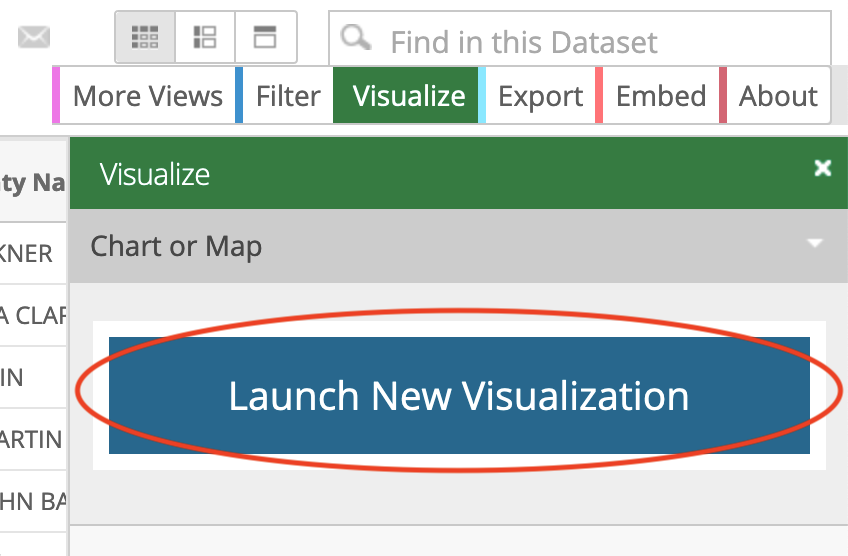
Figure 7.70: Go to Visualize > Launch New Visualization.
- In the top menu, select Map (the globe icon between a scatter chart icon and a calendar) as the visualization type. In a few seconds a basemap will appear, with Map Layers and Map Settings items in the side menu on the left, as shown in Figure 7.71.
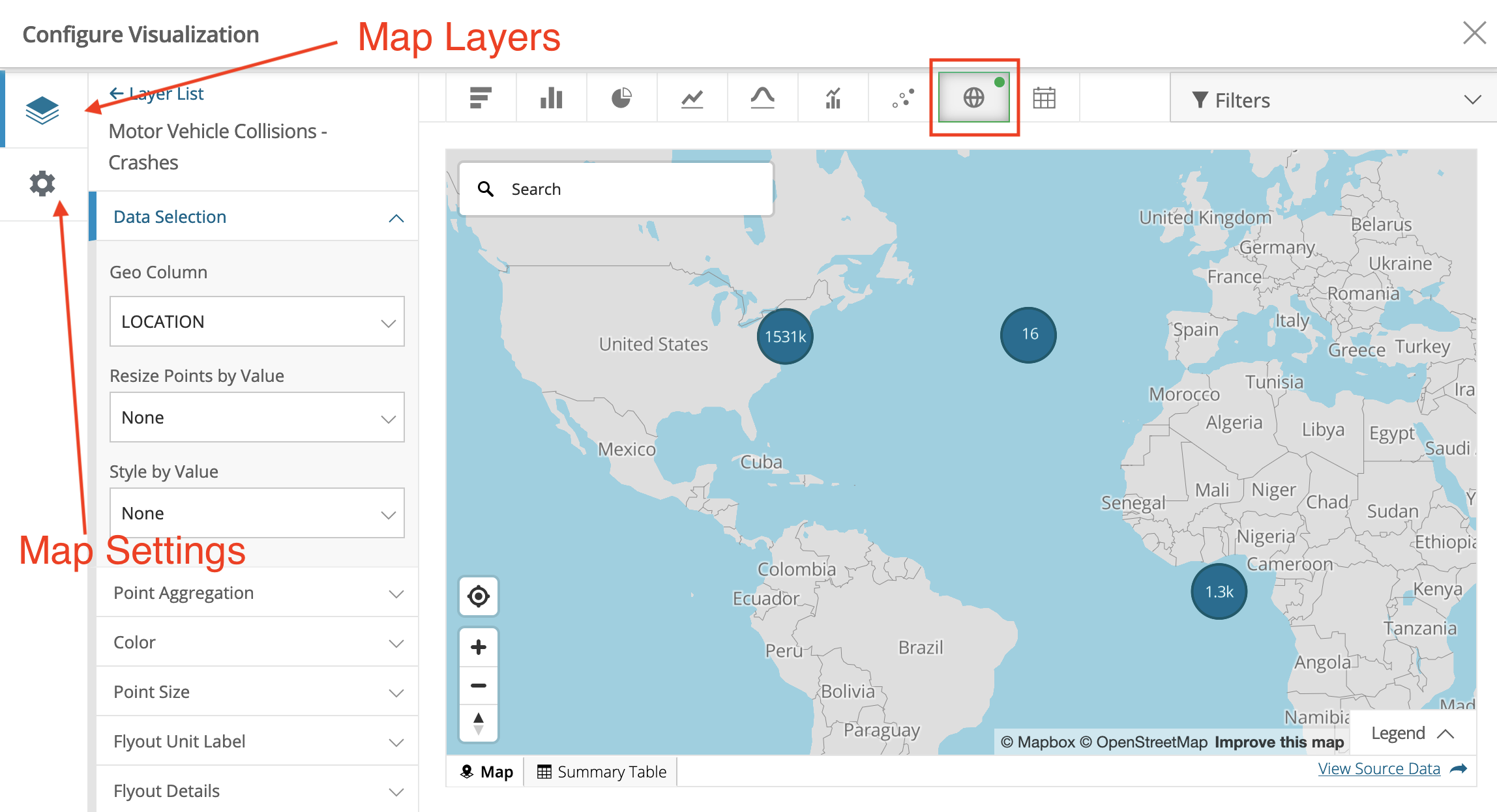
Figure 7.71: Your studio should look similar to this once you choose Map as the visualization type.
Socrata was able to determine which column contains geospatial value, and automatically set the Geo Column value to LOCATION (see Layer List > Data Selection). By default, points are clustered together. That’s why instead of individual crashes you see bubbles with numbers, which represent how many points are clustered in that bubble. Clusters will change when you zoom in and out.
We need to limit our map to display only crashes with fatalities. In the upper-right corner, click Filters > Add filter. The dropdown menu lists all columns (or fields) of the dataset, where you should choose NUMBER OF PERSONS KILLED. In the newly appeared dropdown, choose Is greater than, and set the value to 0, as shown in Figure 7.72. Alternatively you can set it to Is greater than or equal to, and set the value to 1.
We need to clean up the data. Zoom out and you’ll notice that not all crashes were geocoded properly. Several appear on the imaginary Null Island in the Atlantic Ocean, where the latitude and longitude are both 0. You learned how to recognize and deal with bad data in chapter 4. To remove many of these incorrectly geocoded crashes, let’s add another filter on LATITUDE column and set it to Is greater than with the value of 0. This way we show crashes located in the northern hemisphere, north of the Null Island, where New York City is located. After you correctly set both filters , the map will fly over and focus on New York City. If you wish, you can continue to clean up the data by adding more filters.
Instead of showing all recorded crashes since 2012, let’s display crashes that happened over the past year, to be updated continuously. Add a third filter for CRASH DATE column, and set it to Relative Date > Custom > Last 365 day(s). You will see a lot of points disappearing from the map as they don’t fall in the selected dates range. You can now close Filters window to free up screen space.
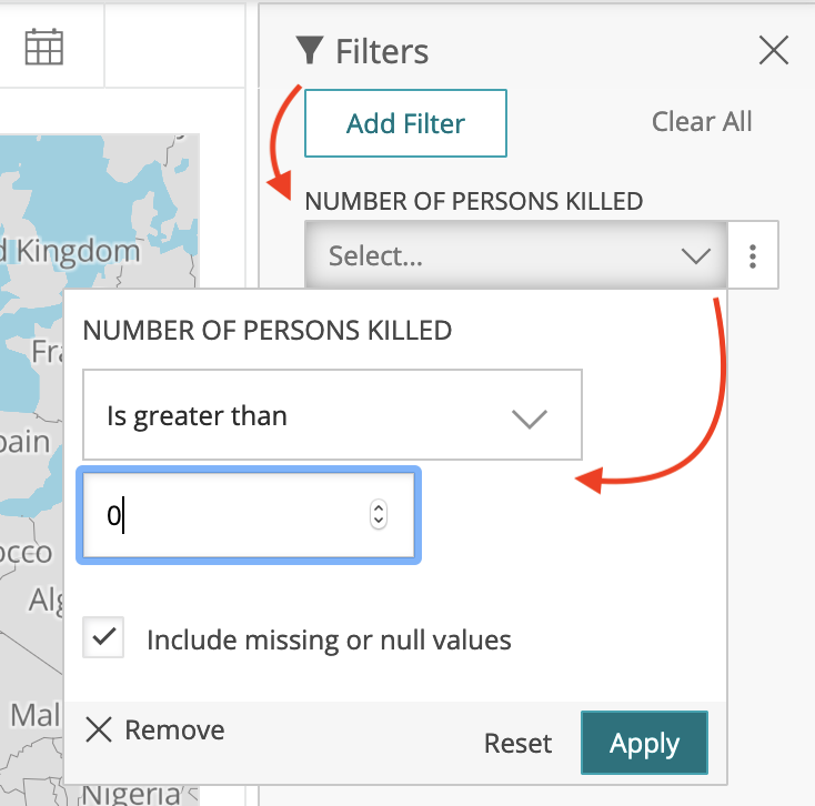
Figure 7.72: Add filters for number of persons killed (>0), location (latitude > 0), and date (last 365 days).
- Let’s ensure that crash locations appear as individual points and are never clustered together. Go to Map Settings > Clusters, and bring the Stop Clustering at Zoom Level slider to 1, as shown in Figure 7.73. You should now see individual crash locations at all zoom levels.
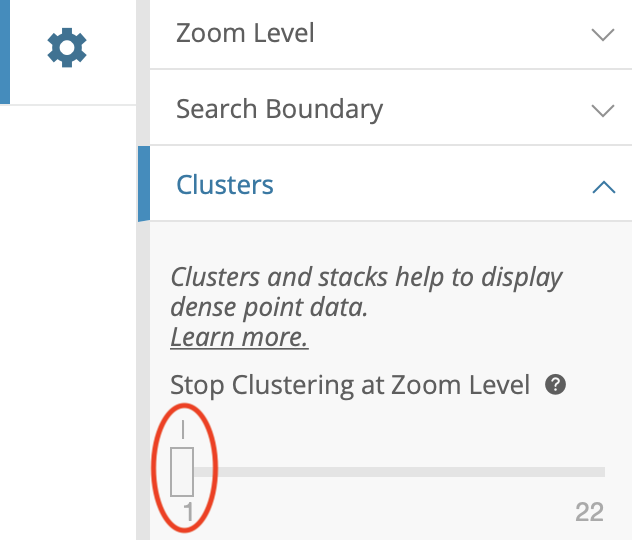
Figure 7.73: To always show individual points instead of clusters, set Stop Clustering at Zoom Level to 1.
In the same accordion menu, change Basemap > Type from default Basic to Dark to give points maximum visibility, and to give the map a more fashionable look. In General, set Title to Fatal Crashes in New York City, Last 365 Days, and hide data table below the map by unchecking the Show data table below visualization box. Under Map Controls, uncheck Show Locate Button as it is only relevant for those accessing the map from NYC. Under Legend Options, uncheck Show Legend. Feel free to experiment with other settings.
Finally, let’s create meaningful tooltips for points. Return back to the Map Layers menu and choose our Motor Vehicle Collisions - Crashes point layer. To change what is shown in tooltips when you hover or click on points, navigate to Flyout Details, and set Flyout Title to ON STREET NAME, adding CRASH DATE, CRASH DATE, NUMBER OF PERSONS INJURED, and NUMBER OF PERSONS KILLED as additional flyout values, as shown in Figure 7.74.
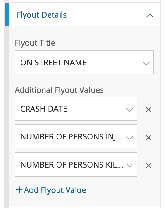
Figure 7.74: To edit tooltip information, use the Flyout Details menu item.
There are more more ways to modify the map that we will not demonstrate in this tutorial. For example, you could use Resize Points by Value functionality in the Data Selection menu to transform your point map into a symbol map, where larger circles represent larger numeric values (such as more people injured in a crash). You can also visualize textual categorical data, such as that stored in CONTRIBUTING FACTOR VEHICLE 1 column of the dataset (with values such as: passing too closely, driver inexperience, etc.), by applying Style by Value functionality to use different colors for different crash categories.
At this point you should have a functional interactive point map that continuously updates to show fatal crashes in New York City in the past 365 days, and it should continue to work as long as administrators continue to update the database on this platform. Before you can share the map with others, you need to save it as a draft, and publish.
- In the lower-right corner, click Save Draft button. Give your map a name (which is different from map’s title that users will see), and hit Save. The gray ribbon at the top will tell you it is still a draft. When you are ready to make it public, go ahead and hit Publish….
Now you can embed the map on your website as an iframe. To do so, click the Share button in the upper-right side of your map (see Figure 7.75), and copy the generated code from Embed Code text area (Figure 7.76). We will talk about embedding visualizations in detail in Chapter 9: Embed on the Web.
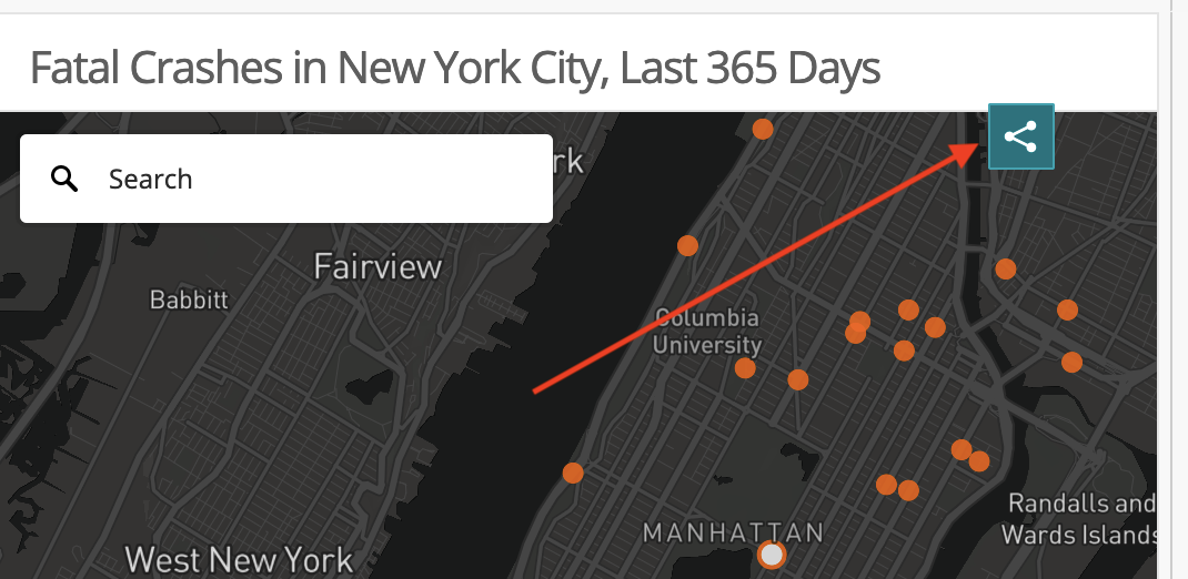
Figure 7.75: Click Share button to bring up Share and Embed window.
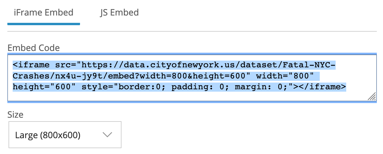
Figure 7.76: Copy iframe code to embed this map in another website.
There are limitations to creating your chart or map on an open data repository platform. First, if the agency stops using the platform, or changes the structure of the underlying data, your online map (or chart) may stop functioning. In fact, we had to rewrite this tutorial when it referred to a different Socrata platform that administrators stopped supporting. Second, you are limited to using datasets and geographic boundaries that exist on that platform. If these limitations concern you, a simple alternative is to export data from the open repository (which means that any “live” data would become “static”), and import it into your preferred data visualization tool, such as Datawrapper, Google Sheets, or Tableau. A second, more advanced alternative, is to learn to pull live data from Socrata using an API (Application Programming Interface), as described in the Leaflet Maps with Open Data APIs tutorial in Chapter 12.
Summary
In this chapter, we reviewed map design principles and explored recommended tools and tutorials for telling different types of data stories. When creating maps, think carefully about whether you are working with point or polygon data, the two most common options. If the latter, remember that well-designed choropleth maps required normalized data and careful thought about color intervals.
We only scratched the surface and showed simple examples to help you quickly create some sample maps. See more advanced designs using Leaflet map code templates in Chapter 12, and how to find and transform geospatial data in Chapter 13