#StandWithUkraine - Stop the Russian invasion
Join us and donate. Since 2022 we have contributed over $5,000 in book royalties to Save Life in Ukraine & Ukraine Humanitarian Appeal & The HALO Trust, and we will continue to give!
Acknowledge Sources & Uncertainty
Since our goal is to tell data stories that are meaningful and true, build credibility into your work, which you can do in several ways:
First, always represent data truthfully. Do not hide or obscure relevant evidence, and avoid visualization methods that might mislead your audience, as we discussed in Chapter 14 on detecting lies and reducing bias. We place our trust in you to fairly interpret the meaning of the data. Warn us if we’re in danger of reading too much into the data, or misinterpreting it by seeing something that isn’t really there.
Second, credit and source your data origins, as we described in Chapter 3: Find and Question Your Data. Some of the visualization tools and templates featured in this book make it easy to display links to online sources, so use that feature whenever feasible. When it’s not, then write these important details into the text that accompanies your tables, charts, and maps. Also, let audiences know who created the visualization, and credit collaborators and other people who assisted in your work.
Third, save and show your data work at different stages of the process. Save notes and copies of the data as you download, clean, or transform it, and document the important decisions you make along the way. One simple method is to save different versions of your data in separate spreadsheet tabs, as shown in Chapter 2. For more complex projects, consider sharing your data and documenting your methods in a public GitHub repository, as shown in chapter 10. If someone questions your work—or if you need to replicate it with updated dataset—you’ll be grateful to have notes that allow you to trace it backwards.
Finally, acknowledge the limitations of your data and disclose any uncertainty. Your work becomes more credible when you admit what you do not know or consider alternative interpretations. Some of our recommended chart tools in chapter 6 and chart code templates in chapter 11 allow you to insert error bars to show the confidence level in the data, so use those when appropriate. Furthermore, the two-column method shown in the prior section also works to visually distinguish between observed versus project data with solid versus dashed lines, as shown in the Google Sheets chart editor in Figure 15.6.
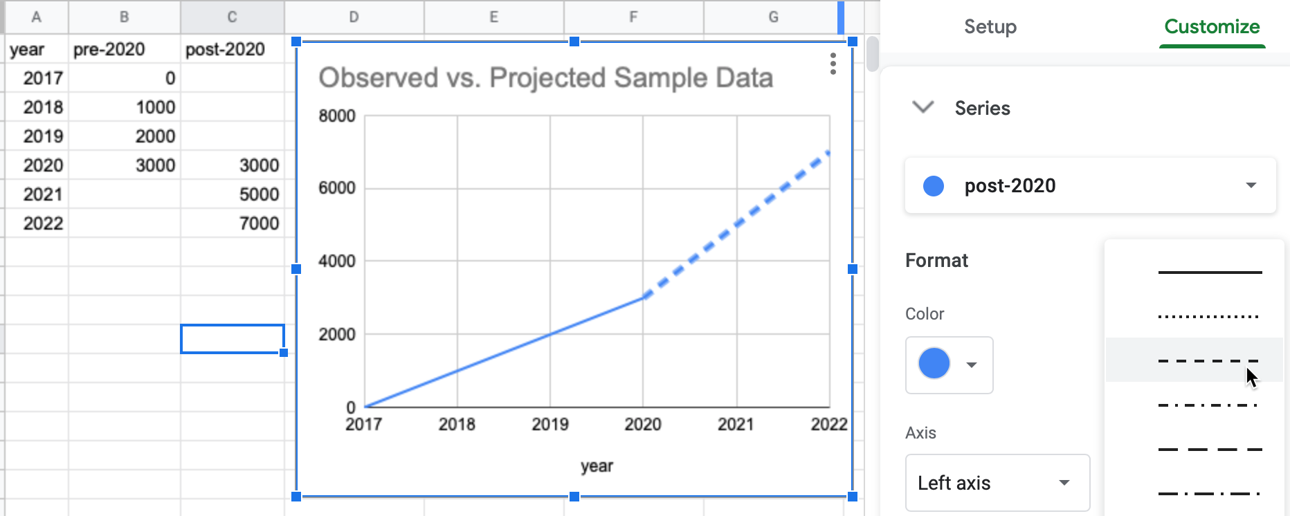
Figure 15.6: Split one data column into two columns to contrast observed data (solid line) versus projected data (dashed line).
Now that we’ve reviewed ways to build credibility in your work, let’s move on to decisions you’ll need to make about telling your data story in different formats.