#StandWithUkraine - Stop the Russian invasion
Join us and donate. Since 2022 we have contributed over $5,000 in book royalties to Save Life in Ukraine & Ukraine Humanitarian Appeal & The HALO Trust, and we will continue to give!
- Range Charts
A range chart, which can be classed as a specific type of a dot chart, emphasizes gaps between data points, and is often used to highlight inequalities. In this tutorial, we will use Datawrapper to build a range chart about the US gender pay gap. The chart compares the median earnings of American men and women by education level, according to the 2019 American Community Survey, as shown in Figure 6.40. We were inspired by the Datawrapper Academy range plot tutorial and created our version using more recent data. Overall, the range chart shows how men, on average, earn more than women at all education levels. In fact, an average US man with a bachelor’s degree earns more than an average US woman with a graduate degree.
Figure 6.40: Range chart: Explore the interactive version. Data from US Census 2019 American Community Survey.
To build this range chart, we organized the data as shown in Figure 6.41. The first column contains five educational attainment levels, from lowest (less than high school) to highest (graduate or professional degree). The second and third columns contain numeric values of median earnings for Men and Women respectively.
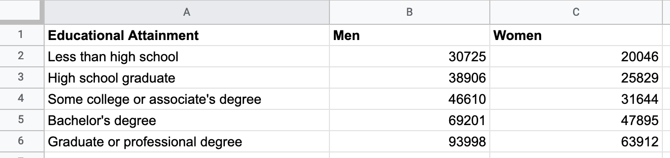
Figure 6.41: Organize your range chart data into three columns: labels, and values for both subgroups.
Since by now you should be familiar with Datawrapper, the steps to create a range chart are less detailed than in the previous tutorial on annotated line charts. If you get lost, see more detailed steps about Datawrapper charts in the section above.
Open the US Earnings by Gender by Education Level data in Google Sheets and go to File > Make a Copy to create your own version in your Google Drive.
Open Datawrapper in your browser and click Start Creating. We recommend that you create a free account to better manage your visualizations, but it’s not required.
In the Upload Data screen, click Import Google Spreadsheet and paste the link to the data in the shared Google Sheet above, then click Proceed. Alternatively, you can upload data by copying and pasting it into the data table window, or uploading an Excel or CSV file.
In the Check and Describe screen, inspect your data, then click Proceed.
In the Visualize screen, Datawrapper will attempt to guess the chart type you desire, based on the data format, but you will need to select Range Plot.
Click the Annotate tab near the top-left of the Visualize screen to add a meaningful title, data source, and byline credits.
Click the Refine tab of the Visualize screen to modify the range chart appearance. You have several options, but here’s the most important ones in this case. First, in the Labels section, change the visibility of the values from start to both, which places numbers at both ends of each range. Second, push the slider to Label first range, which places the word Men and Women above the first range. Third, change Number format to 123k, which will round dollar amounts to the nearest thousand, and replace thousands with a k as shown in Figure 6.42.
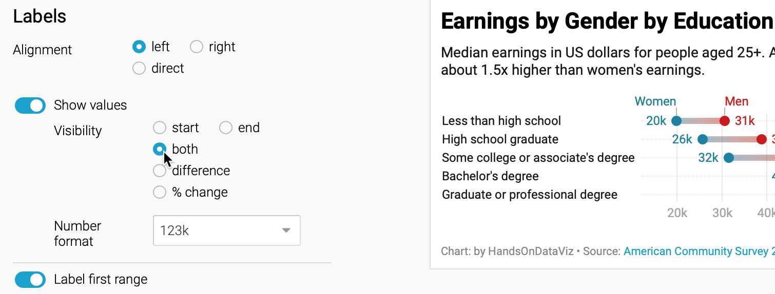
Figure 6.42: Modify the labels settings to show values at both ends of each range, and to place your data labels on your first range.
- Still in the Refine tab, scroll down to the Appearance section to improve the colors. Select the Range end drop-down menu to select a better color, such as red. Change the Range color setting to gradient to emphasize the range, as shown in Figure 6.43.
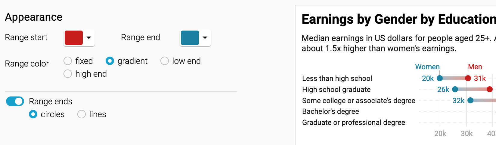
Figure 6.43: Modify the appearance settings to improve the color and add a gradient.
Tip: The Refine tab includes options to resort or group data rows, change the chart size for different devices, and check visibility for colorblind readers.
- After modifying your visualization, proceed to the Publish and Embed screen, and follow the prompts to share your work, or refer to the previous detailed Datawrapper tutorial.
Tip: You can also grant access to Datawrapper visualizations in shared folders with team members. First, go to Menu > My Teams > Create a Team to invite members. Second, go to Archive > Recently Edited to view Shared folders on the left margin, then drag a visualization into the folder to share it with those team members, as shown in Figure 6.44.
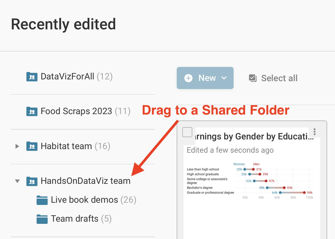
Figure 6.44: After creating a team or accepting an invitation to a team, drag a visualization into its shared folder to grant access to others.
Now that you’ve completed a range chart, let’s see how we can use Datawrapper to build scatter and bubble charts to show relationships between two or more variables.