#StandWithUkraine - Stop the Russian invasion
Join us and donate. Since 2022 we have contributed over $5,000 in book royalties to Save Life in Ukraine & Ukraine Humanitarian Appeal & The HALO Trust, and we will continue to give!
Map Design Principles
Much of the data collected today includes a spatial component that can be mapped. Whether you look up a city address or take a photo of a tree in the forest, both can be geocoded as points on a map. We also can draw lines and shapes to illustrate geographical boundaries of neighborhoods or nations, and color them to represent different values, such as population and income.
However, just because data can be mapped does not always mean it should be mapped. Before creating a map, stop and ask yourself: Does location really matter to your story? Even when your data includes geographic information, sometimes a chart tells your story better than a map. For example, you can clearly show differences between geographic areas in a bar chart, or trace how they rise and fall on different rates over time with a line chart, or compare two variables for each area in a scatter chart. Sometimes a simple table, or even text alone, communicates your point more effectively to your audience. Since creating a well-designed map requires time and energy, make sure it actually enhances your data story.
As you learned in the previous chapter about charts, data visualization is not a science, but comes with a set of principles and best practices that serve as a foundation for creating true and meaningful maps. In this section, we’ll identify a few rules about map design, but you may be surprised to learn that some rules are less rigid than others, and can be “broken” when necessary to emphasize a point, as long as you are honestly interpreting the data. To begin to understand the difference, let’s start by establishing a common vocabulary about maps by breaking one down into its elements.
Deconstructing a Map
Our book features how to create interactive web maps, also called tiled maps or slippy maps, because users can zoom into and pan around to explore map data layers on top of a seamless set of basemap tiles. Basemaps that display aerial photo imagery are known as raster tiles, while those that display pictorial images of streets and buildings are tiles that are built from vector data. Raster map data is limited by the resolution of the original image, which gets fuzzier as we get closer. By contrast, you can zoom in very close to vector map data without diminishing its visual quality, as shown in Figure 7.1. You’ll learn more about these concepts in the GeoJSON and Geospatial Data section of Chapter 13.
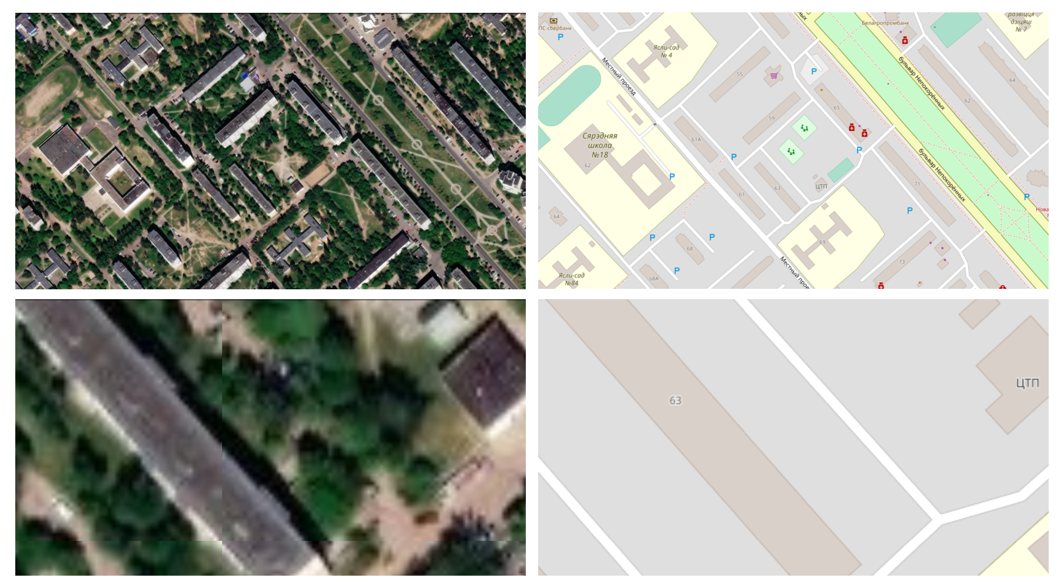
Figure 7.1: Raster map data from Esri World Imagery (on the left), and vector map data from OpenStreetMap (on the right), both showing Ilya’s childhood neighborhood in Mogilev, Belarus. Zooming into raster map data makes it fuzzier, while vector map data retains its sharpness.
Look at Figure 7.2 to learn about basic elements in the interactive maps you’ll create in this chapter. The top layer usually displays some combination of points, polylines, and polygons. Points show specific places, such as the street address of a home or business, sometimes with a location marker, and each point is represented by a pair of latitude and longitude coordinates. For example, 40.69, -74.04 marks the location of the Statue of Liberty in New York City. Polylines are connected strings of points, such as roads or transportation networks, and we place the “poly-” prefix before “lines” to remind us that they may contain multiple branches. Polygons are collections of lines that create a closed shape, such as building footprints, census tracts, or state or national boundaries. Since points, polylines, and polygons fundamentally consist of latitude and longitude coordinates, all of them are vector data.
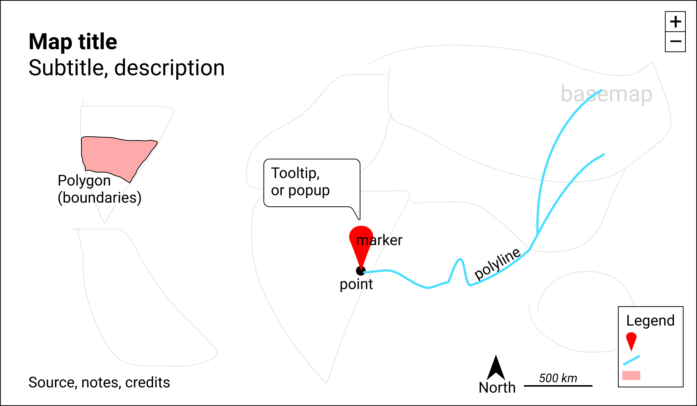
Figure 7.2: Key elements of an interactive map.
Interactive maps usually include zoom controls (+ and - buttons) to change the display of the basemap tiles and give the appearance of viewing the surface from different distances. Top-layer map data may display a hidden tooltip (when you hover the cursor over them) or a popup (when you click on them) that reveals additional information about its properties. Like a traditional static map, the legend identifies the meaning of symbols, shapes, and colors. Maps also may include a north arrow or scale to orient readers to direction and relative distance. Similar to a chart, good maps should include a title and brief description to provide context about what it shows, along with its data sources, clarifying notes, and credit to the individuals or organizations that helped to create them.
Clarify Point versus Polygon Data
Before you start to create a map, make sure you understand your data format and what it represents. Avoid novice mistakes by pausing to ask these questions. First, Can your data be mapped? Sometimes the information we collect has no geographic component, or no consistent one, which makes it difficult or impossible to place on a map. If the answer is yes, then proceed to the second question: Can the data be mapped as points or polygons? These are the two most likely cases (which are sometimes confused), in contrast to the less-common third option, polylines, which represent paths and routes.
To help you understand the difference, let’s look at some examples. What type of data do you see listed below: points or polygons?
- 36.48, -118.56 (latitude and longitude for Joshua Tree National Park, CA)
- 2800 E Observatory Rd, Los Angeles, CA
- Haight and Ashbury Street, San Francisco, CA
- Balboa Park, San Diego, CA
- Census tract 4087, Alameda County, CA
- City of Los Angeles, CA
- San Diego County, CA
- State of California
In most cases, numbers 1-4 represent point data because they usually refer to a specific locations that can be displayed as point markers on a map. By contrast, numbers 5-8 generally represent polygon data because they usually refer to geographic boundaries that can be displayed as closed shapes on a map. See examples of both point and polygon maps in previous Table 7.1.
This point-versus-polygon distinction applies most of the time, but not always, with exceptions depending on your data story. First, it is possible, but not common, to represent all items 1-8 as point data on a map. For example, to tell a data story about population growth for California cities, it would make sense to create a symbol point map with different-sized circles to represent data for each city. To do this, your map tool would need to find the center-point of the City of Los Angeles polygon boundary in order to place its population circle on a specific point on the map. A second way the point-versus-polygon distinction gets blurry is because some places we normally consider to be specific points also have polygon-shaped borders. For example, if you enter “Balboa Park, San Diego CA” into Google Maps, it will display the result as a map marker, which suggests it is point data. But Balboa Park also has a geographic boundary that covers 1.8 square miles (4.8 square kilometers). If you told a data story about how much land in San Diego was devoted to public space, it would make sense to create a choropleth map that displays Balboa Park as a polygon rather than a point. Third, it’s also possible to transform points into polygon data with pivot tables, a topic we introduced in Chapter 2. For example, to tell a data story about the number of hospital beds in each California county, you could obtain point-level data about beds in each hospital, then pivot them to sum up the total number of beds in each county, and display these polygon-level results in a choropleth map. See a more detailed example in the Pivot Points into Polygon Data section of Chapter 13: Transform Your Map Data
In summary, clarify if your spatial data should represent points or polygons, since those two categories are sometimes confused. If you envision them as points, then create a point-style map; or if polygons, then create a choropleth map. Those are the most common methods used by mapmakers, but there are plenty of exceptions, depending on your data story. Later in this chapter you’ll learn how to make a basic point map in Google MyMaps and a symbol point map in Datawrapper, then we’ll demonstrate how to visualize polygon-level data with a choropleth map in Datawrapper and also in Tableau Public.
Map One Variable, Not Two
Newcomers to data visualization sometimes are so proud of placing one variable on a map that they figure two variables must be twice as good. But this usually is not true. Here is the thought process that leads to this mistaken conclusion. Imagine you want to compare the relationship between income and education in eight counties of your state. First, you choose create a choropleth map of income, where darker blue areas represent areas with higher levels in the northwest corner, as shown in Figure 7.3(a). Second, you decide to create a symbol point map, where larger circle sizes represents a higher share of the population with a university degree, as shown in Figure 7.3(b). Both of those maps are fine, but they still do not highlight the relationship between income and education.
A common mistake is to place the symbol point layer on top of the choropleth map layer, as shown in Figure 7.3(c). And this is where your map becomes overloaded. We generally recommend against displaying two variables with different symbologies on the same map, because it overloads the visualization and makes it very difficult for most readers to recognize patterns that help them to grasp your data story.
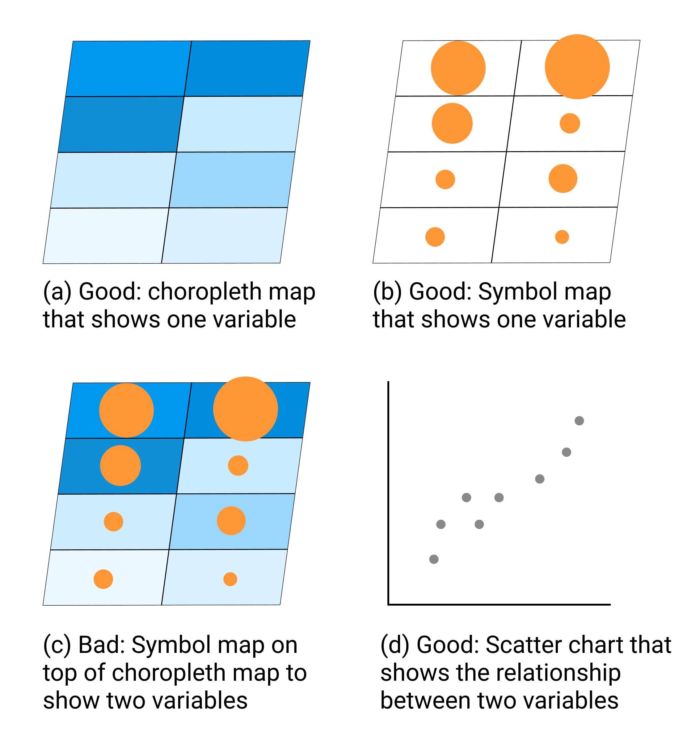
Figure 7.3: To compare two variables, such as income and education, avoid placing a symbol point map on top of a choropleth map. Instead, create a scatter chart, and consider pairing it with a choropleth map of one variable.
Instead, if the relationship between two variables is the most important aspect of your data story, create a scatter chart as shown in Figure 7.3(d). Or if geographic patterns matter for one of the variables, you could pair a choropleth map of that variable next to a scatter chart of both variables, by combining Figure 7.3(a and d). Overall, remember that just because data can be mapped does not always mean it should be mapped. Pause to reflect on whether or not location matters, because sometimes a chart tells your data story better than a map.
Choose Smaller Geographies for Choropleth Maps
Choropleth maps are best for showing geographic patterns across regions by coloring polygons to represent data values. Therefore, we generally recommend selecting smaller geographies to display more granular patterns, since larger geographies display aggregated data that may hide what’s happening at lower levels. Geographers refer to this concept as the modifiable aerial unit problem, which means that the way you slice up your data affects how we analyze its appearance on the map. Stacking together lots of small slices reveals more detail than one big slice.
For example, compare the two choropleth maps of typical home values in the Northeastern United States, according to Zillow research data for September 2020. Zillow defines typical values as a smoothed, seasonally adjusted measure of all single-family residences, condos, and coops in the 35th to 65th percentile range, similar to the median value at the 50th percentile, with some additional lower- and higher-value homes. Both choropleth maps use the same scale. The key difference is the size of the geographic units. In Figure 7.4, the map on the left shows home values at the larger state level, while the map on the right shows home values at the smaller county level.
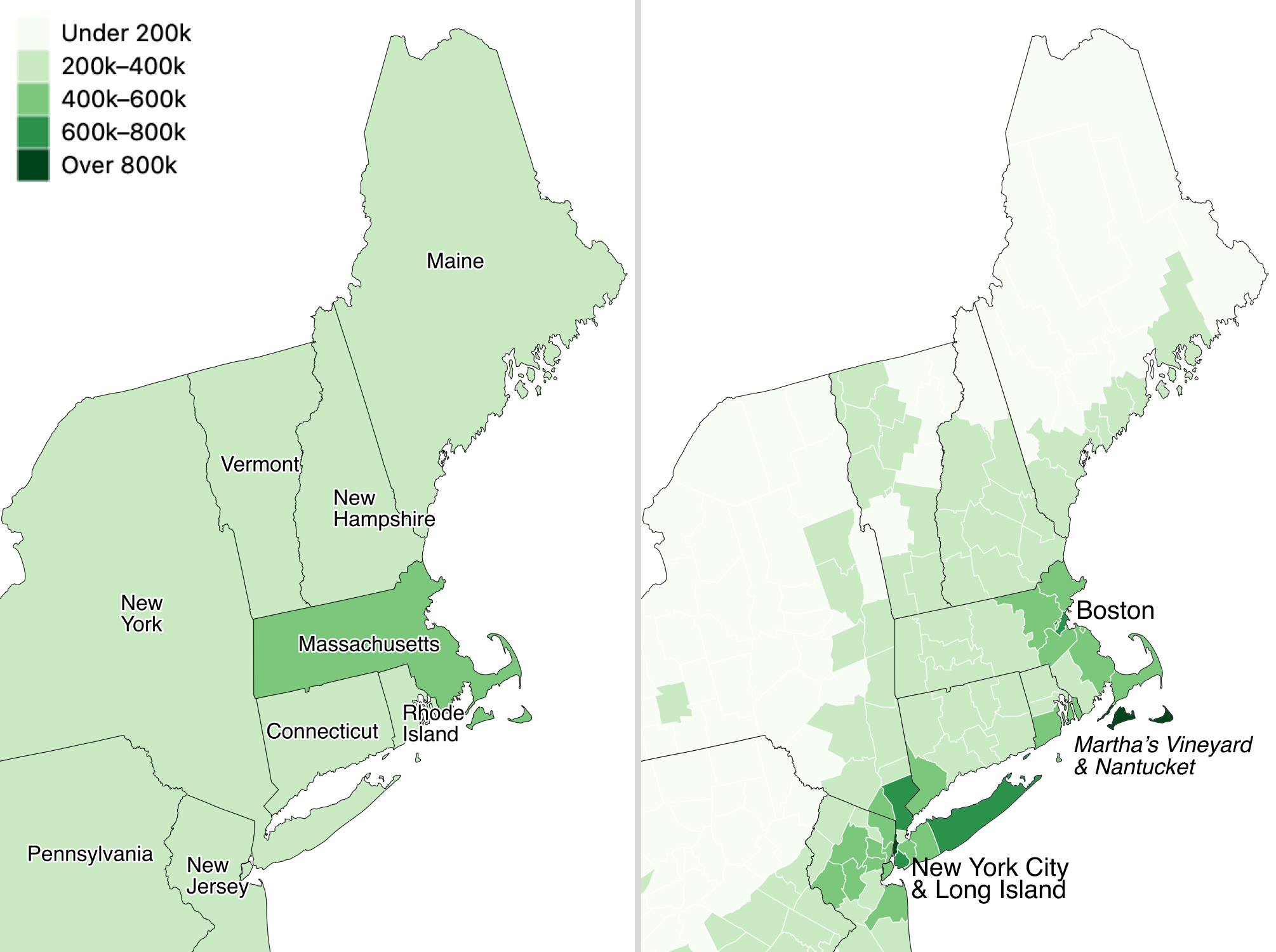
Figure 7.4: Zillow typical home values in September 2020 shown at the larger state level (left) versus the smaller county level (right).
Which map is best? Since both are truthful depictions of the data, the answer depends on the story you wish to tell. If you want to emphasize state-to-state differences, choose the first map because it clearly highlights how typical Massachusetts home prices are higher than those in surrounding Northeastern states. Or if you want to emphasize variation inside states, choose the second map, which demonstrates higher price levels in the New York City and Boston metropolitan regions, in comparison to more rural counties in those two states. If you’re unsure, it’s usually better to map smaller geographies, because it’s possible to see both state-level and within-state variations at the same time, if the design includes appropriate labels and geographic outlines. But don’t turn smaller is better into a rigid rule, since it doesn’t work as you move further down the scale. For example, if we created a third map to display every individual home sale in the Northeastern US, it would be too detailed to see meaningful patterns. Look for just the right level of geography to clearly tell your data story.