#StandWithUkraine - Stop the Russian invasion
Join us and donate. Since 2022 we have contributed over $5,000 in book royalties to Save Life in Ukraine & Ukraine Humanitarian Appeal & The HALO Trust, and we will continue to give!
How to Lie with Charts
In this section, you’ll learn how to avoid being fooled by misleading charts, and also how to make your own charts more honest, by intentionally manipulating the same data to tell opposing stories. First you will exaggerate small differences in a column chart to make them seem larger. Second you will diminish the rate of growth in a line chart to make it appear more gradual. Together, these tutorials will teach you to watch out for key details when reading other people’s charts, such as the vertical axis and aspect ratio. Paradoxically, by demonstrating how to lie, our goal is to teach you to tell the truth and to think more carefully about the ethics of designing your data stories.
Exaggerate Change in Charts
First we’ll examine data about the economy, a topic that’s often twisted by politicians to portray it more favorably for their perspective. The Gross Domestic Product (GDP) measures the market value of the final goods and services produced in a nation, which many economists consider to be the primary indicator of economic health. (Interestingly, not everyone agrees because GDP does not count unpaid household labor such as caring for one’s children, nor does it consider the distribution of wealth across a nation’s population.) We downloaded US GDP data from the US Federal Reserve open-data repository, which is measured in billions of dollars and published quarterly, with seasonal adjustments to allow for better comparisons across industries that vary during the year, such as summer-time farming and tourism versus winter-time holiday shopping. Your task is create a deceptive column chart that exaggerates small differences to make them appear larger in the reader’s eye.
Open the US GDP mid-2019 data in Google Sheets, and go to File > Make a Copy to create a copy that you can edit in your own Google Drive. We’ll create charts in Google Sheets, but you can also download the data to use in a different chart tool if you prefer.
Examine the data and read the notes. To simplify this example, we show only two figures: the US GDP for the 2nd quarter (April-June) and the 3rd quarter (July-September) in 2019. The 2nd quarter was about $21.5 trillion, and the third quarter was slightly higher at $21.7 trillion. In other words, the quarterly GDP rose by just under one percent, which we calculated this way:
(21747 - 21540)/21540 = 0.0096 = 0.96%.Create a Google Sheets column chart in the same sheet using the default settings, although we never blindly accept them as the best representation of the truth. In the data sheet, select the two columns, and go to Insert > Chart, as you learned when we introduced charts with Google Sheets in Chapter 6. The tool should recognize your data and automatically produce a column chart, as shown in the left side of Figure 14.1. In this default view, with the zero baseline for the vertical axis, the difference between $21.5 versus $21.7 trillion looks relatively small to the reader.
Truncate the vertical axis to exaggerate differences. Instead of a zero baseline, let’s manipulate the scale to make the 1 percent change in GDP look larger. Click on the three-dot kebab menu to open the Chart editor and select the Customize tab. Scroll down to the vertical axis settings, and reduce the scale by changing the minimum from 0 (the zero baseline) to 21500, and also change the maximum to 21800, as shown in the right side of Figure 14.1. Although the data remains the same, the small difference between the two columns in the chart now appears much larger in our eyes. Only people who read charts closely will notice this trick. The political candidate who’s campaigning on rising economic growth will thank you!
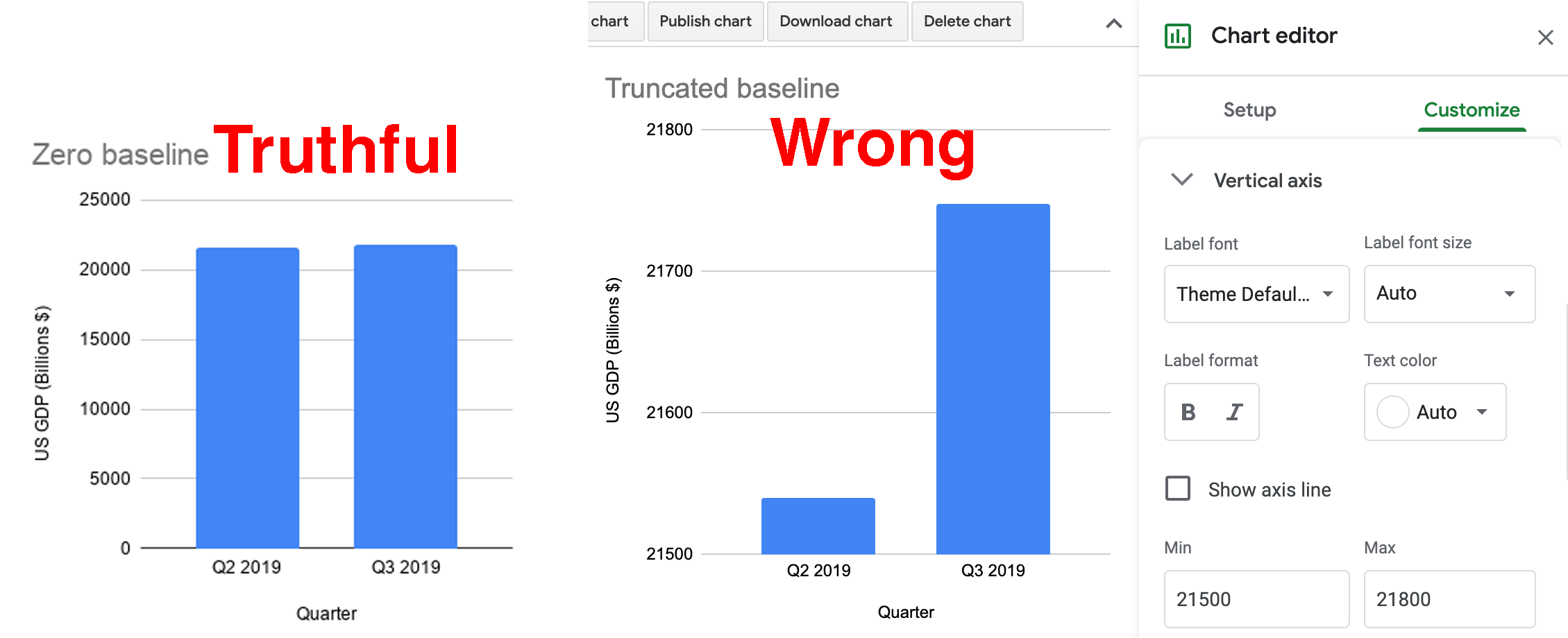
Figure 14.1: The Zero baseline GDP line chart (left), and the Truncated baseline line chart, with the Chart editor (right).
As you can see, the truncated baseline chart is wrong because you’ve violated one of the cardinal rules about chart design in Chapter 6. Column (and bar) charts must start at the zero baseline, because they represent value using height (and length). Readers cannot determine if a column is twice as high as another column unless both begin at the zero baseline. By contrast, the default chart with the zero baseline is truthful. But let’s move on to a different example where the rules are not as clear.
Diminish Change in Charts
Next we’ll examine data about climate change, one of the most pressing issues we face on our planet, yet deniers continue to resist the new reality, and some of them twist the facts. In this tutorial, we’ll examine global temperature data from 1880 to the present, downloaded from the NASA, the US National Aeronautics and Space Administration. It shows that the mean global temperature has risen about 1 degree Celsius (or about 2 degrees Fahrenheit) during the past fifty years, and this warming has already begun to cause glacial melt and rising sea levels. Your task is to create misleading line charts that diminish the appearance of rising global temperature change in the reader’s eye.44
Open the global temperature change 1880-2019 data in Google Sheets, and go to File > Make a Copy to create a version you can edit in your own Google Drive.
Examine the data and read the notes. Temperature change refers to the mean global land-ocean surface temperature in degrees Celsius, estimated from many samples around the earth, relative to the temperature in 1951-1980, about 14°C (or 57°F). In other words, the 0.98 value for 2019 means that global temperatures were about 1°C above normal that year. Scientists define the 1951-80 period as “normal” based on standards from NASA and the US National Weather Service, and also because it’s a familiar reference for many of today’s adults who grew up during those decades. While there’s other ways to measure temperature change, this data from NASA’s Goddard Institute for Space Studies (NASA/GISS) is generally consistent with data compiled by other scientists at the Climatic Research Unit and the National Oceanic and Atmospheric Administration (NOAA).
Create a Google Sheets line chart by selecting the two columns in the data sheet, then Insert > Chart. The tool should recognize your time-series data and produce a default line chart, though we never blindly accept it as the best representation of the truth. Click on the three-dot kebab menu to open the Chart editor and select the Customize tab. Add a better title and vertical axis label, using the notes to clarify the source and how temperature change is measured, as shown in Figure 14.2.
Figure 14.2: Default line chart of global temperature change. Explore the interactive version.
Now let’s create three more charts using the same data but different methods, and discuss why they are not wrong from a technical perspective, but nevertheless very misleading.
Lengthen the vertical axis to flatten the line
We’ll use the same method as shown in the Exaggerate Change in Charts section above, but in the opposite direction. In the Google Sheets chart editor, customize the vertical axis by changing the minimum value to negative 5 and the maximum to positive 5, as shown in Figure 14.3. By increasing the length of the vertical scale, you flattened our perception of the rising line, and cancelled our climate emergency…but not really.
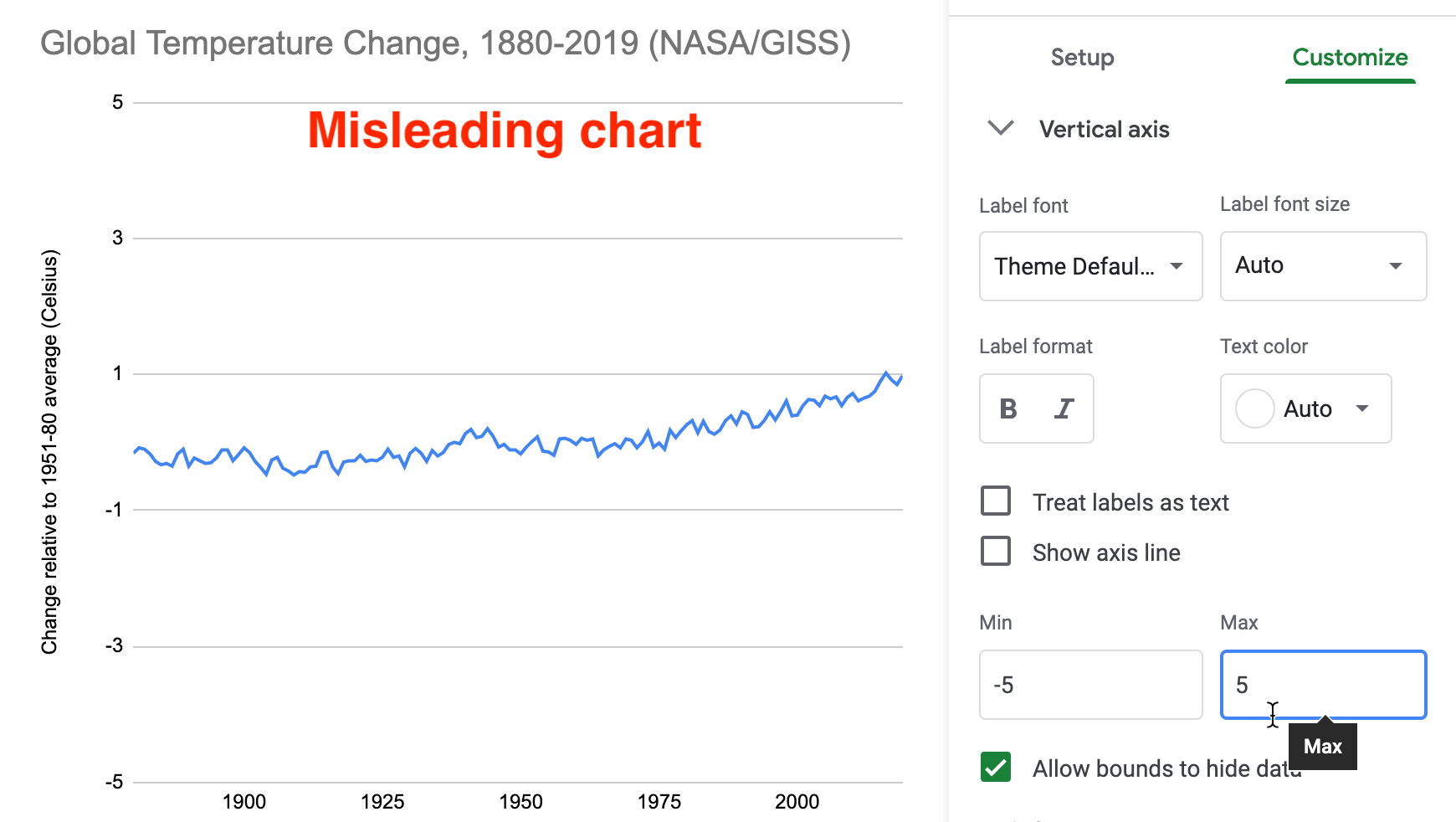
Figure 14.3: Misleading chart with a lengthened vertical axis.
What makes this flattened line chart misleading rather than wrong? In the first half of the tutorial, when you reduced the vertical axis of the US GDP chart, you violated the zero-baseline rule, because column and bar charts must begin at zero since they require readers to judge height and length, as described in the chart design section of Chapter 6. But you may be surprised to learn that the zero-baseline rule does not apply to line charts. Visualization expert Albert Cairo reminds us that line charts represent values in the position and angle of the line. Readers interpret the meaning of line charts by their shape, rather than their height, so the baseline is irrelevant. Therefore, flattening the line chart for temperature change may mislead readers, but it’s technically not wrong, as long as it is labelled correctly.45
Widen the chart to warp its aspect ratio
In your Google Sheet, click the chart and drag the sides to make it very short and wide, as shown in Figure 14.4. Image measurements as listed in width by height, and we calculate the aspect ratio as width divided by height. Since the default chart is 600 x 370 pixels, its aspect ratio is about 1.6 to 1. But the stretched-out chart is 1090 x 191 pixels, and its ratio is about 5.7 to 1. By increasing the aspect ratio, you have flattened our perception of the rising line, and cancelled our climate crisis once again…but not really.
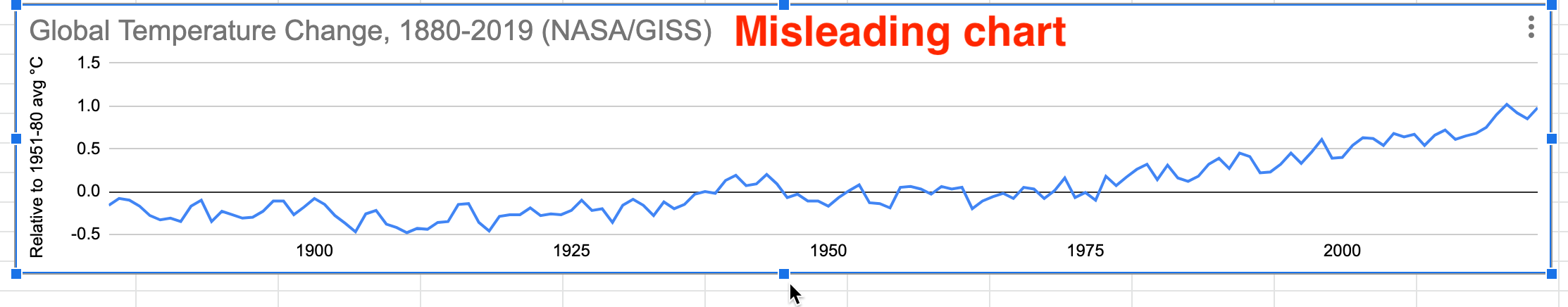
Figure 14.4: Misleading chart with a stretched aspect ratio.
What makes this warped line chart misleading rather than wrong? Once again, since changing the aspect ratio of a line chart does not violate a clearly-defined rule of data visualization, it’s not technically wrong, as long as it’s accurately labeled. But it’s definitely misleading. Cairo states that we should design charts with an aspect ratio that “neither exaggerates nor minimizes change.” What specifically does he suggest? Cairo recommends, yet clearly states this “isn’t a universal rule of chart design,” that the percent change expressed in a chart should roughly match its aspect ratio. For example, if a chart represents a 33 percent increase, which is the same as 33/100 or 1/3, he recommends an aspect ratio of 3:1 (because the fraction is flipped by placing width before height), or in other words, a line chart that is three times wider than its height.46
But Cairo does not propose his aspect ratio recommendation as a universal rule because he recognizes how it fails with very small or very large values. For example, if we apply Cairo’s recommendation to our global temperature change chart, the difference between the lowest and highest values (-0.5° to 1°C) represents a 300% increase. In this case, we calculate the percent change using the lowest value of -0.5°C, rather than the initial value of 0°C, because dividing by zero is not defined, so (1°C- (-0.5°C)) / |-0.5°C| = 3 = 300%. Following Cairo’s general recommendation, a 300% increase suggests a 1:3 aspect ratio, or a line chart three times taller than its width, as shown in Figure 14.5. While this very tall chart is technically correct, it’s misleading because it exaggerates change, which is contrary to Cairo’s main message. The aspect ratio recommendation becomes ridiculous when we divide by numbers that are very close to zero.
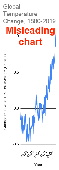
Figure 14.5: Rules of thumb do not always work. Cairo’s recommendation to use 1:3 aspect ratio to represent 300% change results in a misleading chart in this particular example.
Cairo acknowledges that his aspect ratio recommendation also can result in misleading charts in the opposite way that diminish change. For example, instead of global temperature change, which increased from 0° to 1°C, imagine a chart that displays global temperature, which increased from about 13° to 14°C (or about 55° to 57°F) over time. Even though a 1°C difference in average global temperature may not feel very significant to our bodies, it has dramatic consequences for the Earth. We can calculate the percent change as: (14°C - 13°C) / 13°C = 0.08 = 8% percent increase, or about 1/12. This translates into a 12:1 aspect ratio, or a line chart that is twelve times wider than it is tall, as shown in Figure 14.6. Cairo warns that this significant global temperature increase looks “deceptively small,” so he cautious against using his aspect ratio recommendation in all cases.47
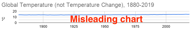
Figure 14.6: Once again, rules of thumb do not always work. Cairo’s recommendation for an 8% increase results in a 12:1 aspect ratio that produces a misleading chart in this particular example.
Note: Some experts advise that aspect ratios for line charts should follow the banking to 45 degrees principle, which states that the average orientation of line segments should be equal to 45 degrees, upwards or downwards, in order to distinguish individual segments. But this requires statistical software to calculate slopes for all of the lines, and still is not a “rule” that fits all cases. Read a good overview by Robert Kosara.48
Where does all of this leave us? If you feel confused, that’s because data visualization has no universal rule about aspect ratios. What should you do? First, never blindly accept the default chart. Second, explore how different aspect ratios affect its appearance. Finally, even Cairo argues that you should use your own judgment rather than follow his recommendation in every situation, because there is no single rule about aspect ratio that fits all circumstances. Make a choice that honestly interprets the data and clearly tells a story to your reader.
Add more data and a dual vertical axis
Another common way to mislead is to add more data, such as a second data series that corresponds to a second vertical axis on the right side of a line chart. While it’s technically possible to construct a dual-axis chart, we strongly advise against them because they can easily be manipulated to mislead readers. Let’s illustrate how with an example that combines two prior datasets—global temperature change and US Gross Domestic Product—in one dual-axis chart. In the Google Sheet, go to the temp+GDP sheet, where you will see temperature change plus a new column: US Gross Domestic Product (GDP) in billions of dollars from 1929 to 2019, downloaded from the US Federal Reserve. To simplify this example, we deleted pre-1929 temperature data to match it up more neatly with available GDP data.
Select all three columns and Insert > Chart to produce a default line chart with two data series: temperature (in blue) and US GDP (in red).
In the Chart editor, select Customize and scroll down to Series. Change the drop-down menu from Apply to all series to US GDP. Just below that in the Format area, change the Axis menu from Left axis to Right Axis, which creates another vertical axis on the right side of the chart, connected only to the US GDP data, as shown in Figure 14.7.
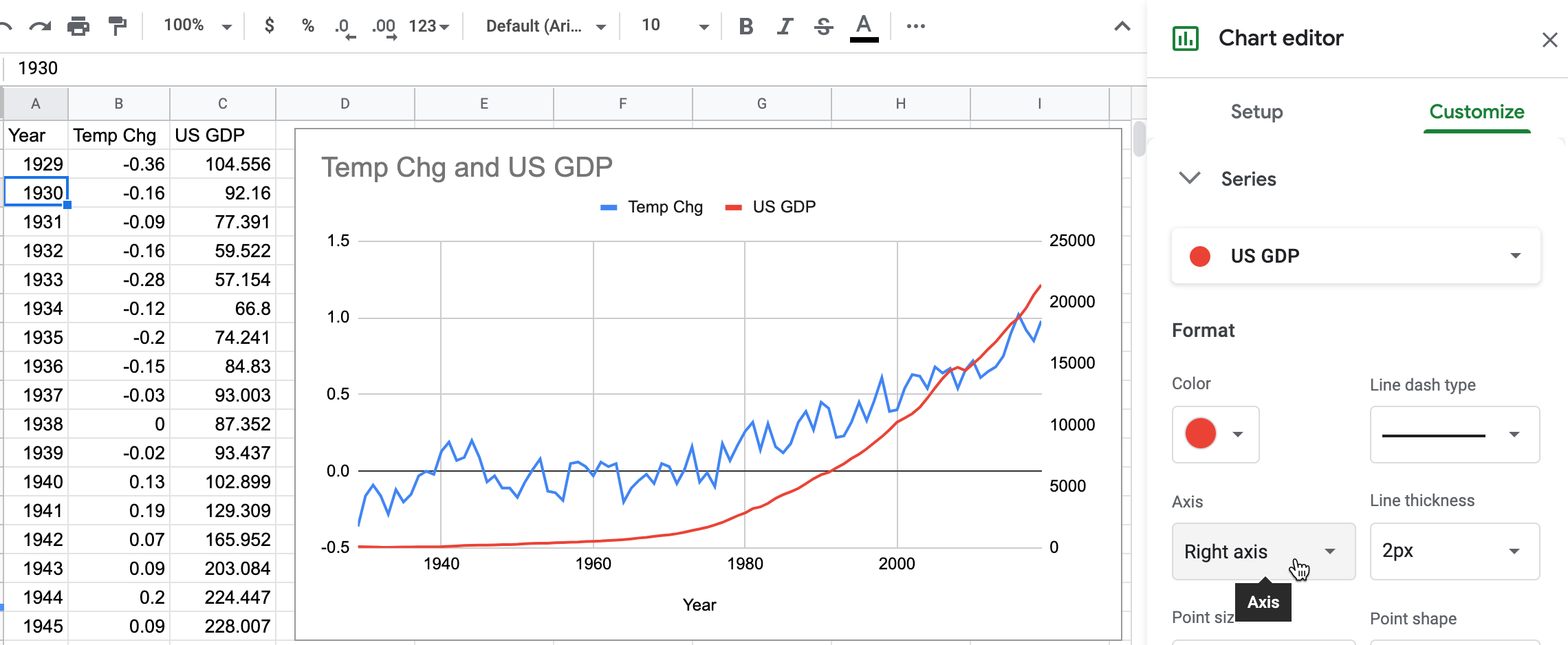
Figure 14.7: Add another vertical axis to the right side of the chart.
- In the Chart editor > Customize tab, scroll down and you will now see separate controls for Vertical Axis (the left side, for temperature change only), and a brand-new menu for the Right Axis (for US GDP only), as shown in Figure 14.8.
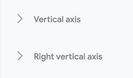
Figure 14.8: Brand-new menu for the right axis.
- Finish your chart by adjusting Vertical Axis for temperature change, but with even more exaggeration than you did in the previous section on “Lengthen the vertical axis to flatten the line.” This time, change the minimum value to 0 (to match the right-axis baseline for US GDP) and the maximum to 10, to flatten the temperature line even further. Add a title, source, and labels to make it look more authoritative, as shown in Figure 14.9.
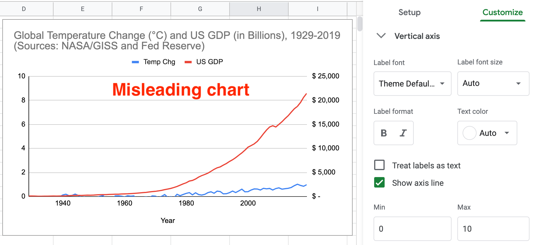
Figure 14.9: Misleading dual-axis chart of US GDP and global temperature change.
What makes this dual axis chart misleading rather than wrong? Once again, since it does not violate a clearly-defined visualization design rule, the chart is not wrong. But many visualization experts strongly advise against dual-axis charts because they confuse most readers, do not clearly show relationships between two variables, and sometimes lead to mischief. Although both axes begin at zero in Figure 14.9, the left-side temperature scale has a top level of 10°C, which is unreasonable since the temperature line rises only 1°C. Therefore, by lowering our perception of the temperature line in comparison to the steadily rising GDP line, you’ve misled us into ignoring the consequences of climate change while we enjoy a long-term economic boom! Two additional issues also make this chart problematic. Since the GDP data is not adjusted for inflation, its misleads us by comparing 1929 dollars to 2019 dollars, a topic we warned about in Chapter 5: Make Meaningful Comparisons. Furthermore, by accepting default colors assigned by Google Sheets, the climate data is displayed in a “cool” blue, which sends our brain the opposite message of rising temperatures and glacial melt. To sum it up, this chart misleads in three ways: an unreasonable vertical axis, non-comparable data, and color choice.
What’s a better alternative to a dual-axis line chart? If your goal is to visualize the relationship between two variables—global temperature and US GDP—then display them in a scatter chart, as we introduced in chapter 6. We can make a more meaningful comparison by plotting US real GDP, which has been adjusted into constant 2012 dollars, and entered alongside global temperature change in this Google Sheet. We created a connected scatter chart that displays a line through all of the points to represent time, by following this Datawrapper Academy tutorial, as shown in Figure 14.10. Overall, the growth of the US economy is strongly associated with rising global temperature change from 1929 to the present. Furthermore, it’s harder to mislead readers with a scatter chart because the axes are designed to display the full range of data, and our reading of the strength of the relationship is not tied to the aspect ratio.
Figure 14.10: Connected scatter chart of relationship between US real GDP and global temperature change from 1929 to 2019. Explore the interactive version.
To sum up, in this tutorial we created several charts about global temperature change. None of them were technically wrong, only some were truthful, but most were unreasonably manipulated to fool readers by hiding or disguising important patterns in the data. We demonstrated several ways that charts can be designed to deceive readers, but did not exhaust all of the options. For example, see additional readings on ways to create three-dimensional charts and to tilt the reader’s perspective below the baseline, which causes readers to misjudge the relative height of column or line charts.49
You may feel frustrated that data visualization lacks clearly-defined design rules for many cases, like we are accustomed to reading in our math, science, or grammar textbooks. Instead, remember that the important visualization rule is a three-step process: never blindly accept the default, explore how different designs affect the appearance of your interpretation, and use your best judgement to tell true and meaningful data stories.
Now that you’ve learned about how to lie with charts, in the next section you’ll build on these skills to lie with maps.
The tutorial on misleading climate change data was inspired by a high school classroom activity created by the NASA Jet Propulsion Laboratory (JPL), as well as Alberto Cairo’s analysis of charts by climate change deniers. NASA JPL, “Educator Guide”; Cairo, How Charts Lie, 2019, pp. 65-67, 135-141.↩︎
Cairo, How Charts Lie, 2019, p. 61.↩︎
Cairo, p. 69.↩︎
Cairo, p. 70.↩︎
Robert Kosara, “Aspect Ratio and Banking to 45 Degrees” (Eagereyes, June 3, 2013), https://eagereyes.org/basics/banking-45-degrees.↩︎
Cairo, How Charts Lie, 2019, p. 58.↩︎