#StandWithUkraine - Stop the Russian invasion
Join us and donate. Since 2022 we have contributed over $5,000 in book royalties to Save Life in Ukraine & Ukraine Humanitarian Appeal & The HALO Trust, and we will continue to give!
- Scatter and Bubble Charts
Scatter charts (also known as scatter plots) are best to show the relationship between two datasets by displaying their XY coordinates as dots to reveal possible correlations. In the scatter chart example below, each dot represents a nation, with its life expectancy on the horizontal X axis and its fertility rate (births per woman) on the vertical Y axis. The overall dot pattern illustrates a correlation between these two datasets: life expectancy tends to increase as fertility decreases.
Bubble charts go further than scatter charts by adding two more visual elements—dot size and color—to represent a third or fourth dataset. The bubble chart example further below begins with the same life expectancy and fertility data for each nation that we previously saw in the scatter chart, but the size of each circular dot represents a third dataset (population) and its color indicates a fourth dataset (region of the world). As a result, bubble charts are scatter charts on steroids, because they pack even more information into the visualization.
Fancier bubble charts introduce one more visual element—animation—to represent a fifth dataset, such as change over time. Although creating an animated bubble chart is beyond the scope of this book, watch a famous TED talk by Hans Rosling, a renowned Swedish professor of global health, to see animated bubble charts in action, and learn more about his work at the Gapminder Foundation.
In this section, you’ll learn why and how to create a scatter chart and a bubble chart in Datawrapper. Be sure to read about the pros and cons of designing charts with Datawrapper in the prior section.
Scatter Charts
A scatter chart is best to show the relationship between two sets of data as XY coordinates on a grid. Imagine you wish to compare life expectancy and fertility data for different nations. Organize your data in three columns, as shown in Figure 6.45. The first column contains the Country labels, and the second column, Life Expectancy, will appear on the horizontal x-axis, while the third column, Fertility, will appear on the vertical y-axis. Now you can easily create a scatter chart that displays a relationship between these datasets, as shown in Figure 6.46. One way to summarize the chart is that nations with lower fertility rates (or fewer births per woman) tend to have high life expectancy rates. But another way to phrase it is that nations with higher life expectancy at birth have lower fertility. Remember that correlation is not causation, so you cannot use this chart to argue that fewer births produce longer lives, or that longer-living females create fewer children.
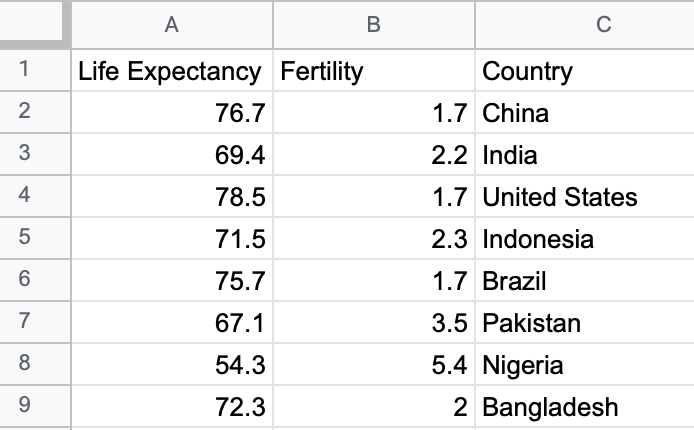
Figure 6.45: To create a scatter chart in Datawrapper, format data in three columns: labels, x-values, and y-values.
Figure 6.46: Scatter chart: Explore the interactive version. Data from the World Bank.
Create your own interactive scatter chart in Datawrapper, and edit the tooltips to properly display your data:
Open our Scatter Chart sample data in Google Sheets, or use your own data in a similar format.
Open Datawrapper and click to start a new chart.
In the Datawrapper Upload Data screen, either copy and paste the link to the data tab of the Google Sheet above, or copy and directly paste in the data. Click Proceed.
In the Check and Describe screen, inspect your data and make sure that the Life Expectancy and Fertility columns are blue, which indicates numeric data. Click Proceed.
In the Visualize screen, under the Chart type tab, select Scatter Plot. Float your cursor over the scatter chart that appears in the right-hand window, and you’ll notice that we still need to edit the tooltips to properly display data for each point.
In the Visualize screen, under the Annotate tab, scroll down to the Customize tooltip section, select Show tooltips, and click the Customize tooltips button to open its window. Click inside the first field, which represents the tooltip Title, then click further down on the blue Country button to add
{{ Country }}there. This means that the proper country name will appear in the tooltip title when you hover over each point. In addition, click inside the second field, which represents the tooltip Body, typeLife expectancy:, then click the blue button with the same name to add it, so that{{ Life_expectancy }}appears after it. Press return twice on your keyboard, then typeFertility:and click on the blue button with the same name to add it, so that{{ Fertility }}appears right after it, as shown in Figure 6.47. Press Save to close the tooltip editor window.
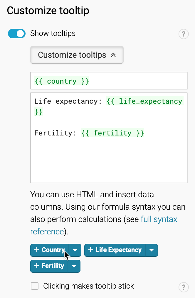
Figure 6.47: In the tooltip editor window, type and click column headers to customize the display.
- Back in the Visualize screen, when you hover your cursor over a point, the tooltip will properly display its data according to your editor settings above, as shown in Figure 6.48.
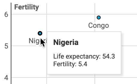
Figure 6.48: Hover over a data point to inspect the edited tooltip display.
- Finish the annotations to add your title and data source, then proceed to publish and embed your chart by following the prompts or reading the more detailed Datawrapper tutorial above. Learn about your next steps in Chapter 9: Embed on the Web.
Tip: In your Google Sheet, you can calculate the correlation coefficient using the =CORREL() function, which displays a numerical value of the strength of any association between pairs of cells in two data columns (or ranges), as shown in Figure 6.49. Correlation coefficients appear on a scale from -1 to 0 to 1, where the extremes show very strong relationships (negative or positive), while values near zero show no relationship. Learn more about this concept in any statistics book. Remember that correlation is not the same as causation, as we discussed in Chapter 5: Make Meaningful Comparisons.
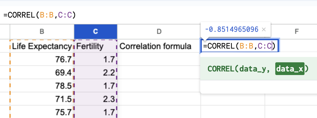
Figure 6.49: Hover over a data point to inspect the edited tooltip display.
Bubble Charts
In your scatter chart above, you learned how to visualize the relationship between two datasets: life expectancy (the X-axis coordinate) and fertility (the Y-axis coordinate). Now let’s expand on this concept by creating a bubble chart that adds two more datasets: population (shown by the size of each point, or bubble) and region of the world (shown by the color of each bubble). We’ll use similar World Bank data as before, with two additional columns, as shown in Figure 6.50. Note that we’re using numeric data (population) for bubble size, but categorical data (regions) for color. Now you can easily create a bubble chart that displays a relationship between these four datasets, as shown in Figure 6.51.
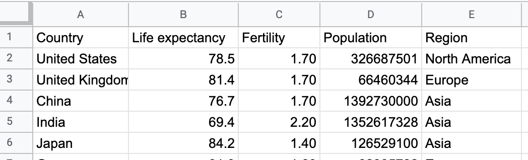
Figure 6.50: To create a bubble chart in Datawrapper, organize the data into five columns: labels, x-axis, y-axis, bubble size, bubble color.
Figure 6.51: Bubble chart: Explore the interactive version. Data from the World Bank.
Create your own interactive bubble chart in Datawrapper, and edit the tooltips, bubble sizes, and colors to display your data:
Open our Scatter Chart sample data in Google Sheets, or use your own data in a similar format.
Open Datawrapper and click to start a new chart.
Follow steps 3-5 above to upload, check, and visualize the data as a Scatter Plot chart type.
In the Visualize screen, under the Annotate tab, scroll down to Customize tooltip, and click edit tooltip template. In the Customize tooltip HTML window, type in the fields and click on the blue column names to customize your tooltips to display country, life expectancy, fertility, and population, as shown in Figure 6.52. Press Save to close the tooltip editor window.
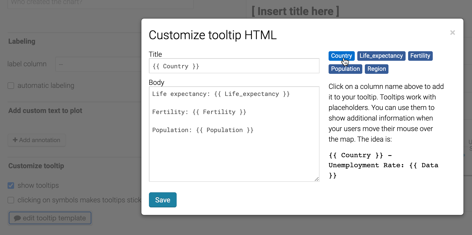
Figure 6.52: In the tooltip editor window, type and click column headers to customize the display.
- Back in the Visualize screen, under the Refine tab, scroll down to Color, select column for Region, and click the customize colors button to assign a unique color to each. Then scroll down to Size, check the box to change size to variable, select column for Population, and increase the max size slider, as shown in Figure 6.53. Click Proceed.
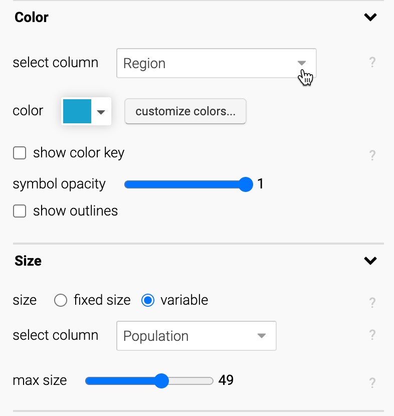
Figure 6.53: In the Visualize screen, modify the bubble colors and set size to variable.
- Test your visualization tooltips. Then finish the annotations to add your title and data source, and proceed to publish and embed your chart, by following the prompts or reading the more detailed Datawrapper tutorial above. See your next steps in Chapter 9: Embed on the Web.
For more information about creating scatter and bubble charts, see the Datawrapper Academy support site.
Now that you’ve learned how to create a scatter chart in Datawrapper, in the next section you’ll learn how to create the same chart type with a different tool, Tableau Public, to build up your skills so that you can make more complex charts with this powerful tool.