#StandWithUkraine - Stop the Russian invasion
Join us and donate. Since 2022 we have contributed over $5,000 in book royalties to Save Life in Ukraine & Ukraine Humanitarian Appeal & The HALO Trust, and we will continue to give!
Chapter 6 Chart Your Data
Charts pull readers deeper into your story. Images such as the slope of a line chart, or clusterings of dots on a scatter chart, can communicate your evidence to readers’ eyes more effectively than text or tables. But creating meaningful charts that draw our attention to key insights in your data requires clear thinking about design choices.
In this chapter, we will examine principles of chart design, and learn to identify good charts from bad ones. You will review important rules that apply to all charts, and also some aesthetic guidelines to follow when customizing your own designs. While many tools allow you to download charts as static images, our book also demonstrates how to construct interactive charts that invite readers to explore the data in their web browsers. Later you’ll learn how to embed interactive charts on your website in Chapter 9.
Learn about different types of charts you can create in this book in Table 6.1. Decisions about chart types are based on two main factors: the format of your data, and the kind of story you wish to tell. For example, line charts work best to show a series of continuous data points (such as change over time), while range charts are better suited to emphasize the distance between data categories (such as inequality gaps). After selecting your chart type, follow our tool recommendations and step-by-step tutorials. This chapter features Easy Tools with drag-and-drop menus, such as Google Sheets, Datawrapper, and Tableau Public. But the table also points you to Power Tools that give you more control to customize and host your visualizations, such as Chart.js and Highcharts code templates in Chapter 11. These advanced tools require prior knowledge on how to edit and host code templates with GitHub in Chapter 10.
A note about terminology: we jointly refer to bar and column charts because they’re essentially the same, except that bars are oriented horizontally and columns vertically. The main difference is the length of your data labels. Use bar charts to display longer labels (such as “Mocha Frappuccino 24-ounce” and “Double Quarter Pounder with cheese”) since they require more horizontal reading space. But you can use either bar or column charts for shorter labels that do not require as much room (such as “Starbucks” and “McDonald’s”). You’ll also notice that all of the examples in this chapter focus on food (because we were really hungry when writing it) and healthy eating (because we also need to lose weight).
| Chart | Best use and tutorials in this book |
|---|---|
Grouped bar or column chart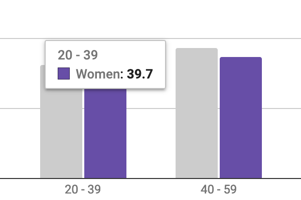 |
Best to compare categories side-by-side. If labels are long, use horizontal bars instead of vertical columns. Easy tool: Bar and Column Charts in Google Sheets tutorial or Datawrapper Charts Power tool: Ch 12: Chart.js and Highcharts templates |
Split bar or column chart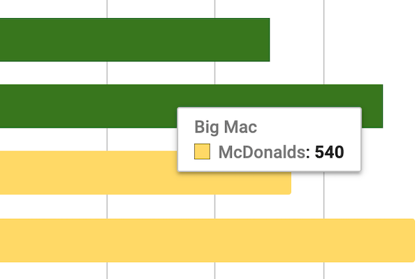 |
Best to compare categories in separate clusters. If labels are long, use horizontal bars instead of vertical columns. Easy tool: Bar and Column Charts in Google Sheets tutorial or Datawrapper Charts Power tool: Ch 12: Chart.js and Highcharts templates |
Stacked bar or column chart |
Best to compare sub-categories, or parts of a whole. If labels are long, use horizontal bars instead of vertical columns. Easy tool: Bar and Column Charts in Google Sheets tutorial or Datawrapper Charts Power tool: Ch 12: Chart.js and Highcharts templates |
Error bars in bar or column chart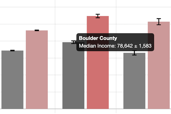 |
Best to show margin of error bars when comparing categories side-by-side. If labels are long, use horizontal bars instead of vertical columns. Easy tool: Google Sheets Charts has limited support for error bars Power tool: Ch 12: Chart.js and Highcharts templates |
Histogram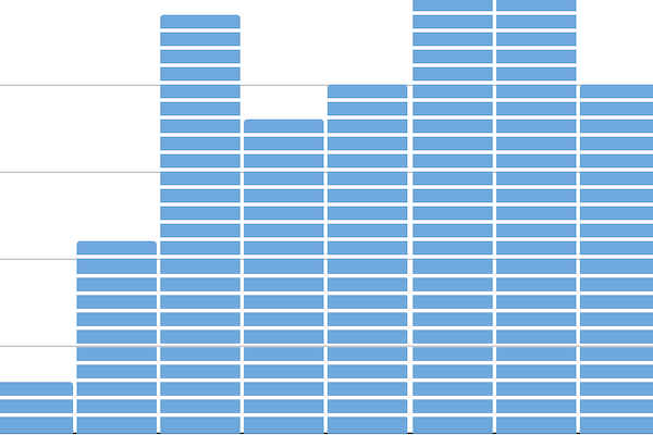 |
Best to show distribution of raw data, with number of values in each bucket. Easy tool: Histogram Chart in Google Sheets tutorial Power tool: Ch 12: Chart.js and Highcharts templates |
Pie chart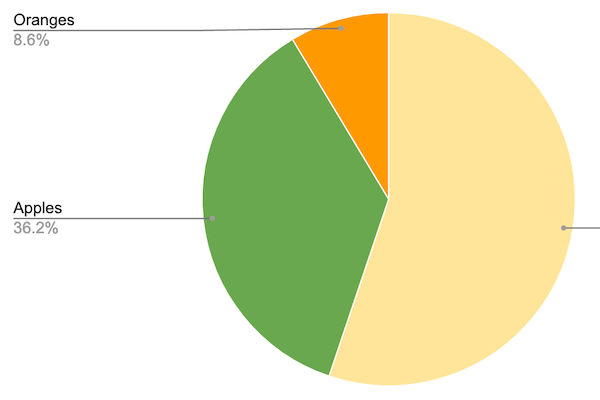 |
Best to show parts of a whole, but hard to estimate size of slices. Easy tools: Pie Chart in Google Sheets tutorial or Datawrapper Charts Power tool: Ch 12: Chart.js and Highcharts templates |
Line chart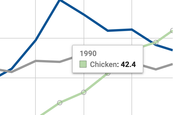 |
Best to show continuous data, such as change over time. Easy tools: Line Chart in Google Sheets tutorial or Datawrapper Charts Power tool: Ch 12: Chart.js and Highcharts templates |
Annotated line chart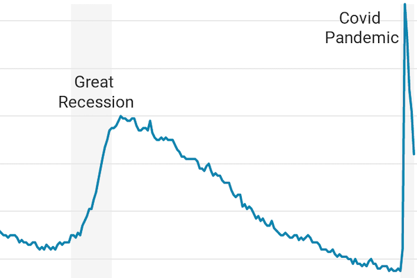 |
Best to add notes or highlight data inside a chart, such as historical context in a line chart. Easy tools: Annotated Chart in Datawrapper tutorial Power tool: Ch 12: Chart.js and Highcharts templates |
Filtered line chart 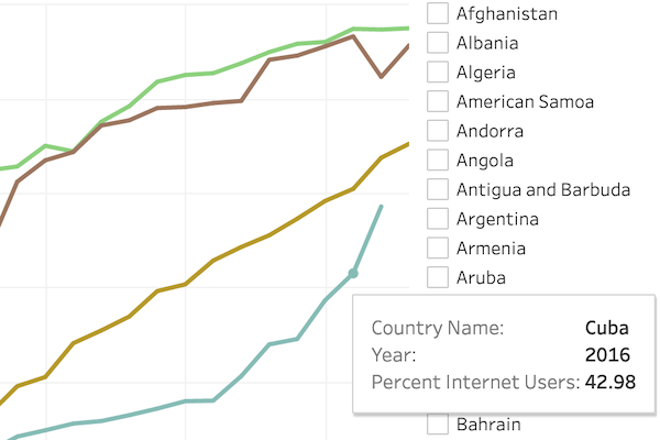 |
Best to show multiple lines of continuous data, which users can toggle on and off. Easy tool: Filtered Line Chart in Tableau Public tutorial |
Stacked area chart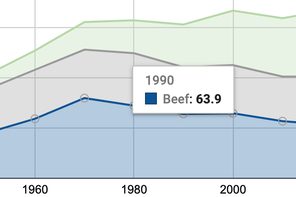 |
Best to show parts of a whole, with continuous data such as change over time. Easy tools: Stacked Area Chart in Google Sheets tutorial or Datawrapper Charts Power tool: Ch 12: Chart.js and Highcharts templates |
Range chart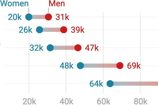 |
Best to show gaps between data points, such as inequalities. Easy tool and Power tool: Range Chart in Datawrapper tutorial |
Scatter chart 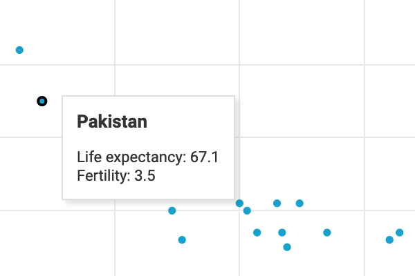 |
Best to show the relationship between two variables, with each dot representing its X and Y coordinates. Easy tool: Scatter and Bubble Chart in Datawrapper tutorial or Scatter Chart in Tableau Public tutorial. Power tool: Ch 12: Chart.js and Highcharts templates |
Bubble chart 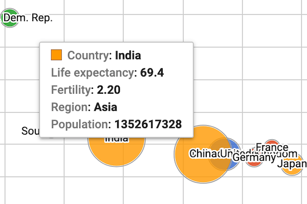 |
Best to show the relationship between three or four sets of data, with XY coordinates, bubble size, and color. Easy tool: Scatter and Bubble Chart in Datawrapper tutorial Power tool: Ch 12: Chart.js and Highcharts templates |
Sparklines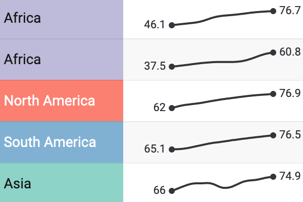 |
Best to compare data trends with tiny line or bar charts, aligned in a table column. Easy tool: Ch 9: Interactive Table with Sparklines in Datawrapper tutorial |
Note: For a more extensive collection of chart types and use cases, see the Financial Times Visual Vocabulary.