#StandWithUkraine - Stop the Russian invasion
Join us and donate. We are contributing all book royalties from 2022 to present to:
Save Life in Ukraine and Ukraine Humanitarian Appeal.
Recognize and Reduce Spatial Bias
In addition to recognizing and reducing data biases in general, we also need to watch out for spatial biases that negatively influence how we create and interpret maps. In this section, we’ll identify four types of spatial biases: map area, projection, disputed territory, and exclusion. We’ll also suggest specific ways to try to counter these biases when creating visualizations.
Map area bias refers to the tendency for our eyes to focus primarily on larger regions on a map, and less on smaller ones. A classic example arises every four years with choropleth maps of US presidential elections, which draw our attention to the geographic area of US states, rather than their population size or number of electoral votes, as shown in Figure 14.17. Conventional maps exaggerate the political influence of rural states with larger geographic areas (such as spacious Wyoming with less than 600,000 people), and diminish the role of urban states with small areas (such as tiny Rhode Island with over 1,000,000 people). Although Wyoming covers 80 times more area than Rhode Island, it casts only 3 electoral votes in US presidential races, while Rhode Island has 4 electoral votes. But when looking at conventional maps, most readers cannot easily make this distinction because our eyes are drawn to states with larger geographic areas, not population.
Projection bias is a related issue about how maps portray geographic areas. Over time, mapmakers have developed different projection systems to display a three-dimensional globe on a two-dimensional surface. Mercator, one of the most common projection systems, inflates the size of many European and North American countries, and diminishes the relative size (and importance) of Central African and Central American countries that lie closer to the equator. See the Engaging Data site and How Map Projections Lie by Maps Mania for interactive visualizations about Mercator projection map bias and comparisons to other systems. As Google maps and similar online services grew in popularity over the past fifteen years, their default projection system, known as Web Mercator, became ubiquitous on the web, further cementing distorted geography in our minds. (In 2018, Google Maps allowed desktop users who zoomed out to enable its 3D Globe view, instead of Web Mercator, but this may not be the default setting and may need to be switched on.)
One way to address both map area and projection bias in national or global maps is to replace conventional map outlines with cartograms, which are also called hexagon maps or population squares on some platforms. Cartograms display the size of geographic regions by their relative importance, which in this case is population, but could also be the size of the economy or other factors, depending on the data story. One advantage is that cartograms can focus our attention more evenly on the most relevant aspect of our data story, such as electoral votes in as shown in Figure 14.17. But one drawback is that cartograms require readers to recognize abstract shapes in place of familiar boundaries, since these population-based visualizations do not align perfectly with conventional Mercator geography-based land maps. See also Lisa Charlotte Rost’s post in Datawrapper Academy on how to visualize US elections results.
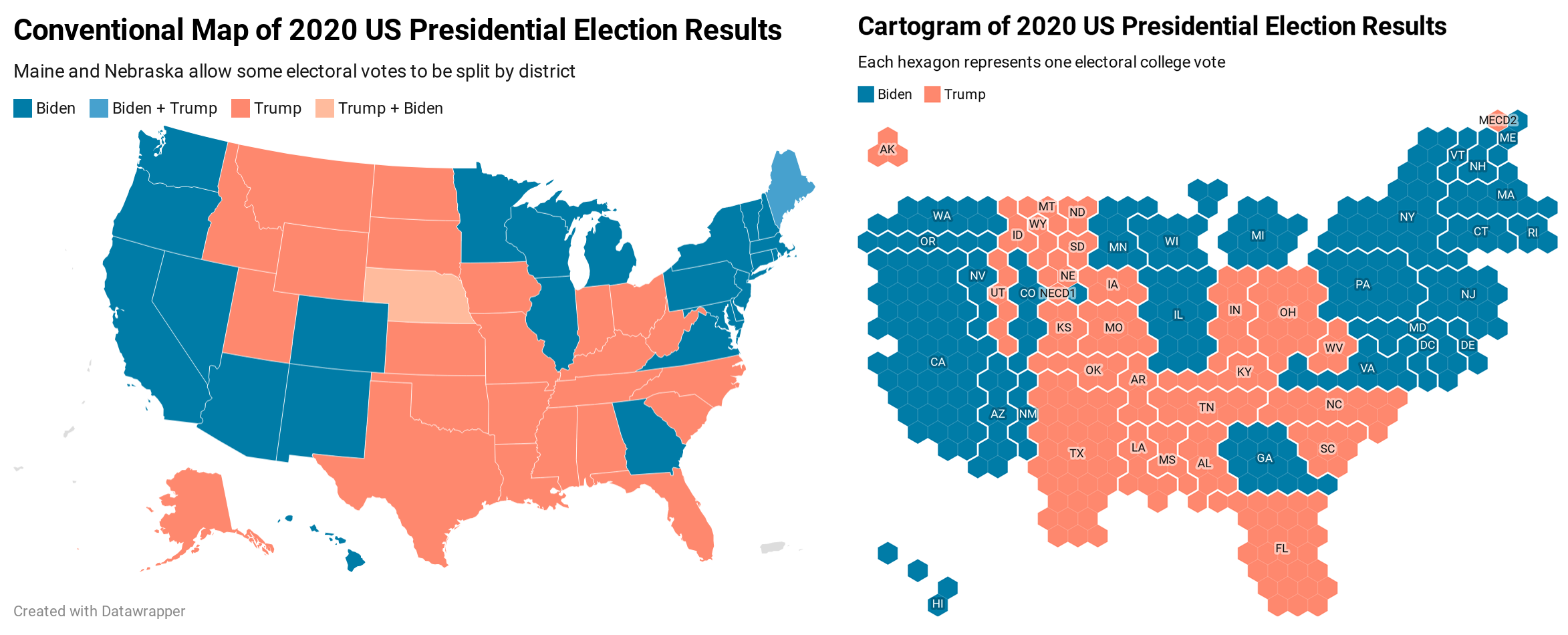
Figure 14.17: The US 2020 Presidential electoral vote displayed in a conventional US map (left) versus a cartogram (right), both created with Datawrapper.
Note: To recreate the cartogram map in Figure 14.17 in Datawrapper, select the file named USA > Electoral College (hexagon) because it allows users to split up electoral votes by district in Maine and Nebraska.
In the How to Lie with Maps section of this chapter, we created choropleth maps of world inequality data in Datawrapper. To convert one from a conventional world map to a population square map, follow this tutorial:
To modify an existing world inequality map that you may have saved in your Datawrapper account, go to My Charts, select and right-click on the map to make a duplicate, and edit it. Or follow the steps in the previous section to create a new map.
Go to the Select your map screen, and type “squares” to see all of those available types (including World population squares). Similarly, type “hexagons” to see all of the cartograms available (including US States). Select your preferred map, and proceed to visualize the data in the same way as other Datawrapper choropleth maps, as shown in Figure 14.18.
Figure 14.18: World population square map with income inequality data. Explore the interactive version.
Disputed territory bias refers to how web map providers sometimes display different views of the world, depending on the location where you access them. For example, Russia sparked a geopolitical dispute when it forcibly seized the Crimean Peninsula away from Ukraine in 2014. Since Google desired to continue making profits in Russia, it created two versions of its border with Ukraine on its Google Maps platform. When viewed from a Russian IP address, Google Maps shows a solid-line border to signify that the territory is controlled by Russia. When viewed from anywhere else in the world, Google Maps shows a dotted-line border that represents a disputed territory. Although Google claims to “remain neutral on geopolitical disputes,” according to the Washington Post, the corporation clearly took a side by displaying a solid border for Russian viewers.55 Google and several other web map providers have taken similar actions regarding the contested border between India and Pakistan, the waterway between Iran and Saudi Arabia, and the sea between Japan and South Korea.
While ordinary people can recognize disputed territory bias in Google Maps and other proprietary services, it’s difficult for us to directly challenge their decisions or pressure them to revise their basemaps. But we can draw on other strategies to reduce these biases. For example, contributors to OpenStreetMap, the crowd-sourced global map, have actively discussed different approaches to recognize disputed territories on their platform. Furthermore, we can use data visualization tool to draw different boundaries on top of proprietary map layers. As one example, the Native Land map, created by a non-profit organization based in Canada, displays outlines of territories and languages of indigenous people on present-day maps, to publicly remind us of colonialist policies and forcible displacement. One way to challenge the monolithic Google Maps platform is to create and publicize alternatives.
Map exclusion bias refers to ways that we fail to represent people or land through the act of omission. Sometimes these actions are taken by Google and other proprietary map providers, and sometimes we make them through our everyday decisions while creating maps. Take a close look at maps you recently made and ask yourself if they truly represent what their titles claim to show. For example, if you’ve created a U.S. map with state-level data, how did you address the District of Columbia? The nation’s capital is not counted as a state, nor does it have a voting representative in the U.S. Congress. But D.C. has over 700,000 residents (more than Wyoming or Vermont), and the Twenty-Third Amendment to the US Constitution grants it electoral votes as if it were a state (though it can never have more than the least populous state). Similarly, how did your U.S. maps represent Puerto Rico, a territory with over 3 million residents who are U.S. citizens, but have no vote in Congress or for the Presidency? What about other U.S. territories whose residents are also U.S. citizens, such as American Samoa, Guam, the Northern Mariana Islands, and the US Virgin Islands? When data exists for these places, do your maps make them visible—or do they vanish? If the latter, then you need to consider if your act of omission is also a type of intergroup bias, given that the majority of residents in D.C. and these territories are Black, Latino, and Pacific Islanders.
To be clear, some data visualization tools make it very difficult to include people and places who have traditionally been excluded from our maps. But sometimes the problem lies within us, or the default settings of our tools and our decisions about whether to try to change them. Take another look at your favorite map tool and closely examine the geographic outlines that appear when you choose to map data for the “United States.” If you feed in data that includes D.C. and U.S. territories—but the map only displays the 50 recognized states—then this omission will erase the existence of 4 million U.S. citizens from your map. Look beyond the default settings to determine if your tool offers more inclusive options. For example, Datawrapper recently improved how its USA > States and Territories map options display both symbol point and choropleth map data, as seen in Figure 14.19. For other regions that do not yet appear in Datawrapper’s options, you can create and upload your own map boundary file in GeoJSON format, as described in Chapter 13. Or, if your tool forces you to omit part of your data story, then call out this bias by describing its absence in the map notes or the companion text. Our mission in data visualization is to tell true and meaningful stories, so include people and places that belong on the map, rather than ignoring their existence.
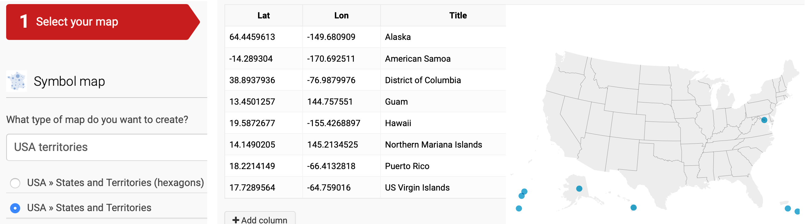
Figure 14.19: Datawrapper recently improved how it displays D.C. and non-contiguous places in its USA - States and Territories option for both symbol and choropleth maps.
Summary
In this chapter, you learned how to distinguish between wrong, misleading, and truthful visualizations, and strengthened your lie-detector skills to understand the importance of being honest when telling your own data stories. You also learned how to recognize and ways to reduce four categories of data bias in general, and spatial bias in particular.
The next chapter will bring together all of the concepts from different parts of the book to emphasize the importance of storytelling in our data visualizations.
Greg Bensinger, “Google Redraws the Borders on Maps Depending on Who’s Looking,” Washington Post, February 14, 2020, https://www.washingtonpost.com/technology/2020/02/14/google-maps-political-borders/.↩︎